Tag: stampin’ up

Don’t Miss Out … Snowflake Showcase

Hello my crafty peeps, just a quick reminder that the Snowflake Showcase promotion is coming to an end on November 30th. There is still time to snag some of the great products in this limited edition release!

These products are designed to coordinate and include stamps, dies, and embellishments for holiday/winter cards as well as floral/spring cards! The die set has 20 dies including a giant, intricate snowflake perfect as the focal point of any card!


Here are a few cards showcasing the versatility of this suite of products.


Until next time, remember, creativity and imperfection live together in all we do. “Grace is the face love wears when it meets imperfection.”

~xoxo,

Stampin’ Up’s Online Extravaganza

Hello my crafty peeps! I wanted to pop on quickly to let you know about a sale going on this week! Stampin’ Up! is celebrating Black Friday/Cyber Monday with an Online Extravaganza! Starting November 23rd, there will be three, 48-hour sales each one focusing on two product categories (paper, ink, stamps, etc) and offering a 10% discount off items in those categories. So, shake off that tryptophan coma and visit the Stampin’ Up! site to snap up some great products!

There will be a shortcut in the SU! store each day so you can easily find all the items in that sale. One sale runs at a time:

A few things to keep in mind:

  • Make sure to submit your orders online or with me while each sale is active (click the image above to go to my SU site)
  • Sales are while supplies last and for in stock merchandise only so order early to insure the best selection

Get ready to stock up on some great essentials during the online extravaganza! I am thankful for each of you and wish you a very Happy Thanksgiving! Leave me a comment below letting me know what you’re thankful for this Thanksgiving and you might get a little surprise from me in the mail! Until next time, remember, creativity and imperfection live together in all we do. “Grace is the face love wears when it meets imperfection.”

~xoxo,

World Card Making Day

Hello my crafty peeps! I wanted to pop on quickly to let you know about a sale going on this week! Stampin’ Up! is celebrating World Card Making Day with a super sale! Select products are 10% off today (October 1st) through Sunday (October 7th). From basic essentials to stamp sets and card kits, there is something for everyone! Gather your friends and spend the day crafting. Just don’t forget to #makeacardsendacard #WCMD18.

Wondering what’s on sale? Check out these great deals:

A few things to keep in mind:

  • Make sure to submit your orders online or with me by Sunday, October 7th (click the WCMD image above to go to my SU site)
  • Demonstrators stack deals, so you can earn an extra 20% off these items (contact me to learn more about joining my team)

Get ready to celebrate with your friends or stock up on essentials before your Holiday Crafting begins. Are you having a crafty get together to celebrate WCMD? I’d love to hear about how you plan to celebrate. Why not leave me a comment below letting me know how you’re getting your crafty on this week? Until next time, remember, creativity and imperfection live together in all we do. “Grace is the face love wears when it meets imperfection.”

~xoxo,

Fun-N-Crafty | Country Lane Suite

Hello my crafty peeps! I’m happy to be here again this month as part of the Fun & Crafty blog hop. You should have arrived here from Stacey’s A Work of Carte blog. If you didn’t, not to worry the complete list is below! Today the Stampin’ Up! Holiday catalog is live and there are oh so many goodies! To kick off the new catalog, a few of us participated in a holiday catalog card swap to get even more creative ideas to share with you!

For my card I decided to use the Country Lane suite, which includes the Country Home stamps, Country Lane DSP, Tin Tile Dynamic TIEF, Braided Linen Trim, Chicken Wire Elements, Galvanized Clips, Galvanized Metallic Paper, and two new combo packs of Stampin’ Blends.I really love the versatility of this stamp set and the embossing folder gives so much detail, especially with the galvanized metallic paper. In the coming months I plan to use more of my favorites from the new holiday catalog in blog posts so stay tuned!

I started with a Blackberry Bliss horizontal top-folding A2 card base and because it’s a dark color I decided to include a white insert for writing a message to that special someone, which meant more stamping inside! For the card front, I began by cutting a piece of Mint Macaron to 4″ x 5.25″ for a mat and a Whisper White to 3.75″ x 5″ for the stamped panel. Next, I cut 6″ x 6″ squares of the galvanized metallic paper and ran it through the Tin Tile TIEF. I cut these into 1.5″ x 5.25 strips.


Using Memento black ink, I stamped the cotton flower image 1.45″ above the bottom edge three times on the panel. I also stamped the sentiment “happy harvest blessings” on the top of the panel. To make the cotton pop and look extra white, I outlined each stamped image using the light Mint Macaron Stampin’ Blend. I also colored the other parts of the images using the combo packs of Blackberry Bliss, Cajun Craze, and Old Olive Stampin’ Blends.


All that remained, was assembling the cards. First, I adhered the interior panel as well as the front Mint Macaron mat, the Whisper White stamped layer, and finally the tin tile galvanized strip. I clipped one of the cute galvanized clips to the panel and adhered it to the card base using dimensionals. For the final touch, I made a bow out of the braided linen trim and using a rolled up mini glue dot, adhered it to the top of the galvanized clip.


There is a ton of inspiration throughout this hop and I encourage you to grab your Stampin’ Up holiday catalog and some post-it notes, and visit the other talented crafters listed below to see what they created and perhaps leave them some crafty love! Up next is the wonderful Merit over at MB Squared Designs. Until next time, remember, creativity and imperfection live together in all we do. “Grace is the face love wears when it meets imperfection.”

~xoxo


  1. Stacey — A Work of Carte
  2. Christine — Artful Musings (you are here)
  3. Merit — MB Squared Designs
  4. Nicole — Inky Fingers Stamping
  5. Jennifer — NW Stamper
  6. Tobe — The Craft Sea
  7. Pamela — Stinky Tofu

Supplies Used:
Country Home Stamps (147678)
Tin Tile Dynamic TIEF (147906)
Galvanized Metallic Paper (147805)
Card Stock: Whisper White, Blackberry Bliss, & Mint Macaron
Ink: Blackberry Bliss & Memento
Blends: Blackberry Bliss, Cajun Craze, Old Olive, & Mint Macaron (light)
Accessories: Galvanized Clips (147806), Braided Linen Trim (147808), Snail, & Glue Dots 

Fun-n-Crafty | Tropical Escape

Hello my crafty peeps! I’m happy to be here again this month as part of the Fun & Crafty blog hop. You should have arrived here from Jennifer Blomquist’s NW Stamper blog. If you didn’t, not to worry the complete list is below! This month’s theme is new catalog goodies! June and July are always full of excitement and renewed creativity, in part, due to the release of the new annual catalog from Stampin’ Up! This month a few of us participated in a new catalog card swap to get even more creative ideas to share with you!

For my creation I decided to use the new Tropical Escape suite, which includes the Tropical Chic stamps, Tropical Thinlits dies, Tropical Escape DSP, and the cutest Tropical Elements (little hibiscus flowers and leaves). This is currently my favorite set in the entire catalog. To see my top 10 goodies, visit this post. In the coming months I plan to use more of my favorites in projects and blog posts so stay tuned!


I started with a Shaded Spruce top-folding A2 card base and because it’s a dark color I decided to include a white insert for writing a message to that special someone, which meant more stamping inside! I began by cutting a piece of the Tropical Escape DSP to 4″ x 5.25″ for the front. Next, I stamped the hibiscus flower and the small and medium leaves on Whisper White card stock. I inked up the flower with Flirty Flamingo, and using a sponge dauber I added a little hint of Blushing Bride to the petal tips. I stamped the small leaf in Flirty Flamingo and the medium leaf in Granny Apple Green. Is anyone else loving the new ink pad design, ink formula, and the 16 new/returning colors as much as I am?!?


Then it was time to die cut the flowers and leaves. These dies are so versatile, each of the leaves has two dies, one cuts the outline and another cuts the interior, so you could cut leaves out of two different colors of card stock, or a combo of cars stock and DSP, or two different DSP patterns — like I said, versatile! I also cut two interior long, large leaf fronds out of Granny Apple Green card stock. Each card used one hibiscus, one small leaf, two medium leaves, and two large leaf interior die cuts. While I had the stamps and ink out I also stamped the sentiment, “With much love & thanks” in Blushing Bride on a strip of Whisper White card stock and stamped the leaf border on the inside panel using all three leaves (small in Blushing Bride, medium in Granny Apple Green, and large in Lemon Lime Twist). I adhered this panel to the inside of the card.


All that remained, was assembling the cards. I knew I wanted varying levels of dimension on the card front, which I achieved using a combination of adhesive, mini glue dots, and dimensionals. The upper medium leaf went down flat with Snail and the lower medium leaf I popped up using dimensionals. Next, using mini glue dots, I positioned the two large interior leaf die cuts. HINT: Adhering thin cuts can be challenging, one of my favorite tricks is rolling the mini glue dots. Using my craft pick I roll up the glue dots so they fit neatly behind even the thinnest things (see below). Next, I adhered the small leaf on top of the lower medium leaf using Snail and the hibiscus flower I popped up using dimensionals. Using one dimensional on each end, I positioned the sentiment over the leaf and flower cluster. For the final touch I used a rolled up mini glue dot to adhere a small linen thread bow to the flower and then attached the flower and leaf to the card, also using mini glue dots.


There is a ton of inspiration throughout this hop and I encourage you to grab your Stampin’ Up catalog and some post-it notes, and visit the other talented crafters listed below to see what they created and perhaps leave them some crafty love! Up next is the wonderful Tobe. Until next time, remember, creativity and imperfection live together in all we do. “Grace is the face love wears when it meets imperfection.”

~xoxo


  1. Nicole — Inky Fingers Stamping
  2. Jennifer — NW Stamper
  3. Christine — Artful Musings (you are here)
  4. Tobe — The Craft Sea

Supplies Used:
Tropical Chic Bundle (148399)
Tropical Escape DSP (146916)
Card Stock: Whisper White, Shaded Spruce, & Granny Apple Green
Ink: Granny Apple Green, Flirty Flamingo, Lemon Lime Twist, & Blushing Bride
Accessories: Tropical Elements (146919), Linen Thread, Dimensionals, Snail, & Glue Dots 

Innovation Station | Watercolor Wonders

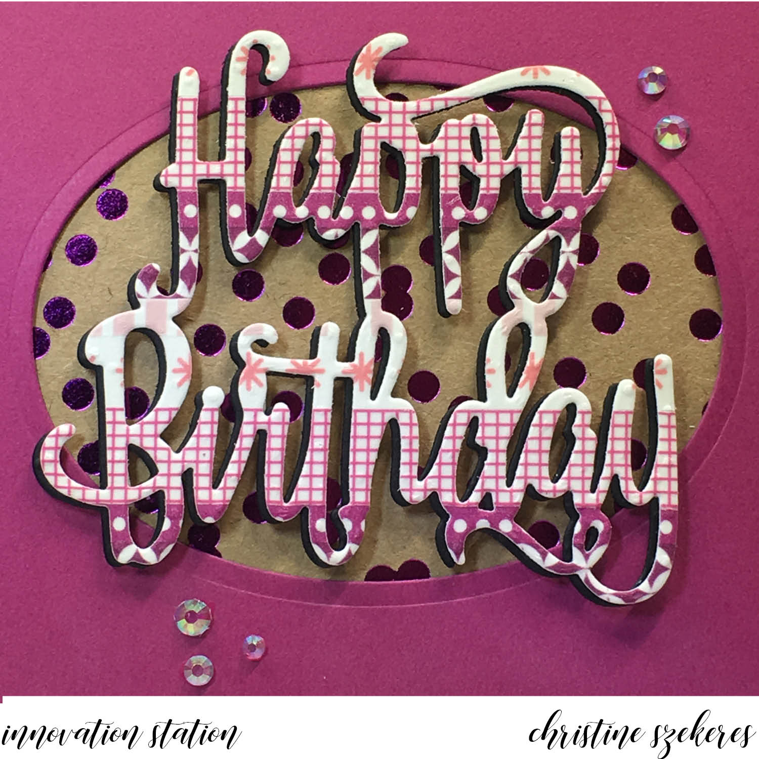
Hello my crafty peeps and welcome to another Innovation Station post, a monthly feature focusing innovative tips and tricks. Each month I share an innovation that I find myself going to again and again.

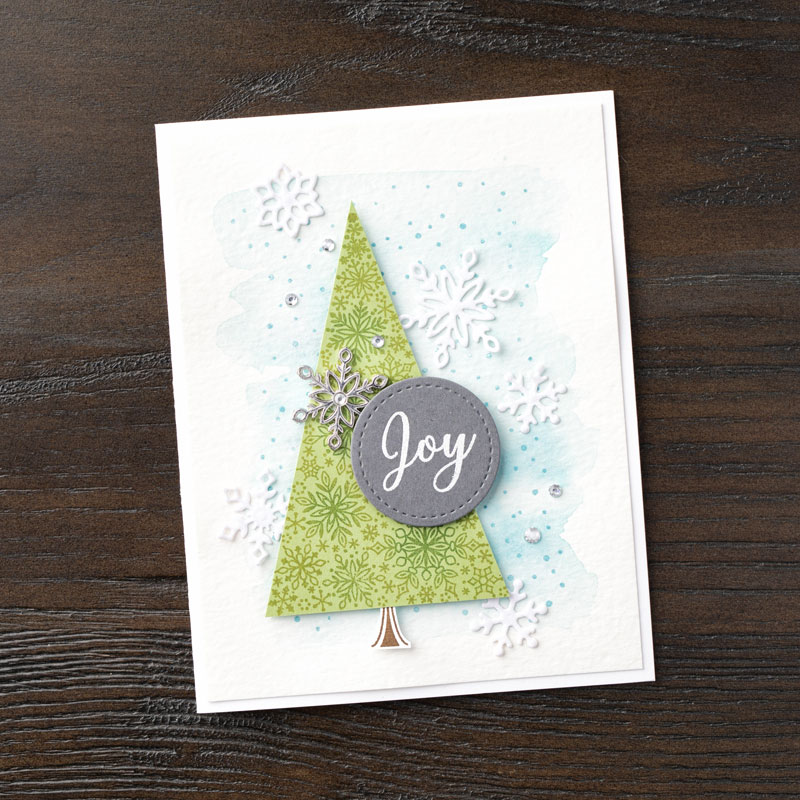
This month’s innovation focuses on watercolor background techniques. There are so many wonderful ways to incorporate watercolor into your cardmaking beyond the traditional watercolor paints. You can use ink pads, watercolor pencils, markers, and, of course the traditional watercolor paints to achieve beautiful watercolor looks for your projects. This month I’ll be focusing on two of my favorites: Ziploc bag “smooshing” with markers and acrylic block and ink pad backgrounds.


A note about supplies… Since most background watercolor techniques involve a fair amount of water the paper you choose and your work surface are important. I like to use watercolor paper or shimmery white card stock from Stampin’ Up!, but I also like to use Tim Holtz watercolor card stock. These papers are designed to take water well without pilling or tearing. Shimmery white card stock will warp under all the water, but you can flatten it under something heavy once it’s 98% dry. I always work on my craft mat or other non-porous surface to make clean up a snap. I also keep paper towels, a heat tool, a spritz bottle, an aqua painter, and some baby wipes handy.

Technique 1: Ziploc Bag Smooshing

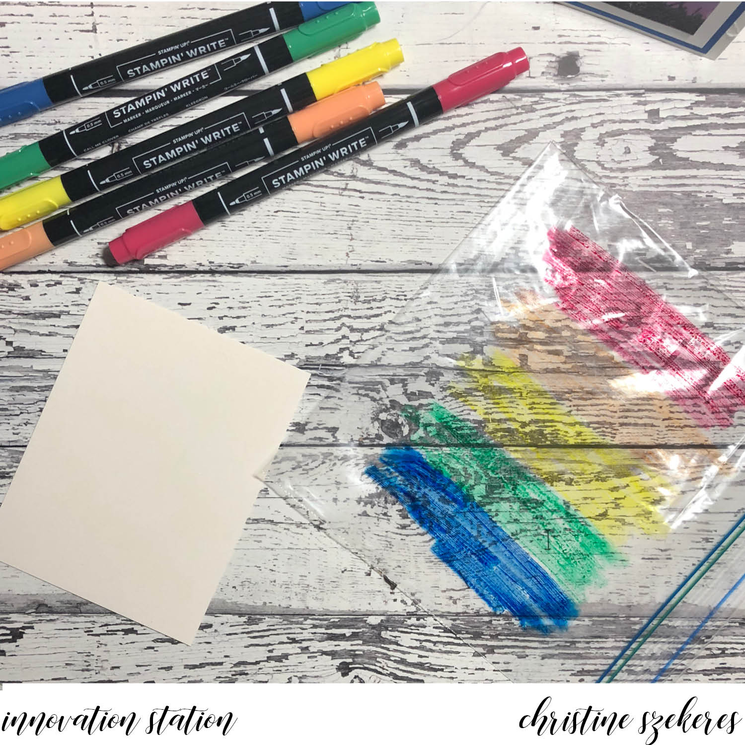
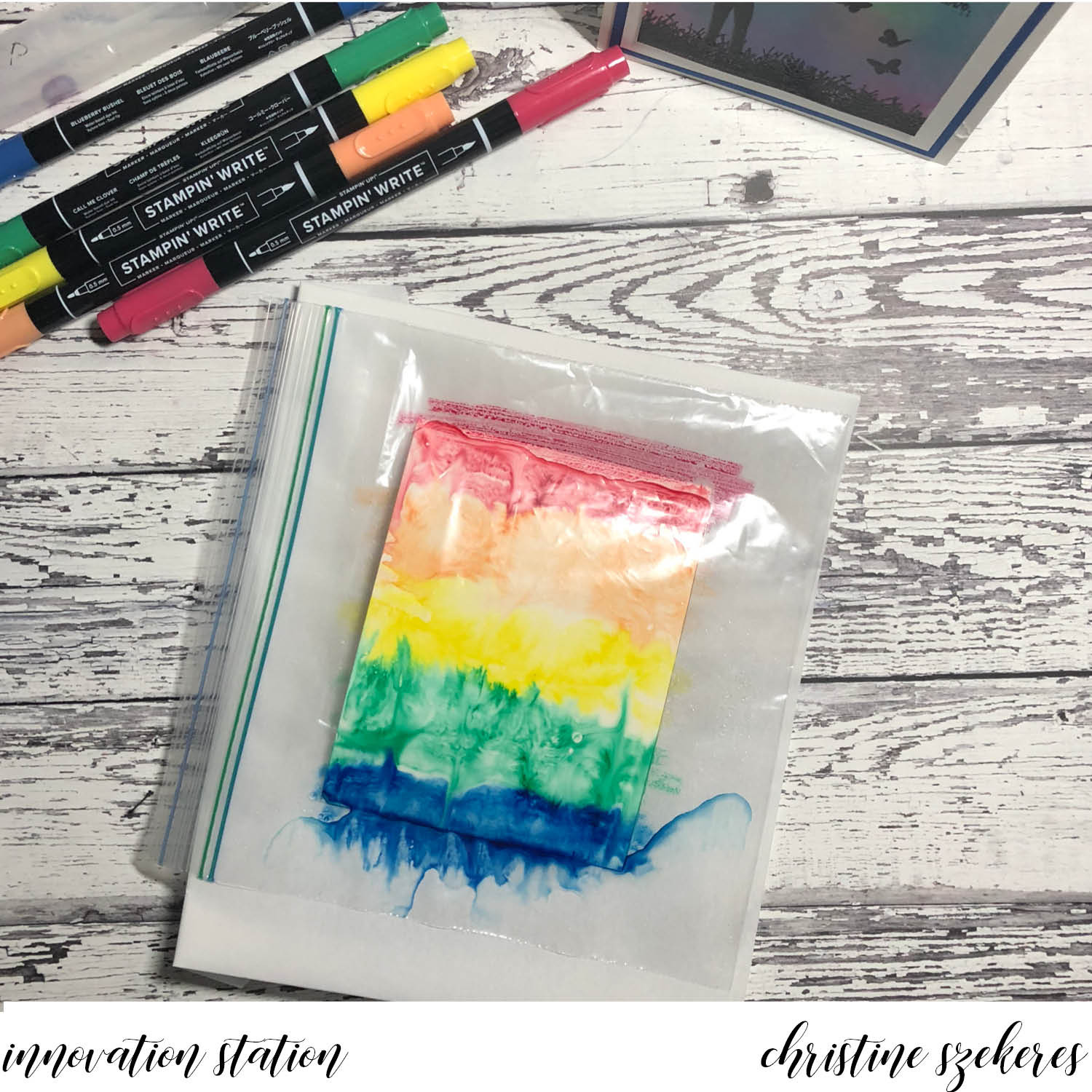
This technique works best with markers. In my examples I am using the new Stampin’ Write 2018 — 19 In Color markers. First, in rainbow order (ROY G BIV) scribble down some of each color onto the Ziploc bag. Set the bag aside. Take your panel and spritz generously all over with water. Don’t drown it, but make sure the entire surface is wet. If you’re worried about control, you can begin using your aqua painter squeezing out a bit of water and spreading it around the panel. It will begin to curl, but don’t worry. Gently lay the Ziploc bag, colored side down over the wet panel and begin massaging the ink around, pushing it all the way to the edge, making sure as much of the panel as you want is covered. Remove the Ziploc bag and set aside.


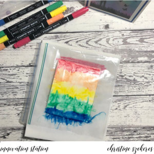
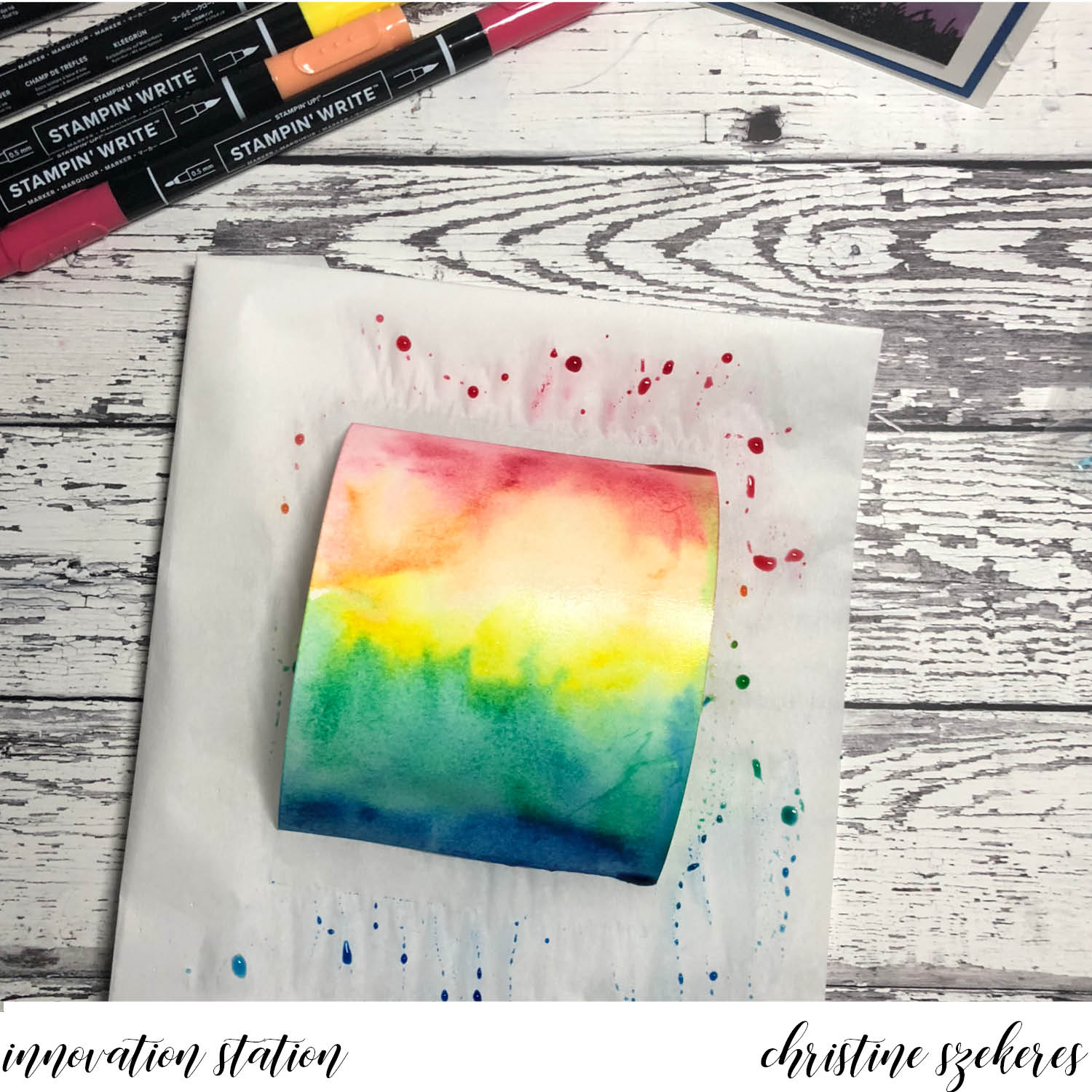
You can also lift and tilt to move the water and ink around the panel. If you find there are uncovered spots you can drag the panel through the ink/water on your mat, just make sure to keep like colors with like colors so you don’t get mud. If you would like you can also sprinkle some coarse grain salt over the wet mixture, which creates snowflake-like variations in the background. Often I will hit the panel with my heat tool to at least dry any pools of water and ink. Once it’s almost completely dry I will put it under something heavy to help flatten it out before I stamp and emboss images and sentiments.

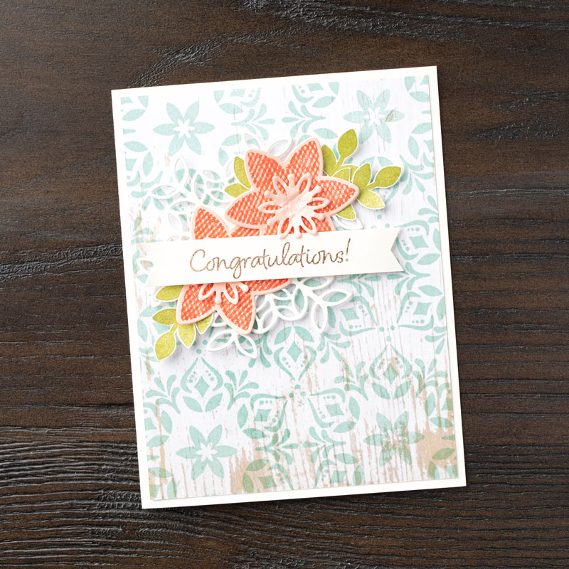
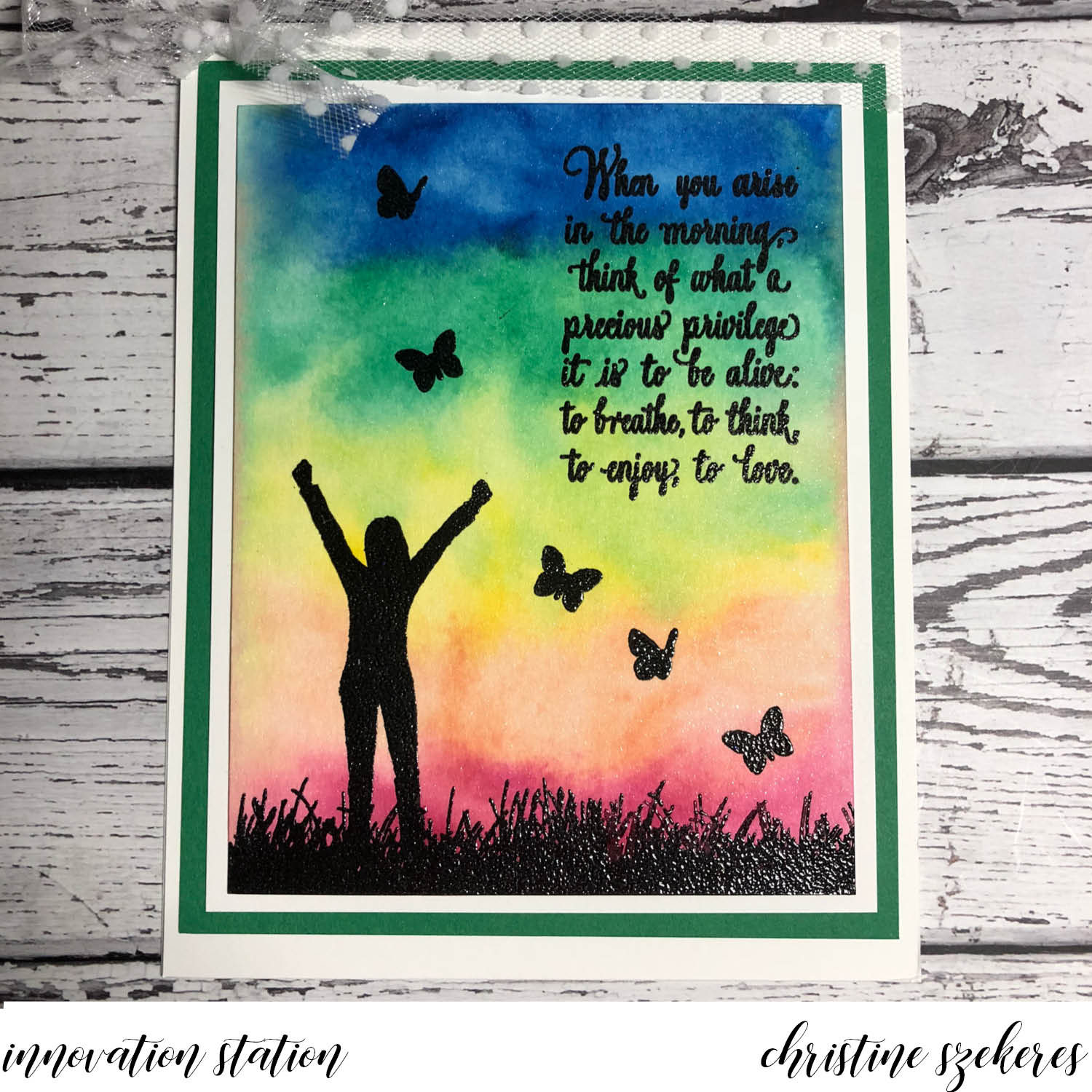
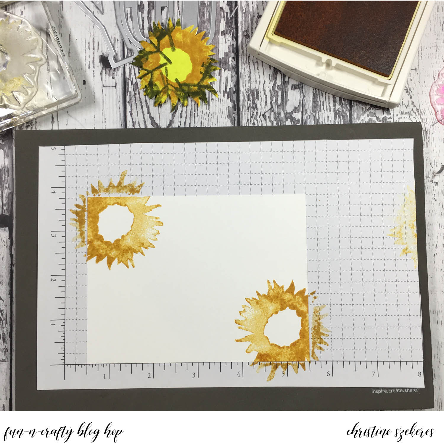
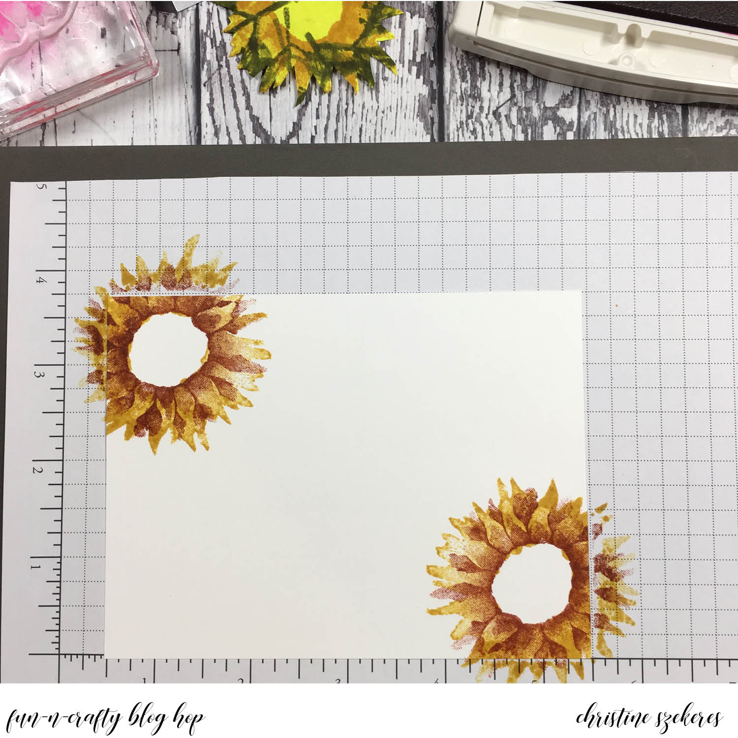
Technique 2: Acrylic Block & Ink Pads

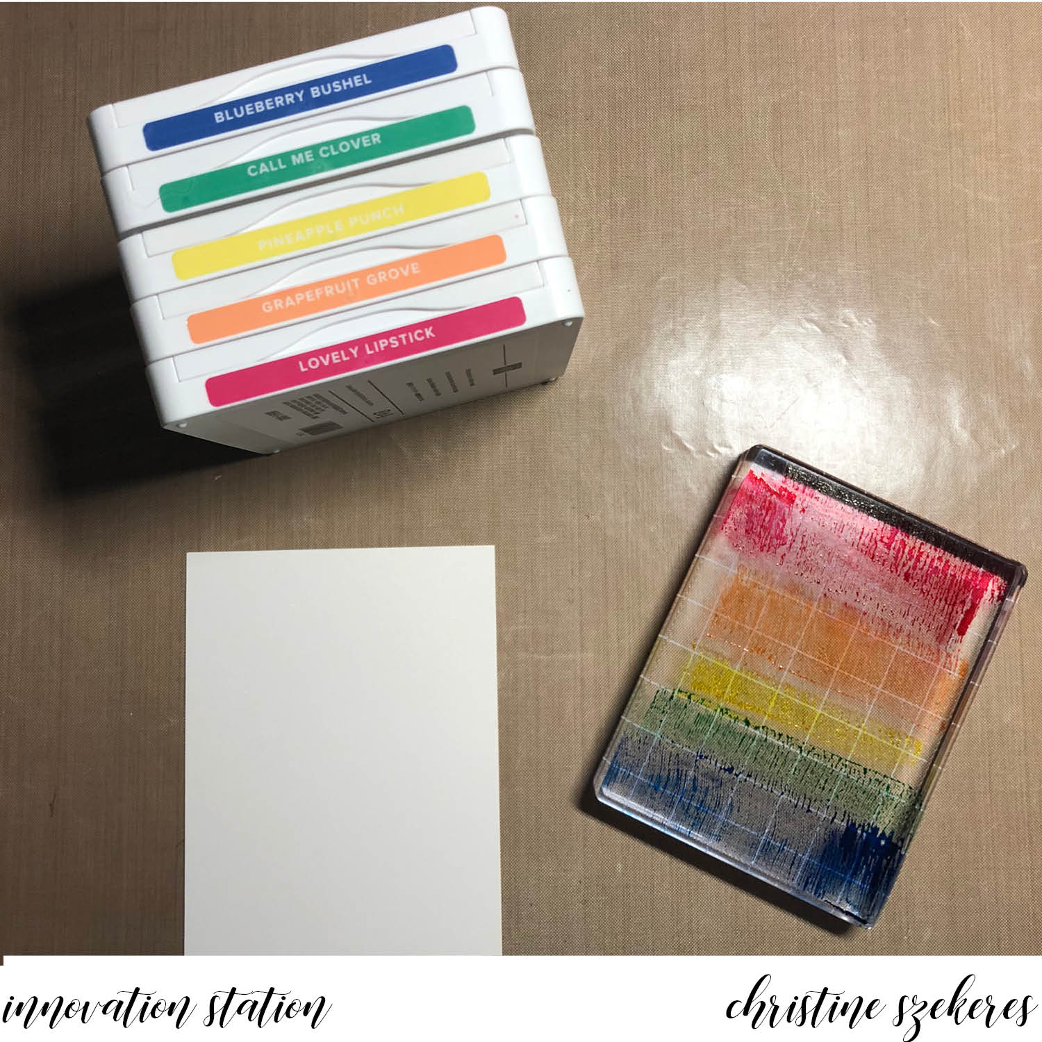
This technique tends to produce surprising results because the colors are more fluid (you get the block very wet and the ink is fairly concentrated). I use the ink pads direct to the block, but you could also drop reinker onto the block and spread out. HINT: When going direct to the block from your ink pad be careful not to overlap while getting as close as you can. Overlapping on a dark pad isn’t so bad, but on a light pad, like Pineapple Punch or Grapefruit Grove can stain the ink pad. You can use a paper towel to remove any dark ink and apply reinker, but the stain will still remain.


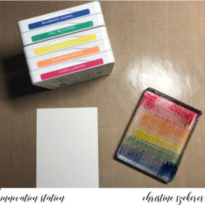
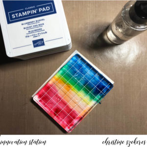
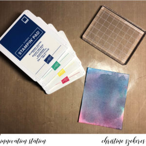
Again, I usually work in rainbow order from light to dark. I also excluded Grapefruit Grove from this mix since it produced some slightly mud-like results with the green. When spritzing the block be aware that ink will splatter, depending on the force of the spritzer and your distance from the block. I often work over my trash can, or keep the spritzer very close to the block to minimize splatter. You want the block wet, but you can also wet the paper. I tilt the block slightly to get the inks moving and mixing as I prepare to place it on the paper. I quickly flip the block over onto the paper. Conversely, you can also put your paper down on your block and then flip the sandwich over. Move the block around, making sure the ink is mixing and covering the whole panel (unless you want white edges).

The biggest mistake made with this technique is not having enough water on the block. HINT: You know your block is wet enough if it freely slides around on the paper. The more you slide it the more the colors will mix, giving some dark and surprising results. When you remove the block the paper will bow and may have puddling water. I usually dry it a bit with my heat tool, tilting the paper as I dry to further mix colors. You can also dab it with a dry paper towel to remove puddles of water. As with the other technique I get it nearly dry and then put something heavy on top of it to flatten it out. When it’s flat and dry I rub the embossing buddy over it before I stamp and emboss the images.

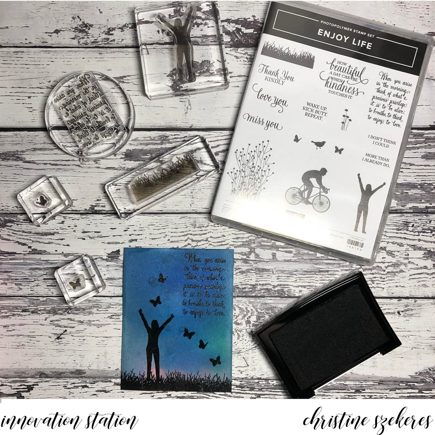
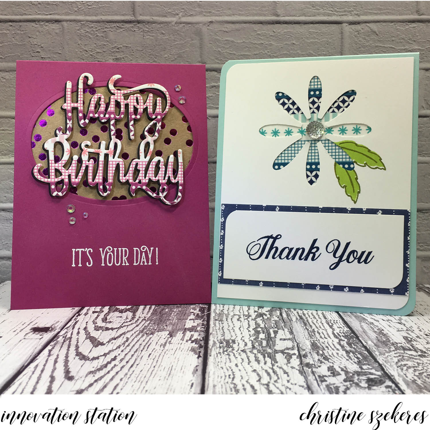
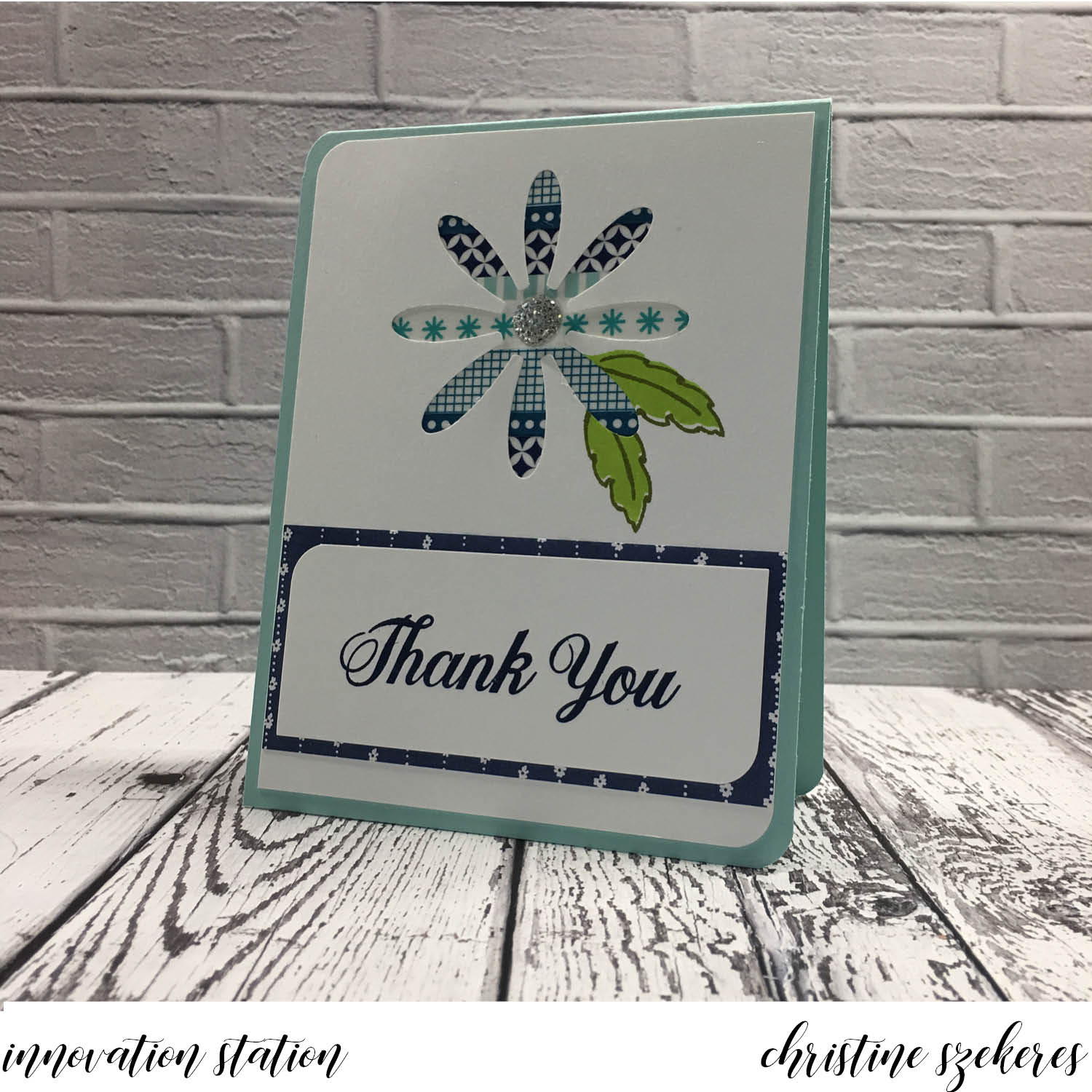
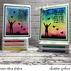
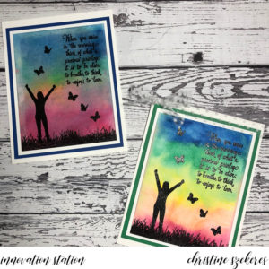
The acrylic block cards are encouragement cards for some friends who are in their busy season. I have wanted to use the new Enjoy Life stamp set for encouragement cards since I saw it and I love how the woman and the butterflies seem to dance across the panel. Inside I stamped the “Wake up. Kick Butt. Repeat.” sentiment, which is the perfect encouragement for the girls at camp.

Thanks for hanging out with me, and learning (or relearning) a fun innovation! Join me next month for another of my go to innovations, shaker cards. Until next time, remember, creativity and imperfection live together in all we do. “Grace is the face love wears when it meets imperfection.”

~xoxo

Supplies Used:
Enjoy Life Stamp Set
Markers & Inks: 2018 – 19 In Color
Card Stock: Whisper White, Shimmer, Blueberry Bushel, & Call Me Clover
Acrylic Block, Heat Tool, Embossing Buddy, Versamark Ink, Black Embossing Powder,
Aqua Painter, Spritz Bottle, Ziploc Bag

2018 – 19 Stampin’ Up Annual Catalog

Confession time: I’ve been a bad, bad girl! Last November I had every intention of continuing my monthly series, Innovation Station, as well as regular posts and blog hops. After all, crafting keeps me sane. Early in November a trip to On Stage in Salt Lake City took me out of town for nearly a week and then my best friend moved (and I had to help – that’s what it means to be best friends for nearly 30 years – you bury the bodies and you help move). Once that was all sorted it was Thanksgiving and then Christmas. So no blogging for two months. Okay, not so bad, right?

I promised myself I’d get going again in January, but as the early months of 2018 rolled by, it became clear that blogging (and even more disturbing) being creative were the casualties of life taking a sharp and unexpected turn in the middle of March. After nearly nine years, I was laid off from my job, which is scary enough on its own, but it also meant I had to move since my home was provided by my employer (yes, I was super fortunate). You would think being unemployed would leave lots of time for crafting, but aside from two weeks of binge-watching TV as I put off processing what it meant to be unemployed after nearly a decade, my life has been surprisingly busy. Busy getting ready to put most of my things in storage and take over my best friend’s spare bedroom, busy looking for a job, busy trying to figure out health insurance (not a simple task).

Once I got moved, I was able to begin picking up the threads of my old life, including being creative. My best friend kindly let me take over a big part of her living room for my crafty zone (a table and a small Origami unit that holds the few stamps, inks, paper, and dies I kept out of storage). Can I tell you how hard it was to fill two 66 quart totes and nothing more? Just today I realized that I forgot to keep out envelopes. Envelopes. I can’t believe it! I went to storage but didn’t have the energy to dig through all the totes to find the one with the envelopes so I’ll just have to buy another package. *sigh*

As a Stampin’ Up! demonstrator I always look forward to the new catalog but given that I was in full packing/purging mode, 5′ high in bins all around my house, for much of May, I really didn’t think too much about the fact that there were 241 pages of new and returning goodies to ‘oh and ah’ over! The one great thing about being settled (at least until August when the bestie moves to Endicott, NY) is I’ve been able to figure out what I’m most excited about from the new catalog.

So, without further ado, my top ten list (plus one honorable mention) of 2018 – 19 annual catalog goodies:

  1. Tropical Escape Suite (p. 121)
  2. Tufted Dynamic Embossing Folder (p. 223)
  3. Stampin’ Blends (p. 205)
  4. Share What You Love Suite (p. 177)
  5. A Big Thank You (p. 122)
  6. Stamparatus (p. 207)
  7. Animal Expedition Suite (p. 27)
  8. Garden Impressions Suite (p. 129)
  9. Friendly Conversation (p. 117)
  10. Artfully Folded (p. 228)
  11. Honorable Mention: Simply Shammy (p. 206)

Wondering why I love these things? Well, give me a bit more of your time and I’ll tell you…

I initially ignored the Tropical Escape suite, but the more I looked at the stamps and the dies, the move in love I fell. The leaf dies have inner and outline dies, making them super versatile. The DSP and the Tropical Elements flowers and leaves are beautiful as well, making this suite a win-win! The Tufted embossing folder is so pretty and when paired with tiny pearls or rhinestones, takes the look to a whole new level. I like the simplicity of the Stampin’ Blends, who wouldn’t, alcohol markers, one light and one dark, designed to blend. My main complaint when they debuted last fall was the palette was very limited. Coming out with 11 new colors was a solid expansion of these markers. I’m in love with Granny Apple Green and Flirty Flamingo.

The Share What You Love suite was the early release this year, out to demos in April and customers in May. This suite has wonderful images and sentiments as well as a double pack of specialty DSP! The bundle A Big Thank You might be something you miss flipping through the catalog, but don’t – there are great sentiments as well as builder images in this set! I often forget that the Stamparatus is new to customers since I first learned about it at On Stage last November and had one in my hands in February. With its stair-step dual plate configuration, you may wonder how you ever got along without it! I didn’t go to On Stage in April, but those who did, kept raving about the Animal Outing bundle and I agree — it is super cute. The whole suite is full of wonderful goodies including leaf ribbon and unique dies that cut both the stamped images and images from the DSP! 

I believe the Garden Impressions suite might be the sleeper suite of the catalog – I’ve seen one of the stamps used as giraffe or leopard print – these stamps are certainly flexible and the dies are intriguing since they can be used with the embossing mats, giving you so much flexibility with these intricate and beautiful dies. Pretty and vibrant DSP, the Metallic Ribbon Combo Pack, and Blooms Elements round out this beautiful suite! Friendly Conversation is an unusual set with just two, large sentiments, but they are interesting enough to be the focal image of a card! I don’t normally fall in love with hostess sets, but Artfully Folded, which is origami images is so fun and playful, what’s not to love?!? The Stamparatus makes this set loads of fun! The Simply Shammy comes along a while after other shammies but as usual, Stampin’ Up! looked at what was on the market and then innovated and the result is a very thick and resilient shammy that gets stamps (particularly photopolymer) as clean as a whistle! Bonus: it fits perfectly inside the standard SU stamp case and since it’s not airtight you don’t need to worry about mold or mildew!

Thanks for hanging out with me today and listening to what’s new with me! I hope to begin innovation station this month (next week). Until next time, remember, creativity and imperfection live together in all we do. “Grace is the face love wears when it meets imperfection.”

~xoxo

Fun-n-Crafty | A Painted Harvest

Hello my crafty peeps! I’m happy to be here again this month as part of the Fun & Crafty blog hop. This month’s theme is Fall or Halloween! It seems like only yesterday we were in the middle of summer. This past Friday was the official first day of Fall, but here in Seattle, we don’t seem to have gotten the memo (it’s been sunny and warm for the past hew weeks). I went shopping at Trader Joe’s bright and early Saturday morning and was amazed. It was like the entire place had been hosed down with pumpkin spice … overnight. Pumpkin spice cake, cookies, pasta, fudge, caramel corn, cereal … you name it and TJ’s probably has it … even the dogs were included with pumpkin spice dog biscuits! I love fall, and pumpkin spice, so a few things (the caramel corn was delicious) may have made their way into my basket!

This month I decided to focus on one of my favorite suites in the new Holiday catalog, The Painted Harvest. It includes a wonderful layering stamp set with these dreamy floral and leaf images, some “thankful” sentiments, and best of all a coordinating leaf punch. There is also a beautiful pack of 12 x 12 DSP and some wooden elements. This is a very versatile suite of products with color combinations for fall, the holidays, and spring.


I decided to combine this suite with a cool technique, eclipse. I love this technique with the Stampin’ Up! large letters framelits. I began with an A2 Whisper White card base, a 5.25″ x 4″ Chocolate Chip mat, and a 5″ x 3.75″ thick Whisper White panel for stamping. This set has that “artistic” look (the base stamps don’t stamp solid) and sometimes I think, “Oh, no, it’s going to look terrible!”, but it never does! HINT: I use the Stampin’ Pierce Mat to make sure I get good coverage from photopolymer stamps.


Beginning with the base flower, I stamped three on the panel in Crushed Curry. Next, using the detail layering image, I stamped over the large flower in Cajun Craze ink. I also stamped a flower onto a post-it note and fussy cut it to use as a mask for stamping the leaves, which I stamped in Pear Pizzazz for the base and Old Olive for the detail. I also stamped the flower middle using Chocolate Chip ink. Lastly, I stamped the sentiment, “I am thankful for you” in Chocolate Chip.


Now, it’s time to create the eclipse. Using the Y – O – U letters, I centered them on the panel and secured them in place using post-it note tape. I ran this through my BigShot and then popped them out. HINT: Make sure to keep any letter centers (like in the O) to adhere to the matte panel. To make sure you get it centered, first put the letter in its place, put adhesive on the back of the center piece, and put it down. Then you can lift out the letter. Using the foam adhesive strips, pop up each letter inside its space on the card.

There is a ton of inspiration throughout this hop. Since you started here, I encourage you to grab a favorite beverage, perhaps a pumpkin spice latte, and visit the other talented team members listed below to leave them some blog love! Next up is the amazing Merit. Until next time, remember, creativity and imperfection live together in all we do. “Grace is the face love wears when it meets imperfection.”

~xoxo


  1. Tobe — The Craft Sea
  2. Christine — Artful Musings (you are here)
  3. Merit — MB Squared
  4. Jennifer — NW Stamper
  5. Susan — Stampin by the SF Bay

Supplies Used:
Stamps & Dies: Painted Harvest (144783) & Large Letters Framelits (141712)
Card Stock: Whisper White (100730) & Chocolate Chip (102128)
Ink: Crushed Curry, Cajun Craze, Chocolate Chip, Pear Pizzazz, & Old Olive
Foam Adhesive Strips (141825)

Innovation Station | Washi, Washi, Washi

Hello, crafty peeps and welcome to another Innovation Station post, a monthly feature focusing innovative tips and tricks. Each month I share an innovation that I find myself going to again and again.

This month’s innovation is washi tape. I seriously need a 12-step program for my washi tape addiction! Thin, thick, glittery, transparent, opaque … I LOVE washi! There are some wonderful tapes on the market today and some of my favorites are from SU! I especially like the face that SU coordinates their washi in complimentary color families. Today I’m going to share two of my favorite washi techniques: the washi die cut and the washi background. Both are super simple, yet add so much to your card making!

Washi is super thin which when layered over card stock makes it perfect for die cutting and background techniques. When I sat about choosing suites for this month’s cards, I knew what I wanted to use for each technique, but beyond the washi element, I wasn’t sure what the cards were going to look like. I almost scrapped both cards because I wasn’t happy with how either was coming together. Does this ever happen to you? Fortunately, inspiration struck and I am pretty happy with the way both cards turned out.


For the washi background card, I used the Delightful Daisy suite. I love this suite! From the stamps, to the DSP, to that great daisy punch … it’s one of my favorite suites in the annual catalog. I knew I wanted to “knock out” the daisy image (sort of the reverse of what might be expected) and have the washi showing through. In some of the photos you will see a version with two daisies that ended up getting scrapped (it was way too busy) in favor of the final card. I began with a Pool Party A2 card base. Using a corner rounder I rounded the upper left and lower right corners of both the card base and the Whisper White panel (4″ x 5.25″). I cut out a daisy in the upper middle of the panel using the Daisy Punch and added two leaves using the companion two-step stamps.


I cut a 2.75″ x 2.75″ piece of Whisper White and using the new Basics Pack 3 washi tape, added rows until the entire piece was covered. Using my bone folder, I burnished the washi down and using adhered it behind the daisy opening with Fast Fuse. I put one of the new clear Faceted Gems n the center of the daisy. Next, I cut a 4″ x 1.75″ piece of DSP from the Delightful Daisy DSP and a 3.73″ x 1.5″ piece of Whisper White, on which I stamped “Thank You” in Night of Navy ink. I rounded the corners of the white piece and adhered it to the DSP, which then was adhered to the main white panel. Inside I stamped “…for your kindness.” in Night of Navy ink. HINT: I could have applied the washi directly to the card base, but since washi is semi-transparent I didn’t want it to show the card base color so I opted for a Whisper White panel instead.

For the die cut washi card, I wanted to use the new “Happy Birthday” die, the coordinating stamp set, and especially the Foil Frenzy specialty DSP. I am in love with this kraft card stock foil paper! It is so beautiful and screams happy birthday! The process for die cutting washi is very simple. Begin with a piece of card stock large enough to accommodate your die and apply washi. Place this piece washi side up on your cutting matte and put the die face down over it. Add the other plate and run it through your Big Shot. Voila, you have die cut washi!


For this card I began with an A2 card base in Berry Burst. Using the largest solid layering oval, I cut a window out of the front of the card. In this opening I adhered a piece of polka dot foil frenzy card stock. I also cut the happy birthday out of a piece of Basic Black card stock. I glued the washi die cut to this black piece slightly offset to create a shadow. Once that was dry, I popped it up using the new mini dimensionals, cutting them in half to make sure they didn’t show. Using VersaMark ink and white embossing powder I added the sentiment “it’s your day” to the front of the card below the oval. For the finishing touch, I added a few flat backed gems by Little Things from Lucy’s Cards.

Thanks for hanging out with me, and learning (or relearning) a fun innovation! Join me next month for another of my go to innovations, watercolor backgrounds. Until next time, remember, creativity and imperfection live together in all we do. “Grace is the face love wears when it meets imperfection.”

~xoxo

Supplies Used:
Washi: Basics Pack 1 (144221) & Pack 3 (144223)
Happy Birthday Gorgeous Bundle (145301)
Foil Frenzy Specialty DSP (144125)
Daisy Delight Bundle (145361) & Delightful Daisy DSP (144137)
Card Stock: Pool Party, Berry Burst, Whisper White & Basic Black
Ink: Night of Navy, Lemon Lime Twist, Old Olive & VersaMark
Extras: Clear Faceted Gems (144142) & Flat Backed Gems

Stampin’ Up Holiday Catalog

Hello, crafty peeps! I hope you are pouring over the newly released Stampin’ Up! holiday catalog, picking out all your favorite items. As a demonstrator I had this opportunity last month and, though it felt like a Herculean feat, I decided to order just a few things.

I know I’ll place another order soon for a few more of the things I LOVED — truly there is so much to love in the catalog. In the meantime, thought it might be fun to share my Top 10 favorite items with you as well as a couple of the things I’ve made using some of these new goodies.

Beanie’s Top Ten Holiday Catalog Favorites

  1. Spooky Night DSP (p 53)
  2. Spooky Cat Stamps (p 53)
  3. Cat Punch (p 53)
  4. Merry Little Christmas DSP (p 12)
  5. Merry Little Labels (p 12)
  6. Everyday Label Punch (p 12)
  7. Year of Cheer DSP (p 37)
  8. Year of Cheer Washi Tape (p 37)
  9. Mini Pizza Boxes (p 44)
  10. Mini Tinsel Trim (p 21) & Quilt Top Embossing Folder (p 5)

The first card I want to share is called “Spooky Kitty Surprise” and uses the new Cat Punch, Spooky Night DSP, and the Spooky Cat stamps. Recently Stampin’ Up! has begun coordinating some of their dies and punches with images from designer series papers. I love this. There are a few different punches and thinlet dies in the holiday catalog that have this ability, Spooky Night DSP being one. The cat image on the DSP is sized perfectly to punch out using the new cat punch. For my card I decided to punch out the cat from the words DSP paper.


The card is very straightforward, with one *small* exception … the surprise. Halloween is my favorite holiday and I’ve always loved adding little extras whenever possible. In perfect Halloween fashion, the surprise appears when the lights go out and you see kitty glows in the dark! To achieve this I used Wow! glow in the dark embossing powder and Versa Mark ink. First, I smeared VersaMark ink all over the punched cat and then poured on the embossing powder, which is transparent (allowing the paper to show through) but also applying a glow in the dark look. I’m not the best photographer, but this was what I was able to capture, it doesn’t even come close to doing justice to the effect and I’m sorry for that. Kitty gets a witches hat (fussy cut from the DSP) and a little tag (cut using the Coffee Cups framelits).


Next up, a couple of other items, one card and one treat bag, featuring the Spooky Night Suite – arguably my favorite of the new catalog. I made these at a recent demonstrator event here in the the Pacific NW. I am loving the new black rhinestones as well as the new Everyday Label Punch. The card shows the versatility of the moon and stars die from the Card Front Builder set.


Finally, I would like to share a Christmas card I created using the Quilted Christmas Suite. After designing and making 8 kits and 9 complete cards I can say with 100% certainty I have a love-hate relationship with this suite. I LOVE the images and the coordinating dies are awash with possibilities, one being paper piecing, which is the focus of my card. Hate might be too strong a word, but after making all these kits and cards for a shoebox swap, I know that getting the coolest cards using this set takes work. Fun work, to be sure, but not a quick card. I used the Quilted Christmas DSP for my quilt pieces and once it was all pieced together ran it through the Big Shot with the Quilt Top Textured Impressions embossing folder – it adds that perfect finishing touch to the quilt block, don’t you agree?


Thank you for sharing a bit of your time with me today. Until next time, remember, creativity and imperfection live together in all we do. “Grace is the face love wears when it meets imperfection.”

~xoxo

Supplies Used
Christmas Quilt Bundle (146026) & Quilted Christmas DSP (144617)
Quilt Top Textured Impressions Embossing Folder (144687)
Spooky Cat Bundle (146014) & Spooky Night DSP (144610)
Black Rhinestone Jewels (144639) & Vintage Crochet Trim (144611)
Dazzling Diamonds Gilmmer Paper (135315) & 3″ x 6″ Cellophane Bags (141704)
Dies: Coffee Cups (143745) & Layering Squares (141708)