Tag: innovation station

Innovation Station | Stampin’ Blends

Hello my crafty peeps and welcome to another Innovation Station post, a monthly feature focusing innovative tips and tricks. Each month I share an innovation that I find myself going to again and again. 

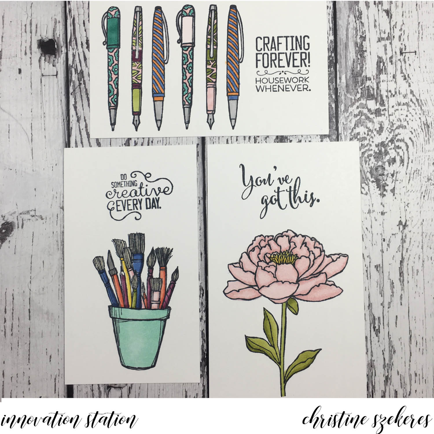
This month’s innovation was going to focus on watercolor backgrounds, but instead I wanted to share about the new Blends alcohol markers. When the new Blends markers were announced a couple of weeks ago I was resolutely in the “I’m not going to invest in these” camp for the simple reason that I have hundreds of COPIC markers. I love my COPICS, they are by far my favorite for coloring medium and I thought, “I don’t need more alcohol markers…”. I stayed in the “no” camp until late Sunday two weeks ago when I decided I would order the set to do a comparison: COPICS vs Blends. I’m so glad I did. The left photo shows the first images I colored on Saturday and the right shows the images I did specifically for this post.


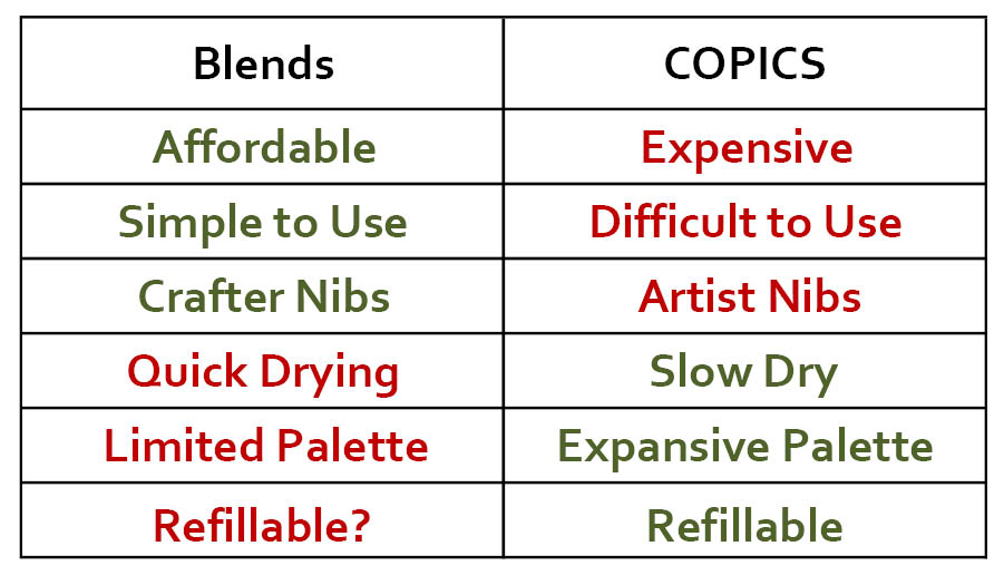
I wrote up my comparison on the demonstrator FB group this past weekend, but decided to dedicate this blog to the topic as well since I’ve played a bit more and as the discussion unfolded on FB, I refined my opinion. For those who want the bottom line right away, here are the pros (in green) and cons (in red):

For those who like the details, please feel free to review the below for additional information:

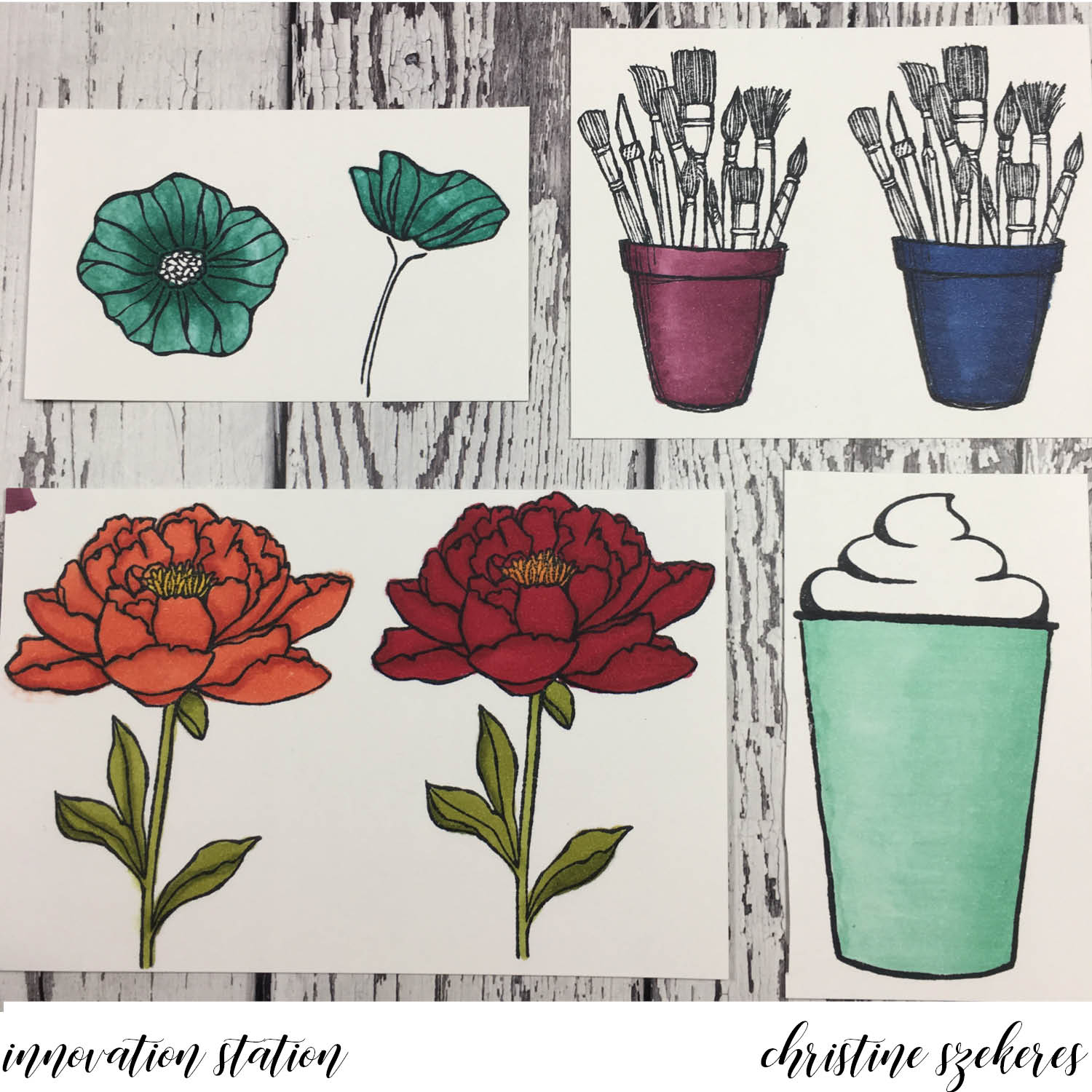
  1. The compound in the Blends drys faster than COPICS, which means you have to work in smaller increments, going back and forth between light and dark. The main time this is an issue is when working in very large areas (see the coffee cup).
  2. The brush tip on the Blends isn’t as flexible or resilient as the COPIC brush tip. As I was working on the coffee cup I noticed that when using the flick technique to blend the light and dark shades, the brush tended to fracture and get “bent out of shape”, creating uneven strokes.
  3. In some of the color groupings, specifically Bermuda Bay and Cherry Cobbler, there isn’t really any difference between the light and dark shades meaning the light is very saturated and dark. This means achieving shadows and depth can be challenging, especially in small areas. That being said, both colors are lovely despite being too close in saturation level.
  4. The BIGGEST benefit to the Blends, and it’s an important one, is their simplicity. If you know anything about COPICS, you know there is a very complex letter and number system and you must understand this system to choose blending colors properly. You can’t just blend any two greens together. It is probably the most daunting thing about COPICS (aside from the cost). Fortunately, SU has engineered the Blends in blending groups and with the exception of the two colors listed above, all the duos blend beautifully. No muss, no fuss, and zero confusion. For anyone new to alcohol markers this is HUGE!
  5. COPICS were originally a fine artist tool. Crafters came along and began using them, but they can be expensive and are not really designed for crafters. Take the nibs, COPICS come with a brush and chisel nib. I NEVER use the chisel nib (does anyone). COPIC finally introduced a bullet nib, but you have to buy and replace the chisel nib and that is just more expense. Blends have the best nibs for crafters, the brush and bullet, and that is another BIG selling point.
  6. COPICS come in over 300 colors. While that is an amazing array of color, it is often daunting and also overkill for most crafters. The initial set of Blends creates a good palette and if (here’s hoping) they add a few more colors the Blends will be a solid coloring set of markers, far fewer than the 350 or so in the COPIC family, which makes Blends more accessible than COPICS.

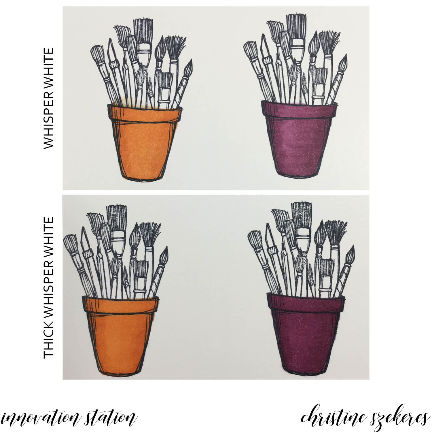
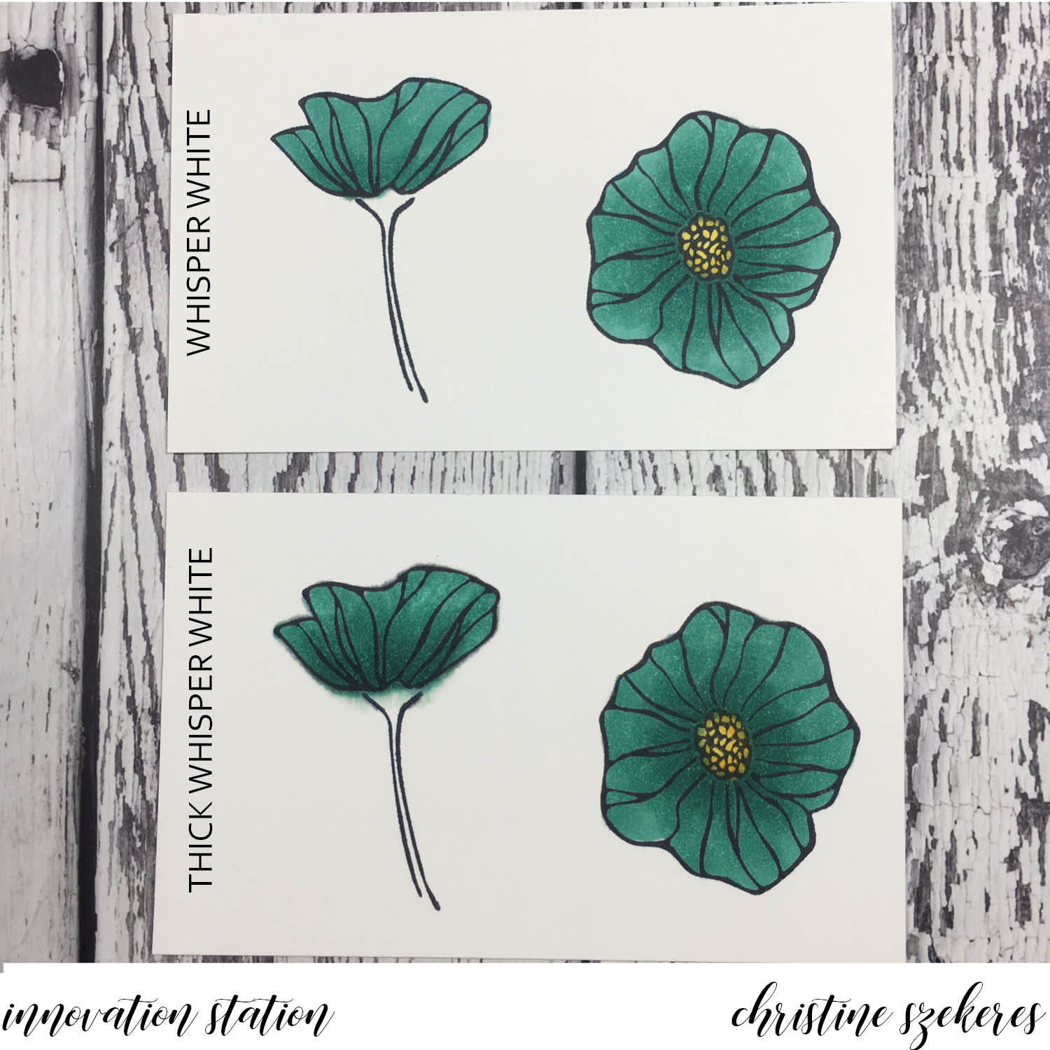
I did my initial testing on Neenah Solar White 80# card stock (the left photo above) because this is what I use for all my Copic work. I went back and did all the tests again using Whisper White and Thick Whisper White card stock (photos below and the right photo above). The clear winner: plain WHISPER WHITE. The colors tend to deepen, losing shadows and light, on thick whisper white — a lighter hand with the markers might help with this. Thick WW tended to have more issues with “bloom”. Alcohol markers tend to seep into the paper slowly and that can cause bloom (where the color goes outside the lines of your stamped image). Bloom happens a lot when you are going over an area multiple times blending colors.

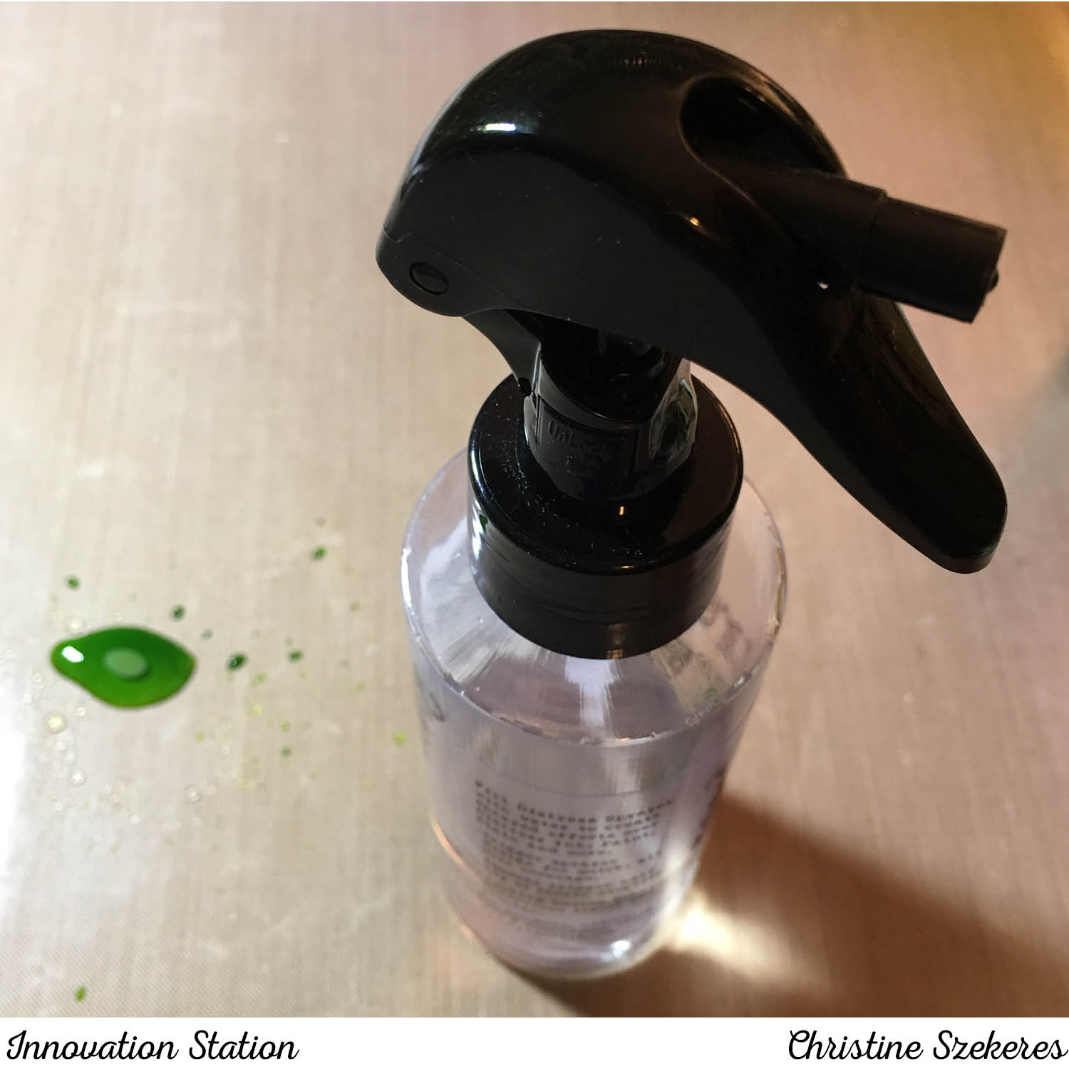
Some bloom can be corrected with the Color Lifter, but you have to be careful because the Color Lifter doesn’t really erase ink, it actually pushes ink, which is why you can come back to a piece that you used the Color Lifter to correct bloom and have a “halo”, a ghostly looking edge of color slightly beyond the area where you had bloom. Halo can happen on any type of paper (see the top orange pot for an example of halo).

I did several tests trying to lighten the dark colors, especially Bermuda Bay, using the Color Lifter:

  1. going over the image with the Color Lifter after the light and dark were laid down (see poppies in left photo above)
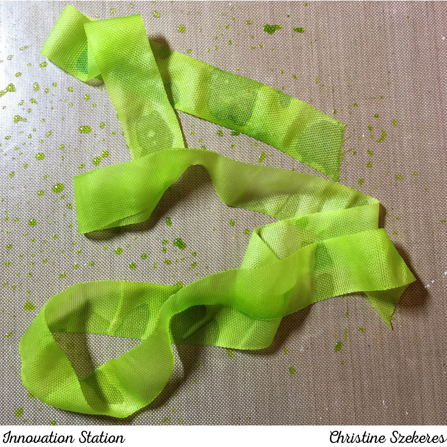
  2. scribbling the light or dark marker on a craft sheet and picking it up using the Color Lifter (side-facing poppy on TWW below)
  3. and laying down a layer of Color Lifter before putting either the light or the dark color down (the other 3 poppies in the image below)

Technique 1 did lighten the color, but in a very splotchy way, technique 2 ended up with bloom and halo, and technique 3 resulted in lighter color and smooth blending. The clear winner: technique 3

There are a lot of neat things you can do with the Color Lifter, but one of the simplest is using it to create patterns in your colored images. Here is a simple example of this. I will delve deeper into the Color Lifter in a future post.

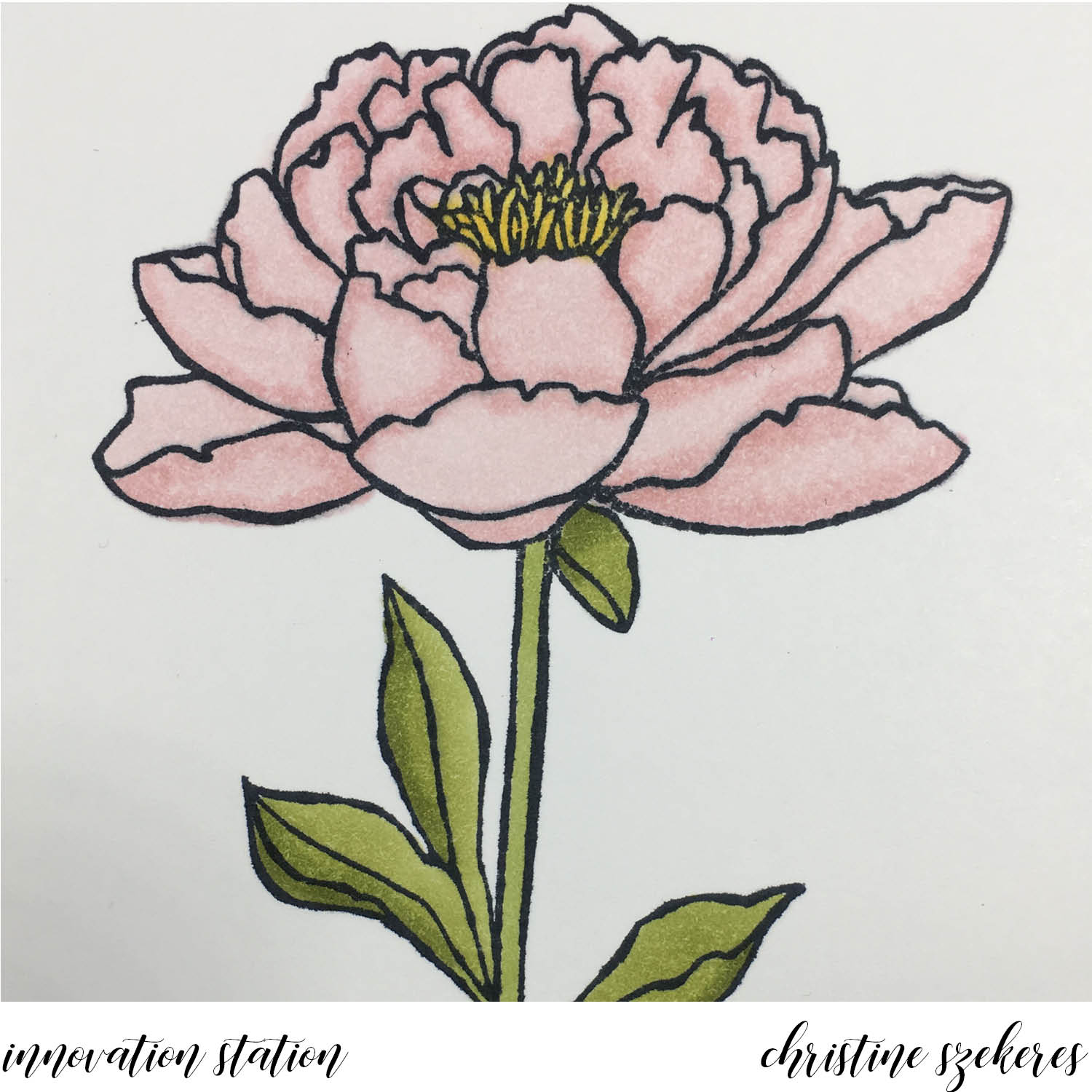
HINT: alcohol coloring tends to smooth out over time. You might be convinced that something is a disaster, but I encourage you to set it aside for a few hours. You will likely be surprised how good it looks when you pick it up again. I was really unhappy with this pink flower, but after an hour or so, the color had settled and I thought it looked much better!

Overall, I am happy with the new Blends. I do have a few wishes: lighten the lights in Cherry Cobbler and Bermuda Bay, add a few more colors, make the nibs replaceable, increase the quality of the brush nib, and the marker refillable. I have a secret hope that the refill (if available) will not be a bottle of liquid but a new internal cartridge. If you’ve ever refilled a COPIC and had ink go everywhere but inside the marker, then you know why I think this is the way to go. 

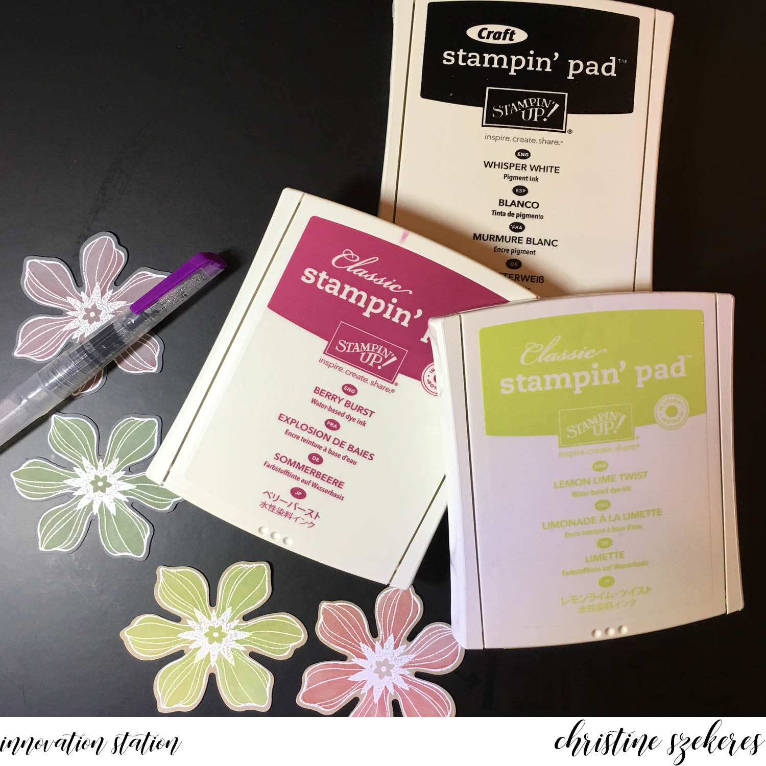
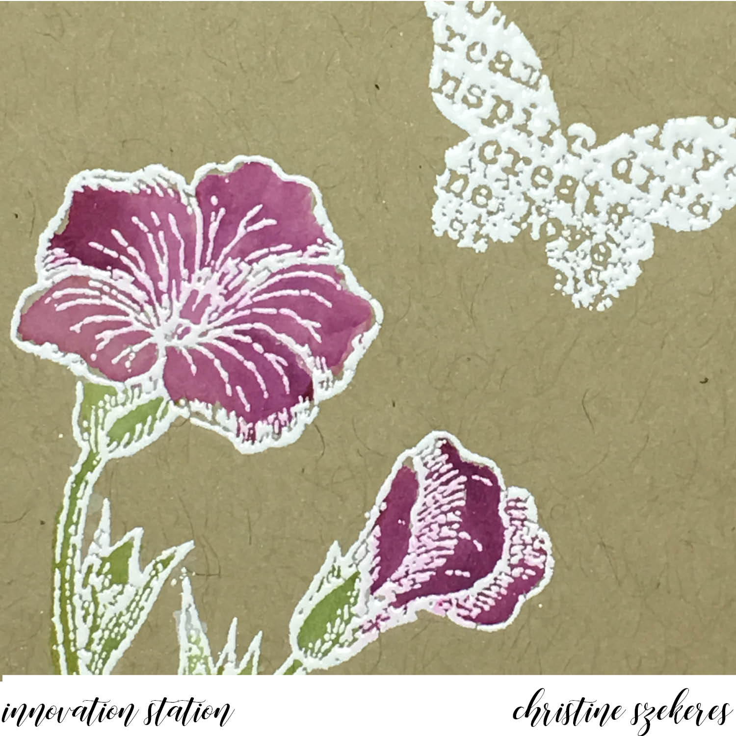
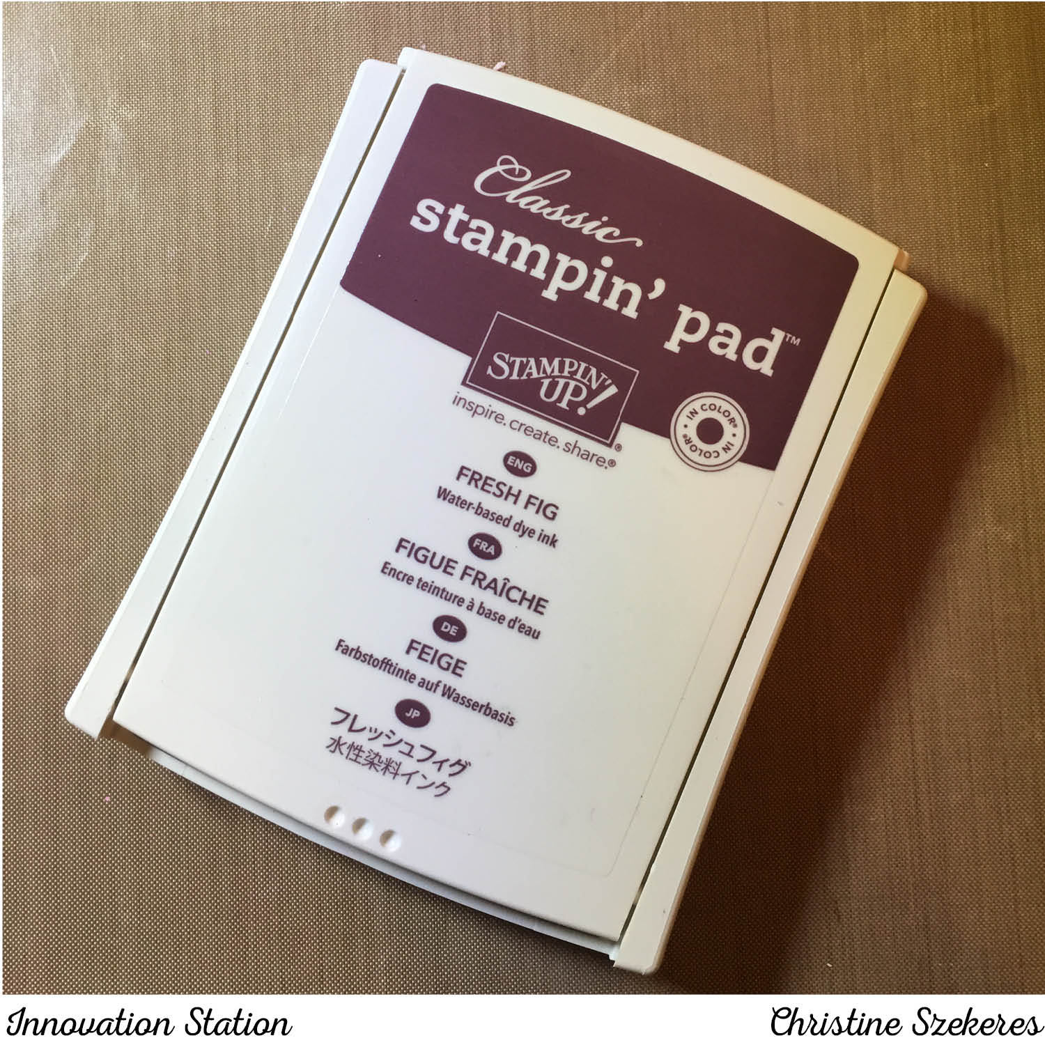
A word about paper and ink. I’ve tried Whisper White with my COPICS and never really cared for the results. I think this may have something to do with how long COPICS stay wet. I’ve had issues with warping, pilling, and bloom when I’m really working on blending several layers. I have not had these same issues when using the Blends on Whisper White, I actually prefer it over Neenah Solar White. I have two inks I use for all of my COPIC work: Memento Tuxedo Black and Simon Says Stamp Intense Black Premium Dye ink. Both produce crisp results with no danger of bleeding once you begin applying color. For all of the examples here I used Memento Tuxedo Black ink since that is what is available from SU.

Thanks for hanging out with me, and learning (or relearning) a fun innovation! Join me next month for another of my go to innovations, shaker cards. Until next time, remember, creativity and imperfection live together in all we do. “Grace is the face love wears when it meets imperfection.”

~xoxo

Supplies Used:
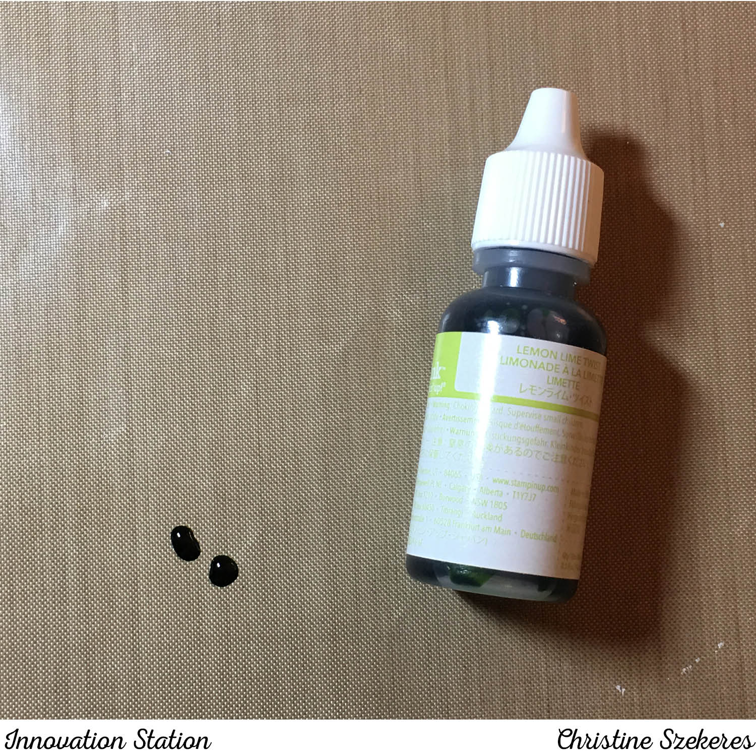
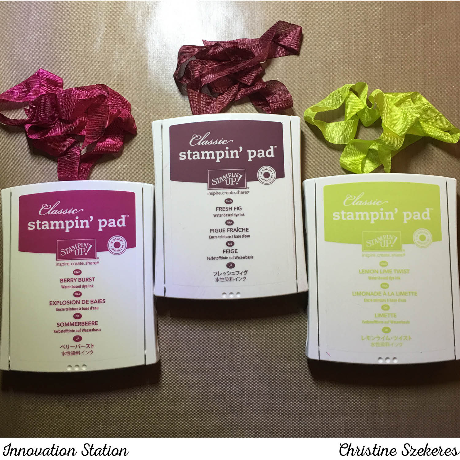
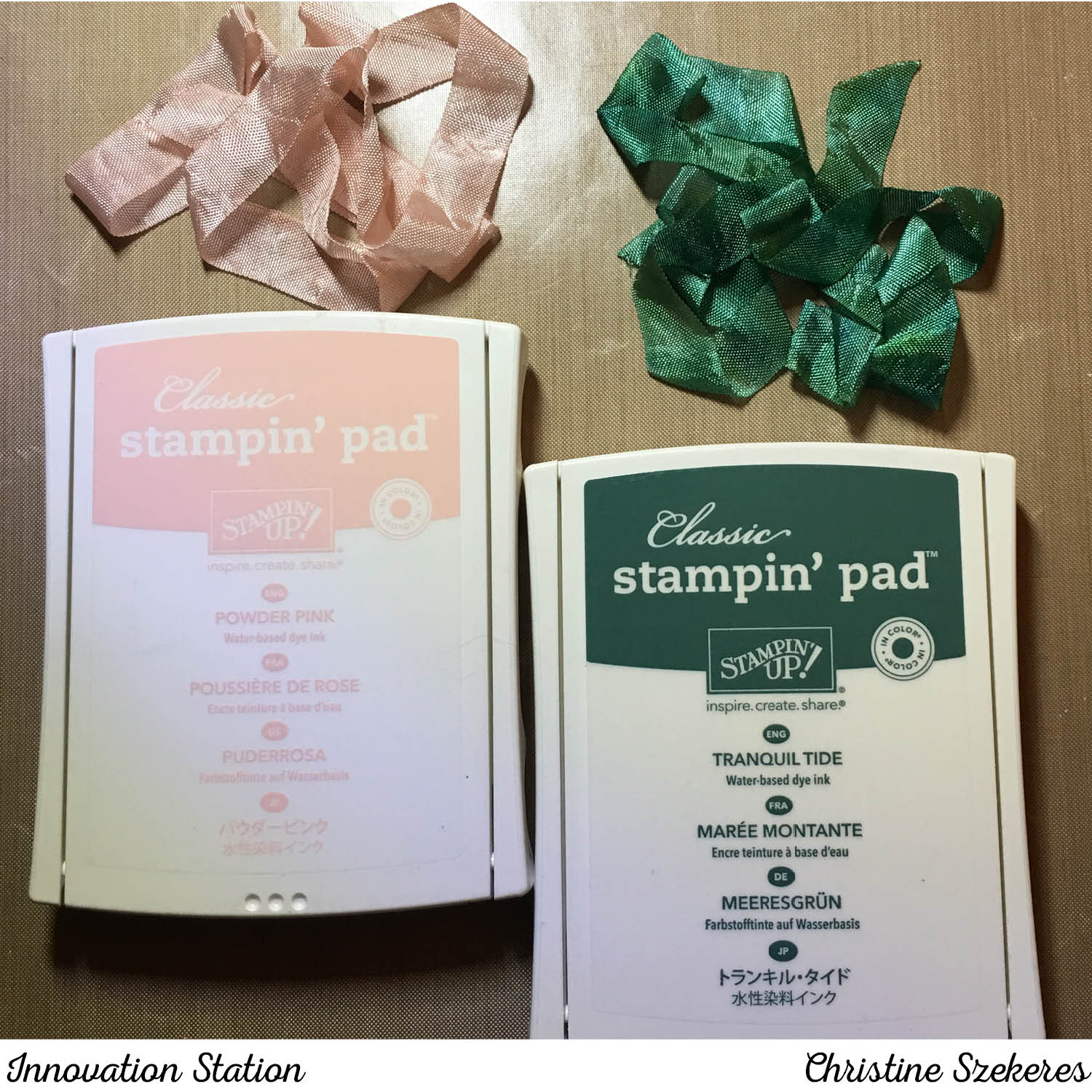
Stampin’ Blends Alcohol Markers
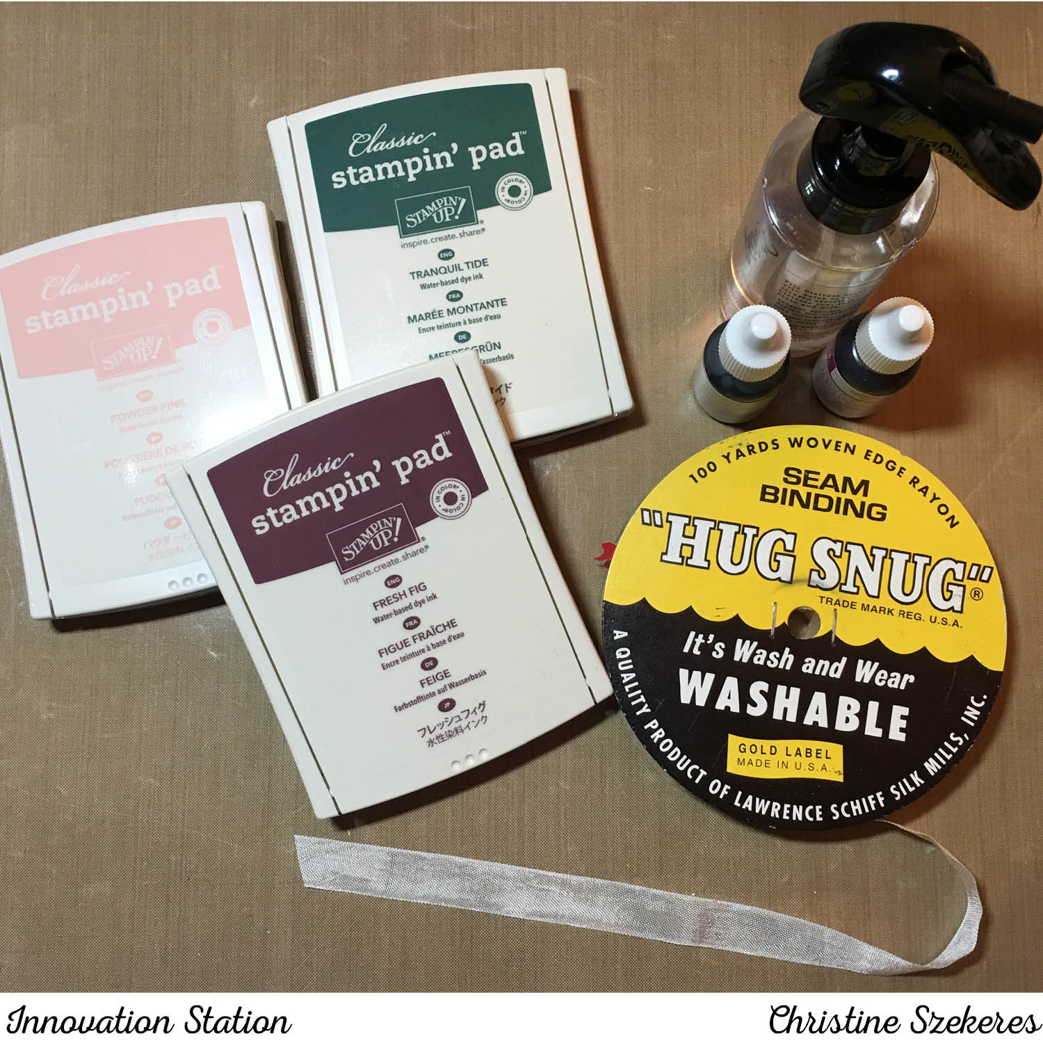
Ink: Memento Tuxedo Black
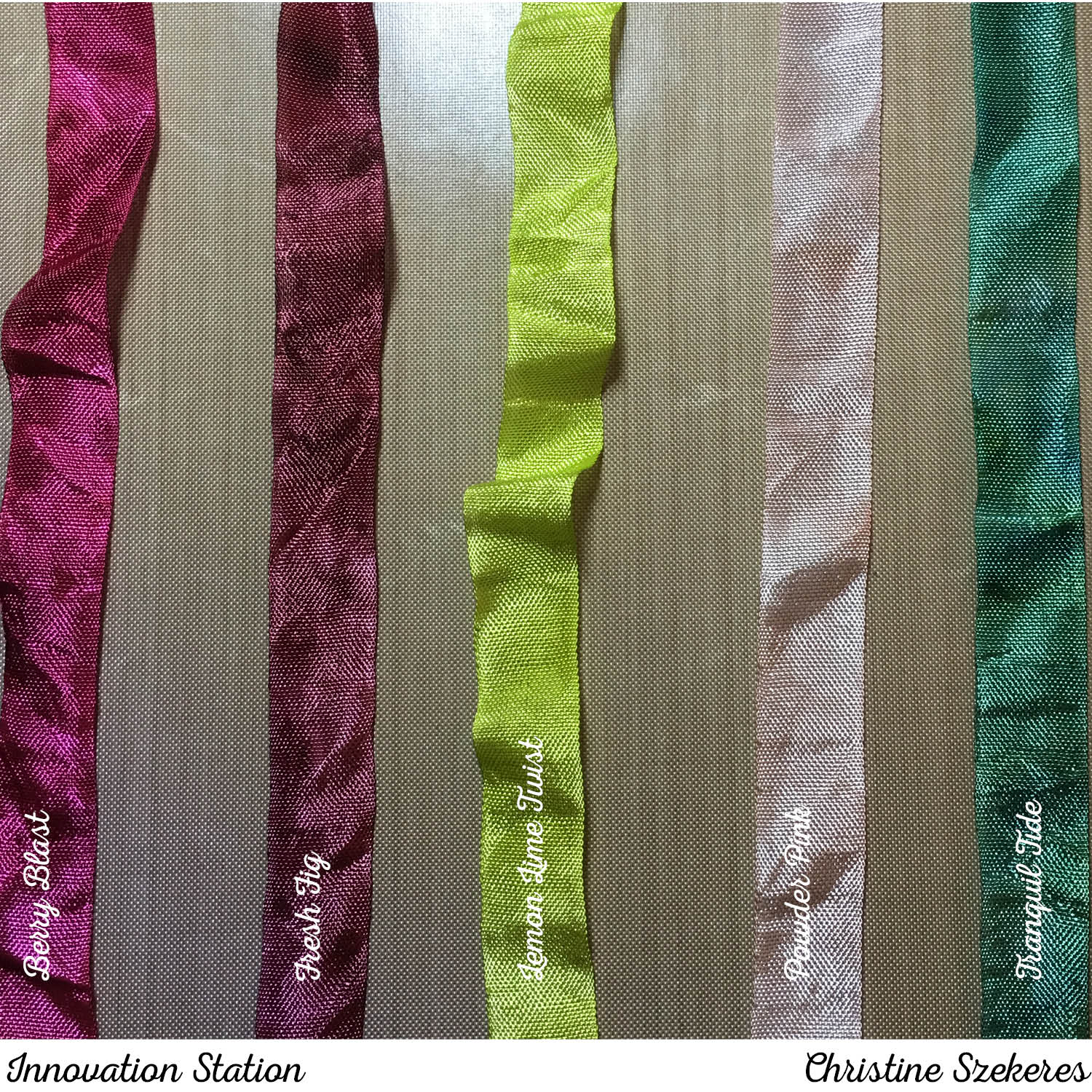
Card Stock: Whisper White & Thick Whisper White
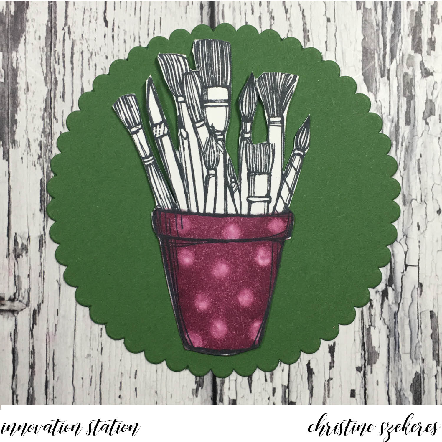
Stamps: You’ve Got This, Coffee Cafe, Crafting Forever, & Oh So Eclectic

Innovation Station | Washi, Washi, Washi

Hello, crafty peeps and welcome to another Innovation Station post, a monthly feature focusing innovative tips and tricks. Each month I share an innovation that I find myself going to again and again.

This month’s innovation is washi tape. I seriously need a 12-step program for my washi tape addiction! Thin, thick, glittery, transparent, opaque … I LOVE washi! There are some wonderful tapes on the market today and some of my favorites are from SU! I especially like the face that SU coordinates their washi in complimentary color families. Today I’m going to share two of my favorite washi techniques: the washi die cut and the washi background. Both are super simple, yet add so much to your card making!

Washi is super thin which when layered over card stock makes it perfect for die cutting and background techniques. When I sat about choosing suites for this month’s cards, I knew what I wanted to use for each technique, but beyond the washi element, I wasn’t sure what the cards were going to look like. I almost scrapped both cards because I wasn’t happy with how either was coming together. Does this ever happen to you? Fortunately, inspiration struck and I am pretty happy with the way both cards turned out.


For the washi background card, I used the Delightful Daisy suite. I love this suite! From the stamps, to the DSP, to that great daisy punch … it’s one of my favorite suites in the annual catalog. I knew I wanted to “knock out” the daisy image (sort of the reverse of what might be expected) and have the washi showing through. In some of the photos you will see a version with two daisies that ended up getting scrapped (it was way too busy) in favor of the final card. I began with a Pool Party A2 card base. Using a corner rounder I rounded the upper left and lower right corners of both the card base and the Whisper White panel (4″ x 5.25″). I cut out a daisy in the upper middle of the panel using the Daisy Punch and added two leaves using the companion two-step stamps.


I cut a 2.75″ x 2.75″ piece of Whisper White and using the new Basics Pack 3 washi tape, added rows until the entire piece was covered. Using my bone folder, I burnished the washi down and using adhered it behind the daisy opening with Fast Fuse. I put one of the new clear Faceted Gems n the center of the daisy. Next, I cut a 4″ x 1.75″ piece of DSP from the Delightful Daisy DSP and a 3.73″ x 1.5″ piece of Whisper White, on which I stamped “Thank You” in Night of Navy ink. I rounded the corners of the white piece and adhered it to the DSP, which then was adhered to the main white panel. Inside I stamped “…for your kindness.” in Night of Navy ink. HINT: I could have applied the washi directly to the card base, but since washi is semi-transparent I didn’t want it to show the card base color so I opted for a Whisper White panel instead.

For the die cut washi card, I wanted to use the new “Happy Birthday” die, the coordinating stamp set, and especially the Foil Frenzy specialty DSP. I am in love with this kraft card stock foil paper! It is so beautiful and screams happy birthday! The process for die cutting washi is very simple. Begin with a piece of card stock large enough to accommodate your die and apply washi. Place this piece washi side up on your cutting matte and put the die face down over it. Add the other plate and run it through your Big Shot. Voila, you have die cut washi!


For this card I began with an A2 card base in Berry Burst. Using the largest solid layering oval, I cut a window out of the front of the card. In this opening I adhered a piece of polka dot foil frenzy card stock. I also cut the happy birthday out of a piece of Basic Black card stock. I glued the washi die cut to this black piece slightly offset to create a shadow. Once that was dry, I popped it up using the new mini dimensionals, cutting them in half to make sure they didn’t show. Using VersaMark ink and white embossing powder I added the sentiment “it’s your day” to the front of the card below the oval. For the finishing touch, I added a few flat backed gems by Little Things from Lucy’s Cards.

Thanks for hanging out with me, and learning (or relearning) a fun innovation! Join me next month for another of my go to innovations, watercolor backgrounds. Until next time, remember, creativity and imperfection live together in all we do. “Grace is the face love wears when it meets imperfection.”

~xoxo

Supplies Used:
Washi: Basics Pack 1 (144221) & Pack 3 (144223)
Happy Birthday Gorgeous Bundle (145301)
Foil Frenzy Specialty DSP (144125)
Daisy Delight Bundle (145361) & Delightful Daisy DSP (144137)
Card Stock: Pool Party, Berry Burst, Whisper White & Basic Black
Ink: Night of Navy, Lemon Lime Twist, Old Olive & VersaMark
Extras: Clear Faceted Gems (144142) & Flat Backed Gems

Innovation Station | Don’t Lose Your Marbles

Hello my crafty peeps and welcome to another Innovation Station post, a monthly feature focusing innovative tips and tricks. Each month I share an innovation that I find myself going to again and again.

This month’s innovation is the rolling marbles technique. This technique reminds me of a Jackson Pollock splatter painting and it’s so simple and fun. Honestly, I’d sort of forgotten about this technique (I used to use it all the time) until a friend demoed it at an event recently. I came home after and began searching for my marbles (literally, not figuratively). Once I’d found them I began playing and couldn’t really seem to stop.


One of the things my friend, Jennifer Blomquist, demoed was using a container (a half wood mount stamp case from Stampin’ Up!) to create this background. I always did this technique in a box and it was messy and sometimes uneven. Needless to say, I thought the stamp case idea was brilliant. The half wood mount case will work for smaller pieces (max size in this case is 3 1/4″ x 4 3/4″), but often I want to do a larger piece so I decided to try using the full wood mount stamp case from Stampin’ Up!, and it was perfect for the larger pieces (max size in this case is 4 3/4″ x 7″). HINT: marble to reinker ratios … half size case between 5 & 7 marbles and 2 — 3 drops of reinker, in the full size case between 9 & 11 marbles and 4 — 6 drops of reinker.

For my first card I wanted to use the new host set, Tranquil Tulips. I love this set! It is both a layering set as well as a mixed media style set, meaning the images aren’t designed to stamp solid, they have a dreamy quality to them. I began with a Mint Macaron A2 card base and cut a matte panel out of Powder Pink (4″ x 5 1/4″) that I mounted to the card base.


Next, I cut the marble panel out of Whisper White (3 7/8″ x 5 1/8″) and marbled it using a full wide stamp case, 9 marbles, and about 6 drops of Mint Macaron reinker. I put the marbles in the case and then the reinker drops in the middle. I closed the case and moved the marbles around until they were covered in reinker and there weren’t any big drops of reinker remaining. Next, I opened the case and secured the Whisper White panel to the lid using some low tac painters tape. Close the case and flip it over so the panel is now on the bottom with the marbles on top. Begin moving the marbles around the case until you are satisfied with the coverage. HINT: You can add additional reinker if needed by flipping the case back over (so the panel is on top and the marbles on the bottom). Once that was done I ran the it through my BigShot with the border from the Card Front Builder dies.


I also the tulip panel is 3 3/4″ x 4 1/4″ and the Powder Pink matte is 3 7/8″ x 4 3/8″. I stamped the tulips, stems, and leaves using Powder Pink, Lemon Lime Twist, and Smokey Gray. HINT: I stamped the stems first, followed by the tulips and finally the leaves. You could also stamp the tulips first, but for optimal placement on the panel, I preferred stamping the stems first. Once dry, I covered the tulips in clear Wink of Stella for a bit of shimmer and shine. I custom dyed some seam binding ribbon using Mint Macaron and Powder Pink reinkers. As I began layering all the pieces together I felt something was missing and decided it needed a sentiment, but I was stuck on where and what. As I looked over some of my sentiment sets, I came across the new bundle, Tabs for Everything, and knew just what I needed! Using the coordinating punch, I punched a tab out of Lemon Lime Twist card stock. Next, I stamped “hello you” on a piece of Whisper White card stock and punched it out using a hole punch. I stamped the scalloped frame from the stamp set onto the tab and mounted the circle using a mini glue dot. I tucked this between the tulip panel and the Powder Pink matte. I think it pulls the card together nicely!

For my second card I wanted to use another marbled background I’d created using Pacific Point so I turned to the Birthday Delivery bundle since Pacific Point is one of the coordinating colors for this suite. I love giving special birthday cards to friends and I knew this would be the perfect card for a friend who loves foxes. I was very excited when I realized that in addition to matching the stamps, the dies cut elements from the coordinating DSP. I also like that there are stamps curved to fit inside the flag banner that the fox holds. There are a bunch of amazing embellishments in this suite, including pop-up honeycomb balloons. I knew the card needed one of these inside and that is how the poodle (I call her Lola) came to be hanging out inside!


I began with an Old Olive A2 card base and I stamped the present randomly in Old Olive in for a tone-on-tone effect. I die cut the fox and banner from the DSP and also cut the following strips: striped DSP (1 1/4″ x 4 1/4″), Pacific Point marbled card stock (1″ x 4 1/4″), and Pacific Point card stock (3/4″ x 4 1/4″) onto which I stamped the sentiment, “Let’s Celebrate Your Day,” and layered all three pieces together with snail. Using the dies, I cut Lola and two balloons from the DSP and stamped the balloon strings on the left inside panel, positioning them so they looked like she had them in her mouth. The honeycomb balloon has adhesive, making placement a breeze! HINT: For perfect honeycomb placement, place it last and follow these steps: expose one side of the adhesive and place it flush with your center score line then you can expose the left side and simply close the card for the proper placement every time! I finished it off with the “SURPRISE” sentiment and some thin strips of DSP.

Thanks for hanging out with me, and learning (or relearning) a fun innovation! Join me next month for another of my go to innovations, washi techniques. Until next time, remember, creativity and imperfection live together in all we do. “Grace is the face love wears when it meets imperfection.”

~xoxo

Supplies Used:
Full Wide Stamp Case (127551) & Half Wide Stamp Case (127552)
Reinker: Mint Macaron, Pacific Point, & Powder Pink
Card Stock: Mint Macaron, Powder Pink, Lemon Lime Twist, Old Olive, Pacific Point, & Whisper White
Birthday Memories DSP (144118), Balloon Honeycomb (144124), & Glass Marbles
Stamps & Dies: Tranquil Tulips (143767) & Card Front Builder (144674)
Bundles: Tabs for Everything (145364) & Birthday Delivery Bundle (145294)

Innovation Station | Inlaid Die Cutting

Hello my crafty peeps and welcome to another Innovation Station post! This is a monthly feature, focusing innovative tips and tricks. During the 2nd week of each month I plan to share an innovation that I find myself going to again and again.

This month’s innovation is inlaid die cutting. Inlaid die cutting is the process by which you place the negative space pieces back into the die cut creating a one layer background. This technique works well with background dies, but it also works with shapes and words. Inlaid die cutting adds color and interest to full panel die cuts and allows you to create many different looks. Inlaid die cutting is pretty straightforward, which is what makes it such a wonderful card making staple. Basically you run the item through your die cut machine over and over, using different card stock and/or pattern papers. It’s really that simple. I have come up with a few tips that I find helpful, which I share at the end of this post.

Now onto the cards. For the first card I used the Hello cover plate from Poppy Stamps. I started with a top folding card base and I die cut the plate into the card face. I set those letters and inserts (the inside of the O’s and E’s) aside. Next, I die cut the plate from several pieces of card stock in the new InColors (lemon lime twist, tranquil tide, powder pink, berry burst, and fresh fig) and I cut a slightly smaller backing for the card front, which I turned into a sticker by adhering it to a piece of Stick It! adhesive and placed it behind the card face. Finally, I began inlaying letters, making sure to include the white inserts for the O’s and E’s. For the finishing touch, I added two silver enamel hearts to one of the O’s.


For my second card I die cut Winnie & Walter’s Multifaceted cover plate out of a piece of Emerald Envy card stock and also out of a piece of the Pick a Pattern DSP. Using Stick It! adhesive, I turned the Emerald Envy die cut into a sticker and adhered it to a Flirty Flamingo card base. Next, I began placing all the shapes from the DSP using the outline version to help me figure out which pieces went where. I stamped the label frame in Emerald Envy and the sentiment in Flirty Flamingo and colored in the letters using a Flirty Flamingo marker. Using my Flirty Flamingo reinker, I dyed a piece of white seam binding and also punched out the frame using the new Pretty Label punch and popped it up on dimensionals over the ribbon.


I took a friend to the airport at 4am this morning and I was leaving the house when I remembered another style of inlaid die cut I had planned to show: using smaller dies to create a background. The wheels were turning (both my car’s and my brain’s) and by the time I returned from the airport this card was almost completely designed! Bonus! I created it using the Frozen Treats dies and it shows how creative you can get with inlaid die cutting. HINT: To get a seamless one layer cut for the ice cream cone follow these steps. Cut the cone out of the white panel first and then overlap the ice cream die so it looks like one clean cut (see below left). Next, place the panel back on the BigShot’s magnetic platform, inserting the proper cone in its spot and placing the ice cream die in position in the hole left by the first time you die cut it. Run that through the machine again and voila, the cone and ice cream meet up and look seamless. I finished off the card with one of the sentiments from the Cool Treats stamp set cut out using the Layering Ovals.


TIPS & TRICKS: A few things I’ve learned along the way… If the die has a lot of pieces I often adhere my frame to a piece of Stick It adhesive sheet so that thin, edge to edge adhesive is showing through the negative spaces where I will put the die cuts in. I love Stick It! because it’s double sided adhesive so you can glue your panel to the card front and the negative spaces also have adhesive! When I do use glue I tend toward Multi Matte Medium or SU! Fine Tip Glue Pen as both provide pinpoint application, dry clear and give a strong bond. I will sometimes die cut something out of a lot of different colors and patterns and save them up for future cards. I will often store these die cuts in the pocket with the dies. With intricate full panels I will often us the version I cut out of DSP to help me figure out where all the little pieces go. The best thing about inlaid die cutting is that you can dress them up with a sentiment, but visually they are interesting enough to carry the card without needing much more.

Thanks for hanging out with me, and learning (or relearning) about inlaid die cutting! Join me next month for another of my go to innovations, marble backgrounds. Until next time, remember, creativity and imperfection live together in all we do. “Grace is the face love wears when it meets imperfection.”

~xoxo

Supplies Used:
Dies: Winnie & Walter Multifaceted, Poppy Stamps Hello, Frozen Treats (142756), & Layering Ovals
Card Stock: Whisper White, Emerald Envy, Flirty Flamingo, Lemon Lime Twist, Tranquil Tide, Fresh Fig, Powder Pink & Berry Burst
Designer Series Paper: Pick a Pattern (144163) & Cool Treats
Stamps: Pieces & Patterns (143843) & Label Me Pretty (143861)
Inks & Markers: Emerald Envy & Flirty Flamingo
Extras: Metallic Enamel Shapes (141678), Stick It!, Tweezers, Pretty Label Punch (143715) & Seam Binding

Innovation Station | White Washed

Hello my crafty peeps and welcome to another Innovation Station post! This is a monthly feature focusing innovative tips and tricks. During the 2nd week of each month I plan to share an innovation that I find myself going to again and again.

This month’s innovation is white washing as a coloring technique. White washing is just what you might think, it’s the process of coloring an image with white chalk ink using a water brush and then using markers (Distress, Stampin’ Write, or ZIG Clean Color) or ink pads to add color over the top of the “whitewash”.


You start off by rubbing your embossing buddy over your card stock and then stamping your image in VersaMark ink. Pour white embossing powder over your image and then heat set. HINT: Let your heat tool heat up for 8-10 seconds before putting it over your image and the embossing powder will melt faster and cause less paper warping. Once the embossing powder is cooled you can begin white washing a layer of craft white over the image using a water brush and ink in the lid of your stamp pad. Never put your water brush directly onto the stamp pad.


Once the white washed layer is dry you can begin adding color using ink in the lid of your stamp pad and a water brush. I typically lay dark color in the corners and then using the water brush pull it through the space. Once you are satisfied and it is dry you can use a damp cloth to wipe the ink off the embossed areas. Typically this technique is done on kraft card stock, but I’ve also had fun results on gray so I’m showing that as well. Here are flowers, two on kraft and two on basic gray card stock. Both sets use Calypso Coral and Lemon Lime Twist over the Craft white. The colors look different over the gray versus the kraft, don’t they? Lastly, I will sometimes add some clear Wink of Stella over the image for that little bit of shine.


Open stamps work best for this technique and it is perfect when paired with floral images because it adds a dreamy quality to them, but it will work with any stamp with large open spaces.


Thanks for hanging out with me, and learning (or relearning) a fun innovation! Join me next month for another go to innovation, inlaid die cutting. Until next time, remember, creativity and imperfection live together in all we do. “Grace is the face love wears when it meets imperfection.”

~xoxo

Supplies Used:
Stamps: Thinking Of You, Beautiful Bunch, & Butterfly Basics
Ink: Versa Mark, Calypso Coral, Lemon Lime Twist, & Berry Burst
Embossing Powder: White
Tools: Water Brush, Heat Tool, Embossing Buddy
Card Stock: Kraft & Basic Gray

Innovation Station | Custom Dyed Ribbon

Hello my crafty peeps and welcome to my first Innovation Station post! This is a new monthly feature, focusing innovative tips and tricks. During the 2nd week of each month I plan to share an innovation that I find myself going to again and again.

I’ve been “innovating” since I bought my first stamp at The Stamp Cabana in Winter Park, FL back in 1997. Over the years I’ve seen things come and go and come back again! In all this time, I’ve found myself going “back to the well” for techniques that never seem to get old.

There’s nothing worse than finishing a card only to realize it’s missing something! Often I find what’s missing is a textile and my go to textile is ribbon. Many times I can get by with an off the rack neutral ribbon (black, brown, gold, silver), but there are times when I think, “If only I had a color-matched ribbon, all would be right in the universe!”, which brings me to this month’s innovation: custom dyed ribbon.

My go to ribbon for this innovation: seam binding. It’s cheap, readily available, and holds up well, but you could use any ribbon for this process. You can use many things to dye ribbon (Color Burst powders, Distress stains and sprays, or Perfect Pearls) but my favorite for custom color matching is reinkers or ink pads. Here is what you need:

White Ribbon or Seam Binding
Craft Mat
Reinkers
Ink Pads
Water bottle
Heat Tool
Baby Wipes
Craft Scrubbie
Ribbon Iron (optional)
Gloves (optional, if you don’t like inky fingers)


Custom dying ribbon is a very simple process. First, cut the length of ribbon you need for your project. Next, place a few drops of reinker, or smear the ink pad, onto your craft sheet. I start with 2 drops of reinker (you can always add more if needed). Add water to the ink. 


Using the ribbon, soak up the liquid, making sure the entire ribbon is saturated. If needed, you can also spray water onto the ribbon. After the ribbon is completely covered you can add more ink if you want a deeper color.

Once you are happy with the color, dry the ribbon with your heat tool (if you have time you can let it air dry). Sometimes I scrunch it up so it looks “ruched” and other times I dry it flat and run it through my ribbon iron. I hold it in my hand, moving it around until it’s completely dry and volià, custom dyed ribbon, a perfect finishing touch for any card or scrapbook layout.


By the time you are done dying ribbon your fingers are quite inky (left hand) so it’s the Craft Scrubbie to the rescue (right hand). Inky fingers don’t stand a chance when you have the Ranger Craft Scrubbie.

Thanks for hanging out with me, and learning (or relearning) a fun innovation! Join me next month for another of my go to innovations, white washing. Until next time, remember, creativity and imperfection live together in all we do. “Grace is the face love wears when it meets imperfection.”

~xoxo

Supplies Used:
Inks: Berry Blast, Fresh Fig, Lemon Lime Twist, Powder Pink, & Tranquil Tide
Ribbon: Hug Snug Winter White Seam Binding
Ranger Craft Scrubbie
Ranger Craft Mat
Distress Water Bottle