Tag: distress inks

Domestic Goddess Mixed Media Canvas

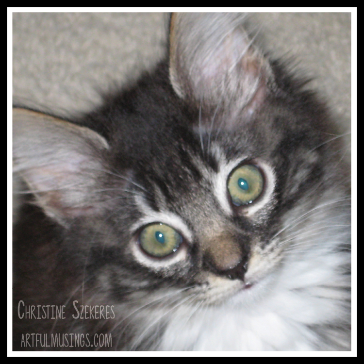
Hello, friends! I hope 2016 is off to an amazing start full of creativity and adventure for each of you. For my first post of 2016 I would like to share an 8 x 10 mixed media canvas I created using the Domestic Goddess paper line from 7 Dots Studio. I really like all the lines from 7DS and this one is no exception. It is reminiscent of 40’s & 50’s domestic life and honestly cracks me up most of the time. I am not June Cleaver. Not even close. It’s a good thing the only other “person” I have to keep alive with regular food and water is my feline friend, Rainey.

Rainey

Growing up with a mom like June Cleaver, Donna Reed, or Marion Cunningham must have been amazing. I respect the women who run households. It’s a full time job and they do it well, but sometimes I wonder if Mom might have “other” dreams (in addition to taking care of her family). This is the inspiration for my project, “Domestic Goddess: She Did Because She Could”.

DomesticGoddess9

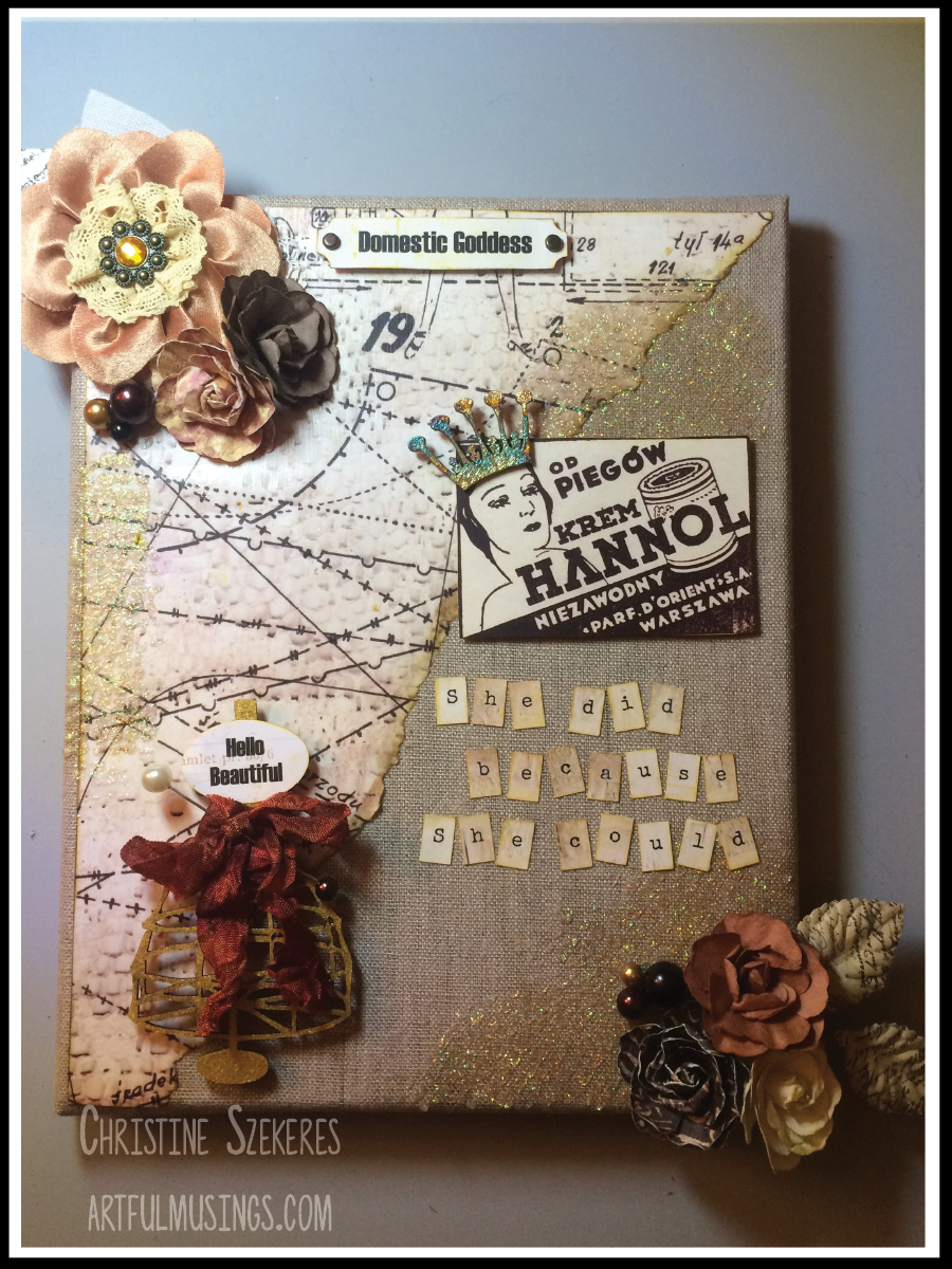
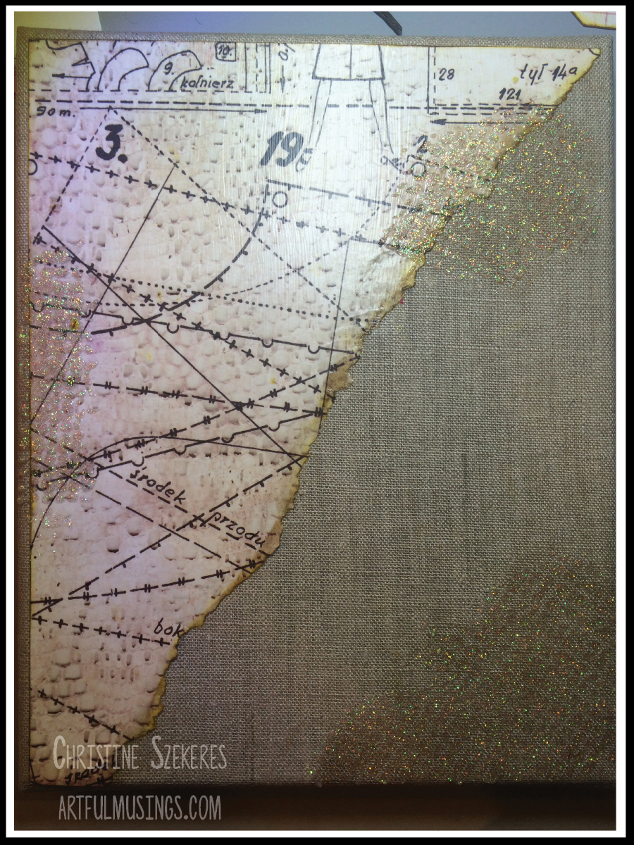
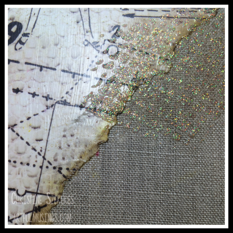
My base is an 8 x 10 canvas I picked up at Michaels back during the summer. It is from a “denim” canvas line and is a burlap brown with these amazing antique brass studs on the edges. You could also use a natural canvas (raw, without gesso). I began by choosing a paper for the background. I decided to use White Apron because I liked the imagery and the neutral palette. I cut a rectangular piece roughly 8 x 10 and ripped it diagonally. Once I was satisfied with the angle and edge I inked all the edges using Distress inks in Fossilized Amber and Hickory Smoke.

DomesticGoddess8

Next, I began gathering the elements I wanted include (ribbon, ephemera, stickers, chipboard, and flowers) and tried them out on the canvas. I almost always do this as I have no idea what configuration will look best when I start out. I also pull together way more items than end up on the final piece so I can try them all out. To me this is the fun part of creating a mixed media piece. Often I will create a mock up and walk away for a time, coming back to see how I like it, moving and swapping out different items until I’m satisfied. I take a picture so I don’t forget (mixed media for me often happens over a series of days) and it’s time to begin assembly.

A quick word about adhesives. I’m not a scrapbooker so I am not necessarily thinking about my work lasting (and being archival) for the next 100 years. Instead, I do my best to choose the best adhesive for the items I’m bonding together. One of my secret weapons is Beacon’s Fabri Tac, which is a liquid seam product used in sewing. It dries clear, bonds quickly, and works well for both porous and nonporous surfaces. The bond it creates is nothing short of miraculous.

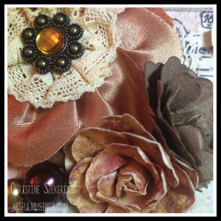
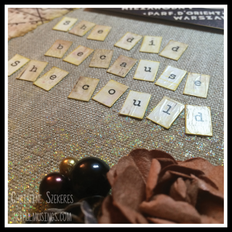
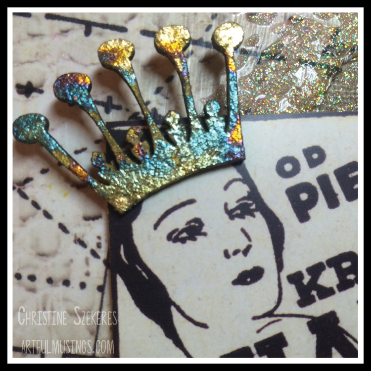
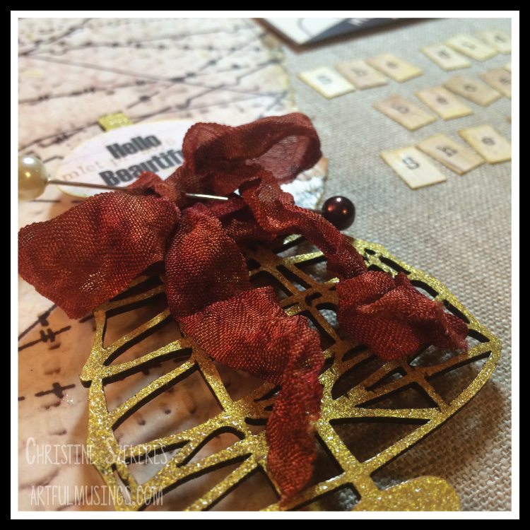
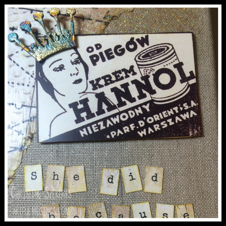
For this canvas I used several things from the Stickers 12×12 sheet, a few things from the Collage Adverts sheet, and letters from the Alphas – Raspberry Muffin sheet. I also used two chipboard pieces, the wire cage dress form and a crown, both from UmWow Studios. Dimensional items included flowers, leaves, and some beads. I used several Prima flowers from my stash, however these flowers would work perfectly and these leaves are a staple of mine.

DomesticGoddess3 DomesticGoddess4

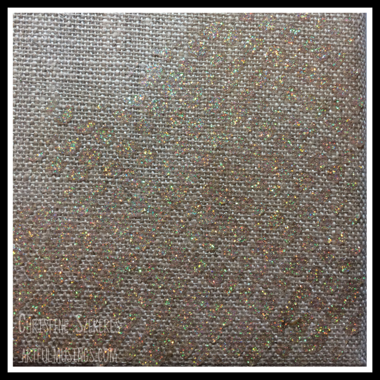
Using “sticky” embossing powder, I applied foil to the crown. I love sticky embossing powder (my favorite is manufactured by Ranger) and it does just what the name implies, makes the surface sticky when heated. Once you have this sticky surface you can apply foil, flocking, flower soft, or glitter to the surface and it stays put! Amazing, no? I also embossed the dress form using Delicata gold ink and clear embossing powder. I tinted the ribbon using Ken Oliver’s Color Burst in merlot, yellow ochre, and sepia. I also used Marion Smith’s Color Lab kit in merlot, 24k, and caramel on a different ribbon. I wanted to compare these two products. At the end of the day I love both. Ken’s product is more widely available, which makes it better for many of us, but Marion Smith’s has this great recipe card for mixing and getting amazing results. I also applied Bo Bunny Gold Glitter Paste through the Tim Holtz Burlap Stencil to add some dimension to the canvas. When the paste was dry I went over it gently with Fossilized Amber and Hickory Smoke inks using a round blending tool.

DomesticGoddess1 DomesticGoddess2 DomesticGoddess6 DomesticGoddess7

I used Mod Podge (matte), Aleene’s Quick Dry tacky glue, Fabri Tac, and black foam mounting tape. TIP: I prefer black foam tape (versus white) because it doesn’t show as easily when looking at the front and blends in perfectly when viewed from the side.

7DS is a Polish-based company so all the adverts are in Polish. On a whim I decided to translate the one I used: “Od piegow krem Hannol Niezawody Parf D’orient Warszawa”. Roughly translated it is an advertisement for “reliable freckle cream” imported to Warsaw from the Orient. Too funny. Finally, and because Mom has a rapier wit, I included the mysterious quote, “She did because she could.”

DomesticGoddess5

I hope this piece inspires you to “do because you can” and create something uniquely you! Until then, remember, creativity and imperfection live together in all we do. “Grace is the face love wears when it meets imperfection.”

~xoxo
Beanie

Supplies Used
Domestic Goddess paper line
UmWow Studio: wire cage dress form & crown
Prima flowers & leaves
Marion Smith’s Color Lab kit or Ken Oliver’s Color Burst
Snug Hug Seam Binding White
BoBunny Gold Glitter Paste & Tim Holtz Burlap Stencil
Distress ink Fossilized Amber & Hickory Smoke
Round Blending Tool
Delicata gold ink & Clear embossing powder
Ranger Sticky Embossing Powder
8×10 Canvas
Adhesive (Mod Podge, tacky, black foam tape)

A Holly Jolly Christmas Shadow Box

Today I am bringing you a mixed media piece using Graphic 45s 3-panel shadow box and Blue Fern Studios Vintage Christmas papers. I am so happy to have the opportunity to share my love of Christmas through my project, which is based on a Graphic 45 3-panel wall hanging.

Last week I absently quipped to one of my fellow design team members that “sometimes my creativity needed the pressure of waiting until close to the deadline” to function properly. The person I was talking with is so on the ball with her submissions and me, well I’m not.

I’ve known what I was creating for about two weeks, but as I began working on it I felt compelled to stop and step away several times. The building of pressure (always inching closer to the publication deadline) helped me hone the design. Each time I came back after an absence (no matter how short) I found that I took things off, rearranged things, and added new goodies. It’s been a truly cathartic.

But enough about my process … onto the Christmas fun! My favorite Christmas cartoon is the classic Rudolph the Red Nosed Reindeer mostly due to the wonderful songs included. The songs Silver & Gold, Fame & Fortune, We’re a Couple of Misfits, There’s Always Tomorrow, and of course, my favorite A Holly Jolly Christmas are what have given the cartoon it’s charm and staying power. I named my piece Holly Jolly Christmas in homage to this classic from my childhood.

HollyJolly1HollyJolly2

I’ve had this Graphic 45 3-panel shadow box for about 4 months. Originally I bought it with the thought of doing something with it for Halloween, but when I joined the NKO design team and learned we were having a Christmas kickoff I decided to save it. I was able to get my hands on some of the brand new Blue Fern Studio Vintage Christmas papers, which formed the basis for this project. These papers are amazing, with rich colors, beautiful imagery, and an opulent thickness not found in other papers. Simply put, the line is perfection.

I started by choosing 3 papers and cutting the background squares. The frame has two pieces of plexi glass that are held in place by swivel clasps. I also used the Greeting Cards paper for the elements added to the back over the background squares. When everything was glued and dry it was sandwiched between the plexi glass and secured to the frame using the swivel hooks. I added metal corners & a paperclip to the front along with the “Merry Christmas” banner (also from the Greeting Cards sheet). Using red and white baker’s twine I tied the silver bells together and then threaded them through the clip holding the banner. I mounted the banner to the wood using foam squares.

HollyJolly6

Next, I inked the edges of all the papers using Hickory Smoke Distress and Powder Puff Chalk Biscotti inks. Once the panels were in place I began laying out each vignette. For the top vignette I fussy cut the little girl off the Noel sheet and glued her in place. I also inked up the 25 chipboard with Fresh Ink’s Red Currant and added sticky embossing powder so I could finish it with some Distress rock candy glitter. I popped it up off the background using black foam dots. TIP: I prefer black foam tape and dots because they are easy to hide and are not as stark as the white. I added an ecru burlap flower to the corner and some vintage metal trim to the bottom of the panel. For the focal piece, I filled a glass bottle (similar to these) with German glass glitter in green, silver, and red. I added the tinsel label, a gumdrop (similar to these) to the top of the cork, and tied a bow with some red and green baker’s twine.

HollyJolly9HollyJolly11

For the middle panel I fussy cut the little letter carrier from one of the cards on the Greeting Cards paper. Since I had two sheets of this I was able to glue down the card and then cut out the frame and the little letter carrier, which I popped up using foam tape. I added a red burlap flower to the corner and for the focal point I filled a small cork dome with mini jingle bells and added the jingle label to the outside.

HollyJolly8HollyJolly13

For the bottom panel I chose another of the Greeting Cards panels and also fussy cut a wreath and added some red berry pearls from Queen & Co. I mounted the wreath using a double stack of black foam dots so that it pops up far away from the background. I added some miniature trees in green, red, and ecru to one corner. For the focal point I used a large corked dome for the “holly jolly” sign post. I mounted the words to a silver memo pin that I stuck into the cork base. To create the snow at the base of the sign I added liquid applique and shaved ice flakes.

HollyJolly10HollyJolly7

Here are a few more closeups of some of the fun elements in this piece.

HollyJolly5HollyJolly3HollyJolly14HollyJolly16

There were so many wonderful panels on the Greeting Cards sheet that I made a card as well. You easily make several cards from this sheet alone.

HollyJolly17

I hope you have enjoyed today’s Christmas preview. There is more fun throughout the week over on the Nani Ke Ola blog.

Until then, remember, creativity and imperfection live together in all we do. “Grace is the face love wears when it meets imperfection.”

~xoxo
Beanie

Supplies Used

Blue Fern Studio Vintage Christmas
Graphic 45 Shadow Box
Chipboard Elements
Powder Puff Chalk Ink Biscotti
Fresh Ink Red Currant & Queen & Co Pearls Berry Red
Cork Domes, Memo Clips, Chitchat Stickers Holiday, Gumdrops, Rock Candy Glitter, Metal Corners
Sticky Embossing Powder Liquid AppliqueShaved Ice Flakes, Glass BottlesBaker’s Twine

P.S. Do you always know what you’re doing when you start a new piece? Does it seem to pour out of you as you work? Do you procrastinate? Do you get it done way ahead? If you feel so inclined I would love to read your comments about your process so drop me a note below.