
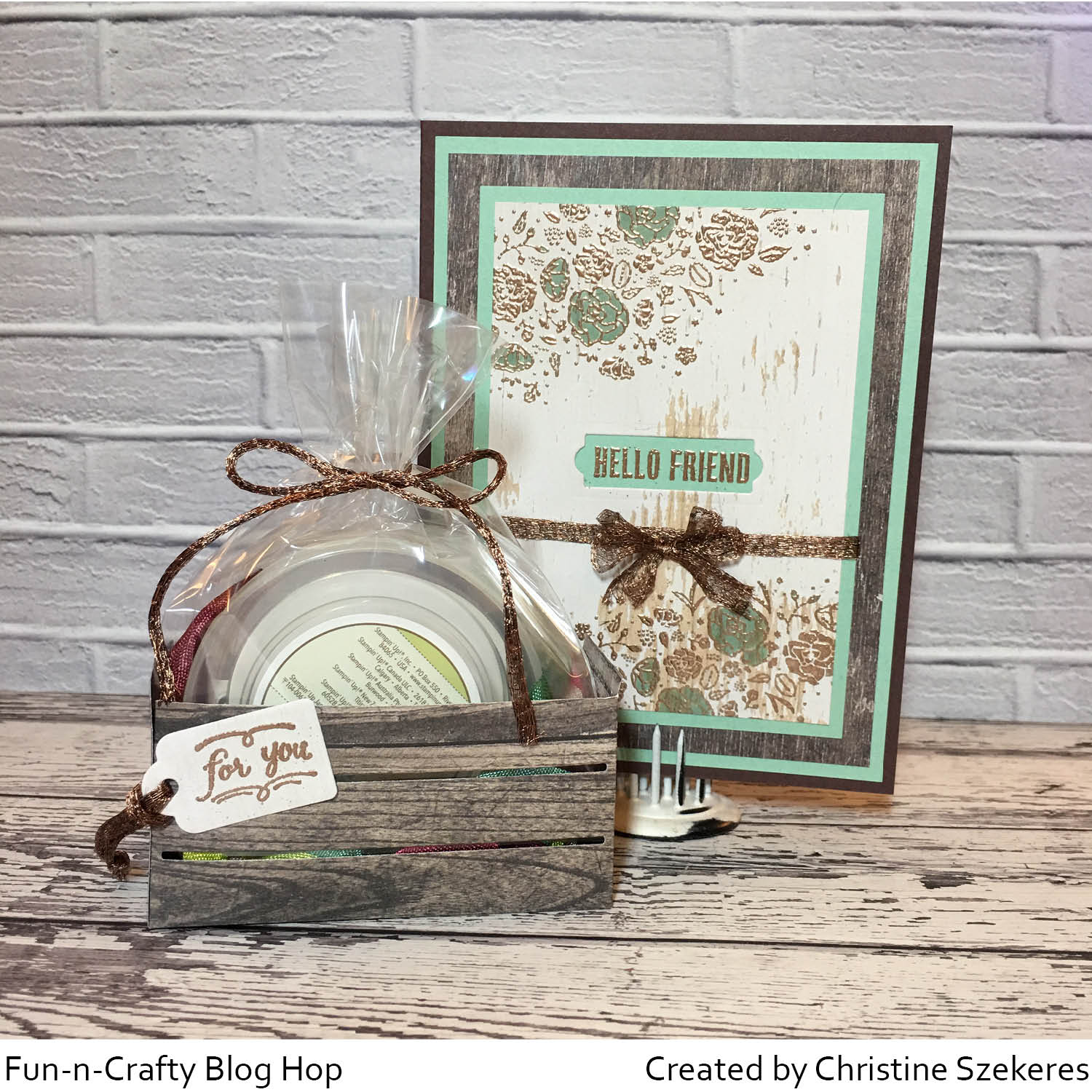
Hello my crafty peeps! I’m happy to be here again this month as part of the Fun & Crafty blog hop. You should have arrived here from Stacey’s A Work of Carte blog. If you didn’t, not to worry the complete list is below! Today the Stampin’ Up! Holiday catalog is live and there are oh so many goodies! To kick off the new catalog, a few of us participated in a holiday catalog card swap to get even more creative ideas to share with you!

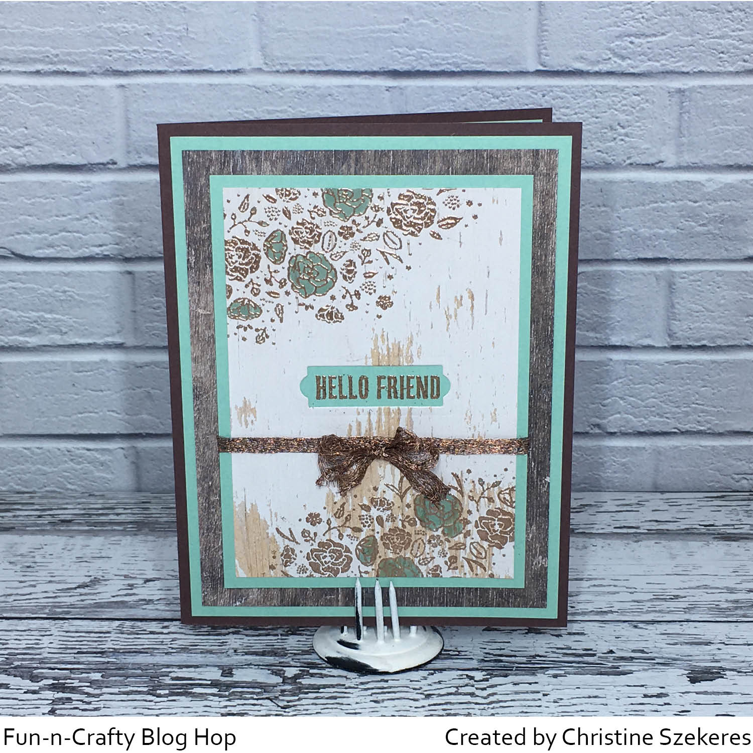
For my card I decided to use the Country Lane suite, which includes the Country Home stamps, Country Lane DSP, Tin Tile Dynamic TIEF, Braided Linen Trim, Chicken Wire Elements, Galvanized Clips, Galvanized Metallic Paper, and two new combo packs of Stampin’ Blends.I really love the versatility of this stamp set and the embossing folder gives so much detail, especially with the galvanized metallic paper. In the coming months I plan to use more of my favorites from the new holiday catalog in blog posts so stay tuned!
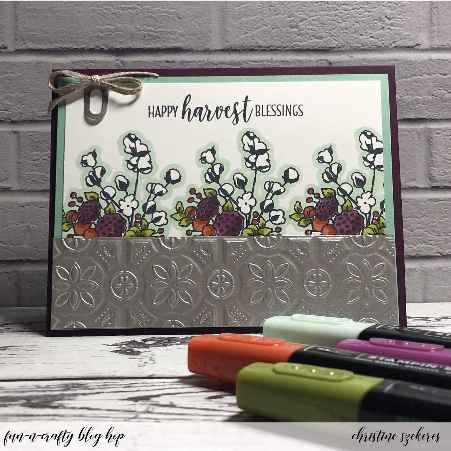
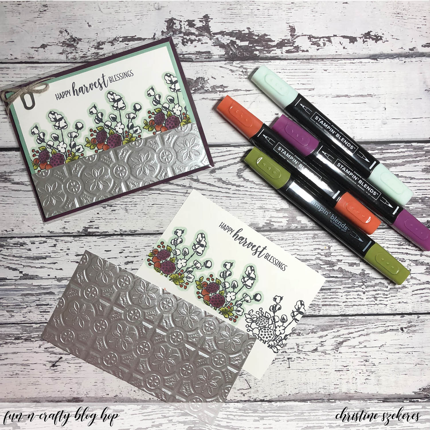
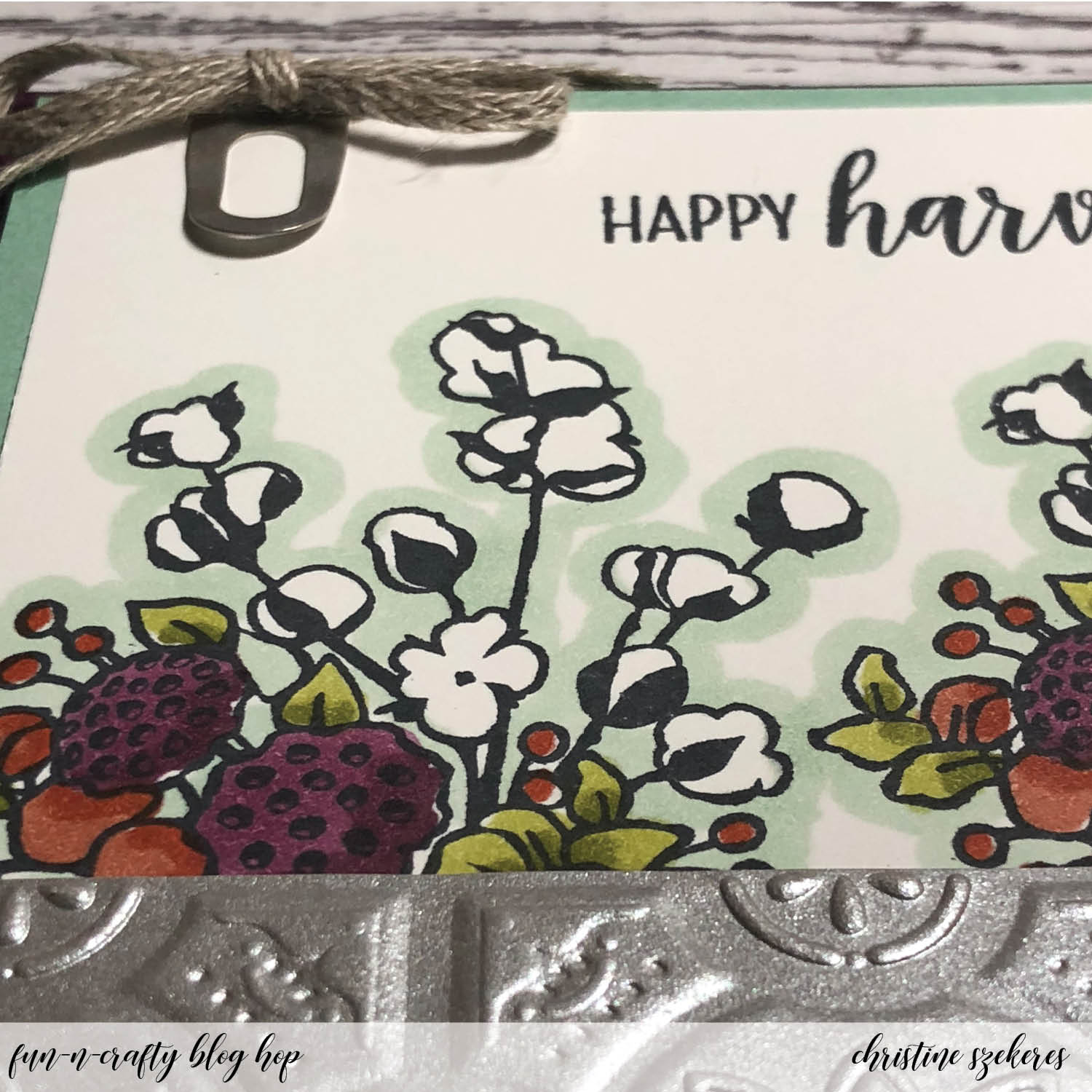
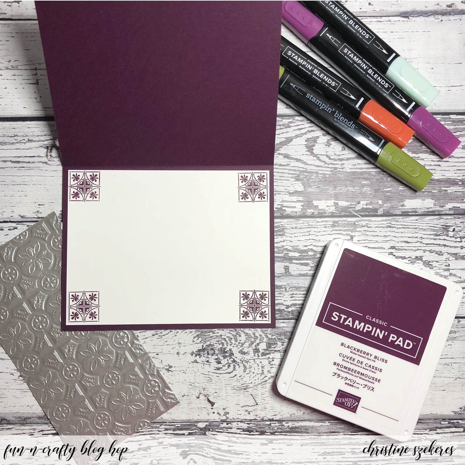
I started with a Blackberry Bliss horizontal top-folding A2 card base and because it’s a dark color I decided to include a white insert for writing a message to that special someone, which meant more stamping inside! For the card front, I began by cutting a piece of Mint Macaron to 4″ x 5.25″ for a mat and a Whisper White to 3.75″ x 5″ for the stamped panel. Next, I cut 6″ x 6″ squares of the galvanized metallic paper and ran it through the Tin Tile TIEF. I cut these into 1.5″ x 5.25 strips.
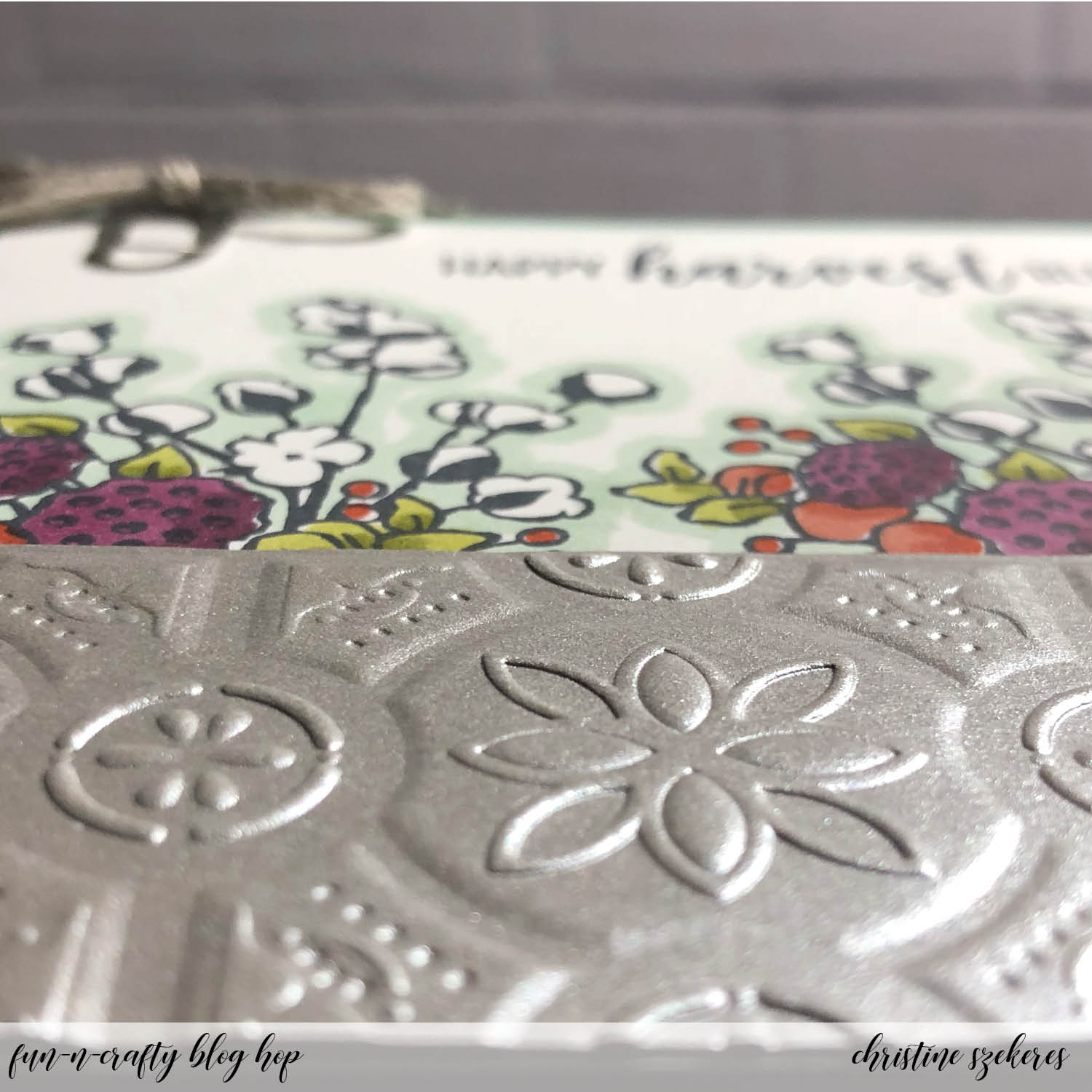
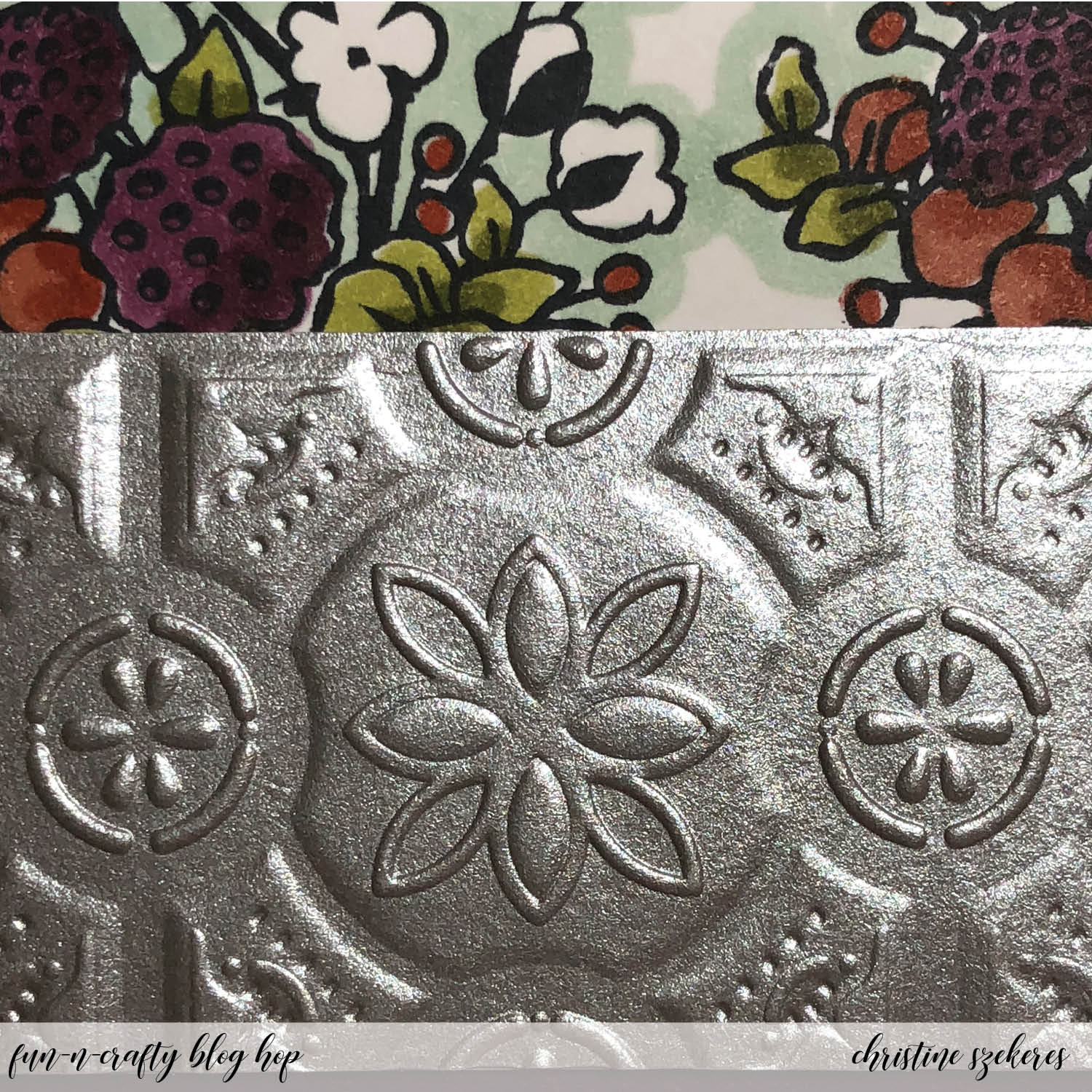
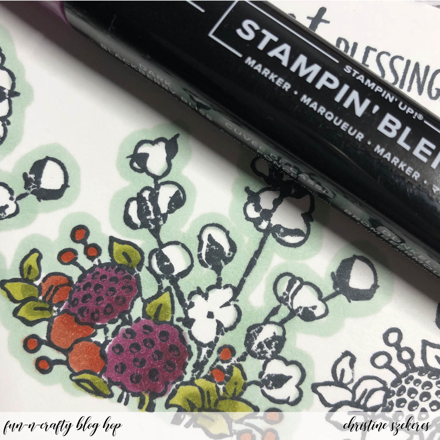
Using Memento black ink, I stamped the cotton flower image 1.45″ above the bottom edge three times on the panel. I also stamped the sentiment “happy harvest blessings” on the top of the panel. To make the cotton pop and look extra white, I outlined each stamped image using the light Mint Macaron Stampin’ Blend. I also colored the other parts of the images using the combo packs of Blackberry Bliss, Cajun Craze, and Old Olive Stampin’ Blends.
All that remained, was assembling the cards. First, I adhered the interior panel as well as the front Mint Macaron mat, the Whisper White stamped layer, and finally the tin tile galvanized strip. I clipped one of the cute galvanized clips to the panel and adhered it to the card base using dimensionals. For the final touch, I made a bow out of the braided linen trim and using a rolled up mini glue dot, adhered it to the top of the galvanized clip.
There is a ton of inspiration throughout this hop and I encourage you to grab your Stampin’ Up holiday catalog and some post-it notes, and visit the other talented crafters listed below to see what they created and perhaps leave them some crafty love! Up next is the wonderful Merit over at MB Squared Designs. Until next time, remember, creativity and imperfection live together in all we do. “Grace is the face love wears when it meets imperfection.”
~xoxo


- Stacey — A Work of Carte
- Christine — Artful Musings (you are here)
- Merit — MB Squared Designs
- Nicole — Inky Fingers Stamping
- Jennifer — NW Stamper
- Tobe — The Craft Sea
- Pamela — Stinky Tofu
Supplies Used:
Country Home Stamps (147678)
Tin Tile Dynamic TIEF (147906)
Galvanized Metallic Paper (147805)
Card Stock: Whisper White, Blackberry Bliss, & Mint Macaron
Ink: Blackberry Bliss & Memento
Blends: Blackberry Bliss, Cajun Craze, Old Olive, & Mint Macaron (light)
Accessories: Galvanized Clips (147806), Braided Linen Trim (147808), Snail, & Glue Dots


