Stampin’ Up Holiday Catalog

Hello, crafty peeps! I hope you are pouring over the newly released Stampin’ Up! holiday catalog, picking out all your favorite items. As a demonstrator I had this opportunity last month and, though it felt like a Herculean feat, I decided to order just a few things.

I know I’ll place another order soon for a few more of the things I LOVED — truly there is so much to love in the catalog. In the meantime, thought it might be fun to share my Top 10 favorite items with you as well as a couple of the things I’ve made using some of these new goodies.

Beanie’s Top Ten Holiday Catalog Favorites

  1. Spooky Night DSP (p 53)
  2. Spooky Cat Stamps (p 53)
  3. Cat Punch (p 53)
  4. Merry Little Christmas DSP (p 12)
  5. Merry Little Labels (p 12)
  6. Everyday Label Punch (p 12)
  7. Year of Cheer DSP (p 37)
  8. Year of Cheer Washi Tape (p 37)
  9. Mini Pizza Boxes (p 44)
  10. Mini Tinsel Trim (p 21) & Quilt Top Embossing Folder (p 5)

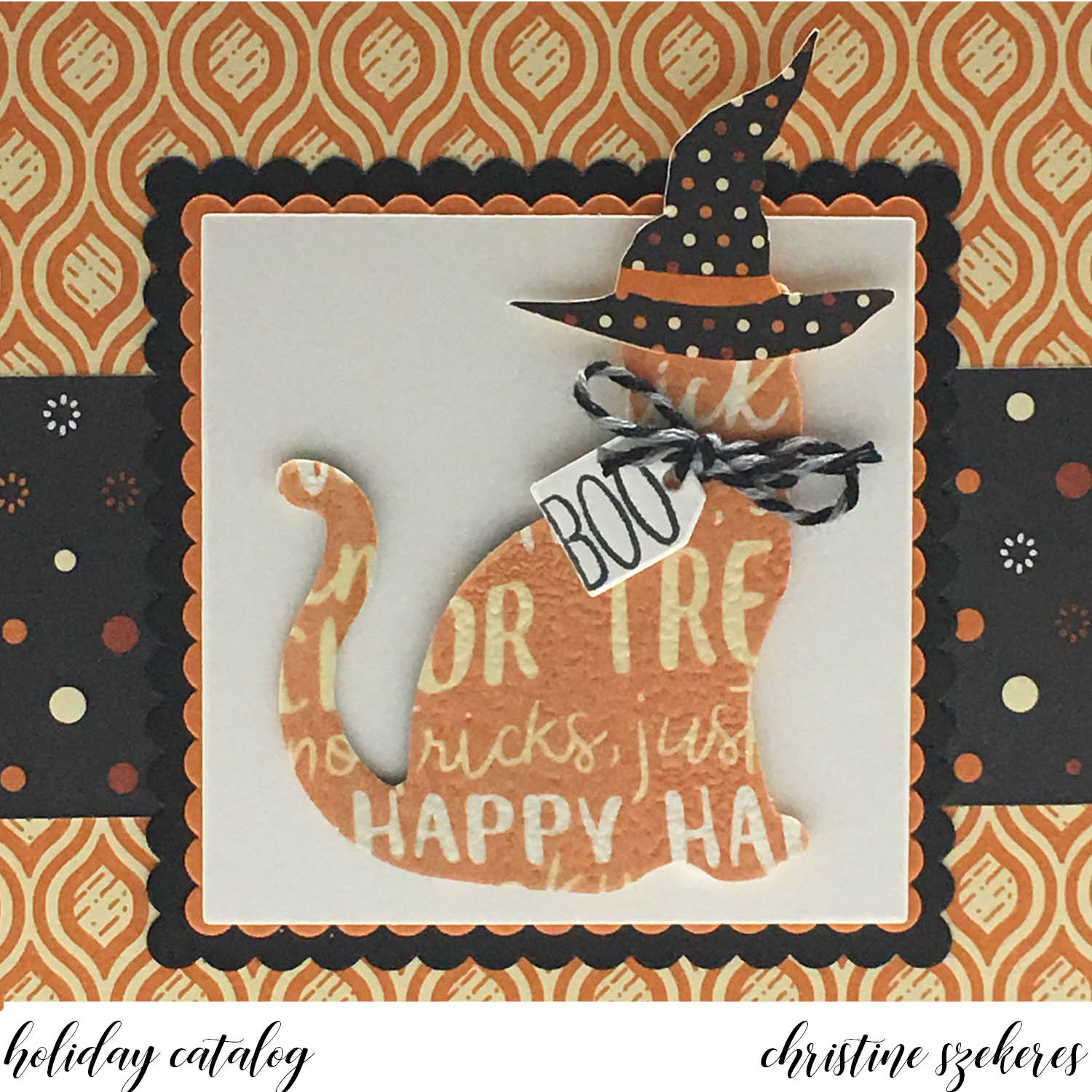
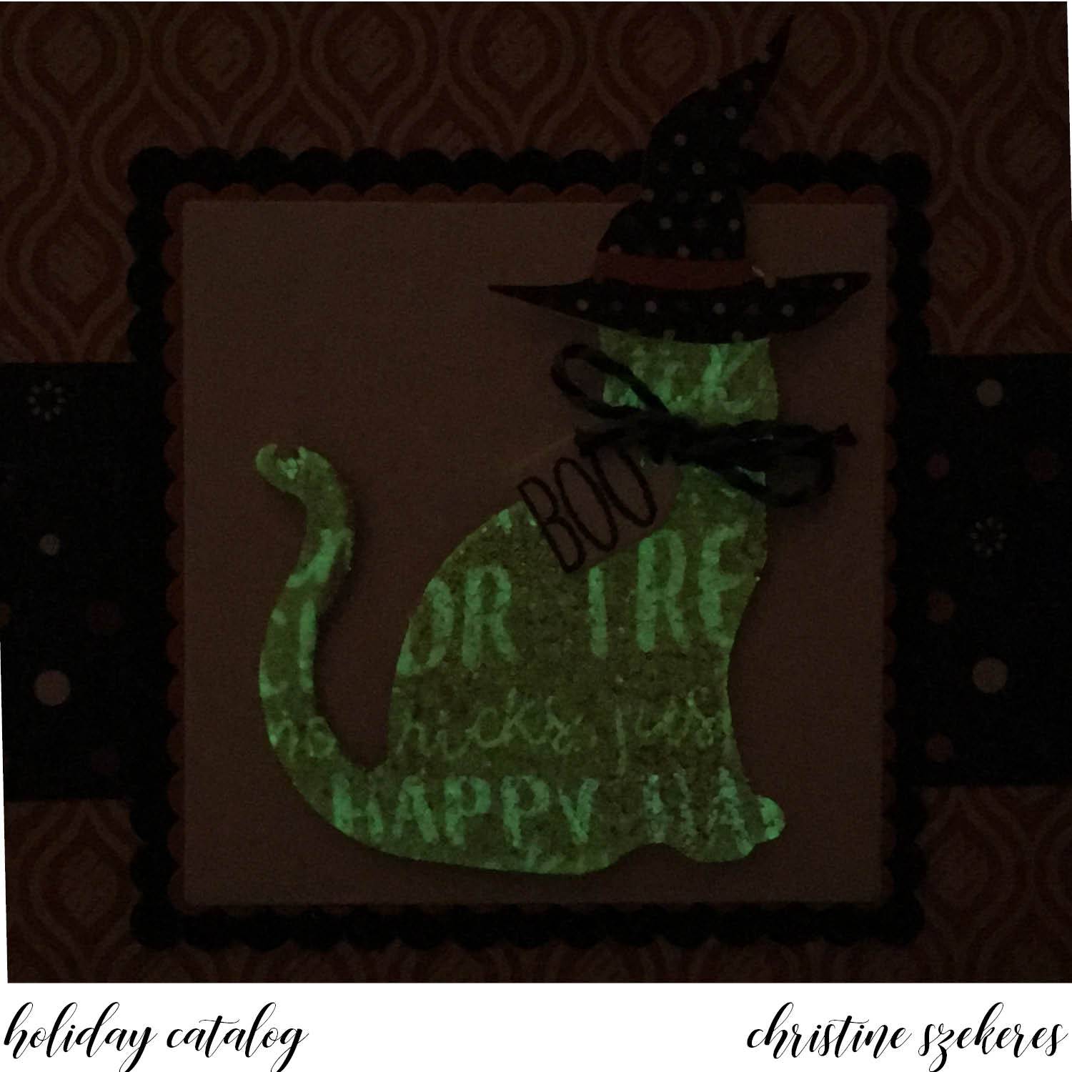
The first card I want to share is called “Spooky Kitty Surprise” and uses the new Cat Punch, Spooky Night DSP, and the Spooky Cat stamps. Recently Stampin’ Up! has begun coordinating some of their dies and punches with images from designer series papers. I love this. There are a few different punches and thinlet dies in the holiday catalog that have this ability, Spooky Night DSP being one. The cat image on the DSP is sized perfectly to punch out using the new cat punch. For my card I decided to punch out the cat from the words DSP paper.


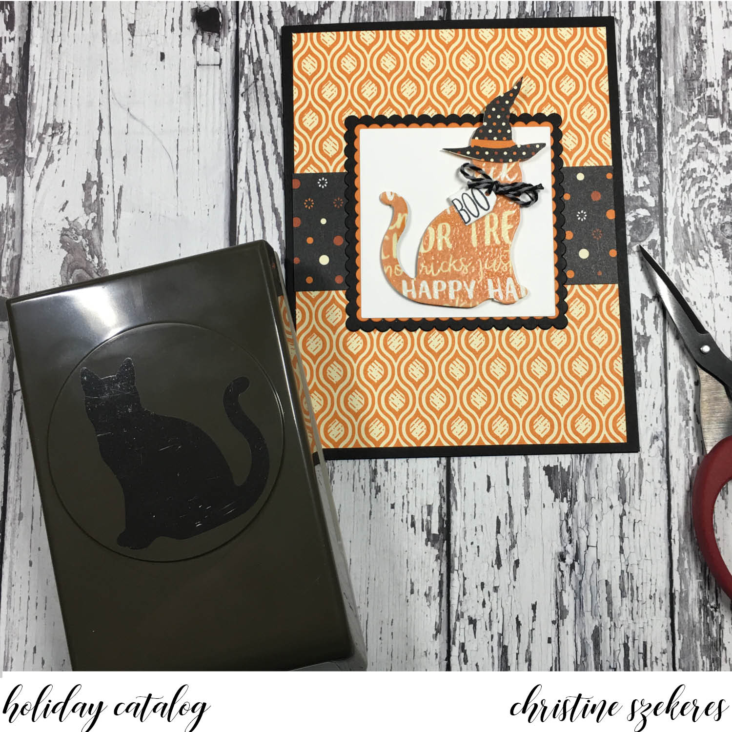
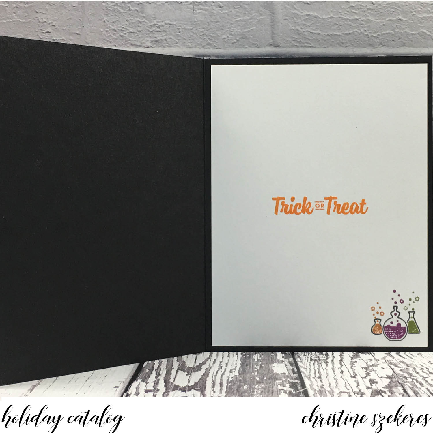
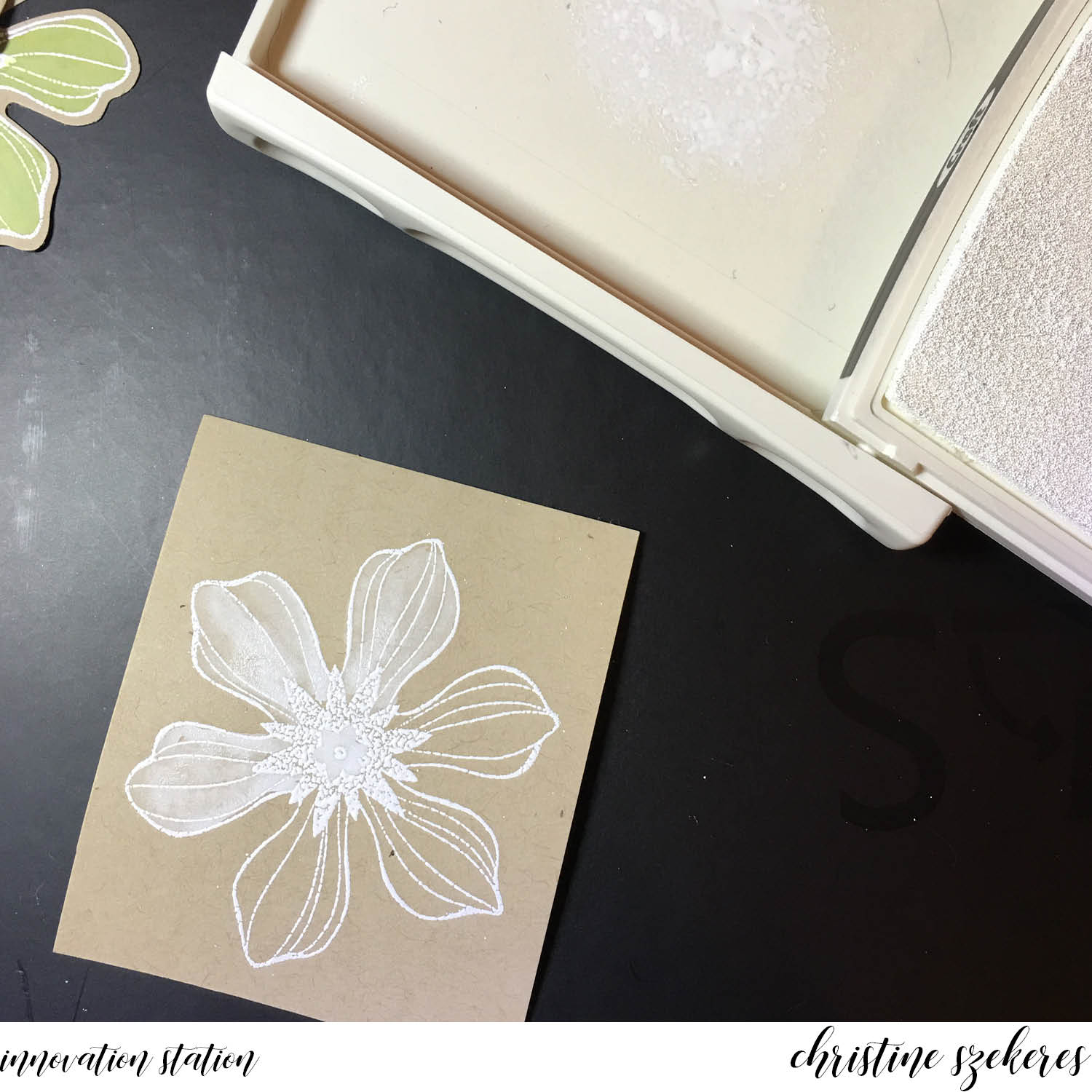
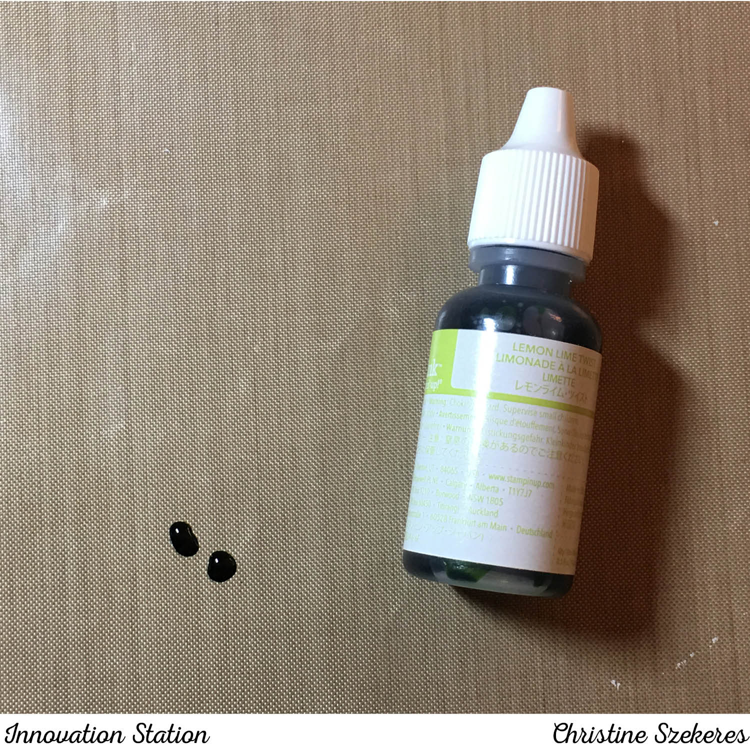
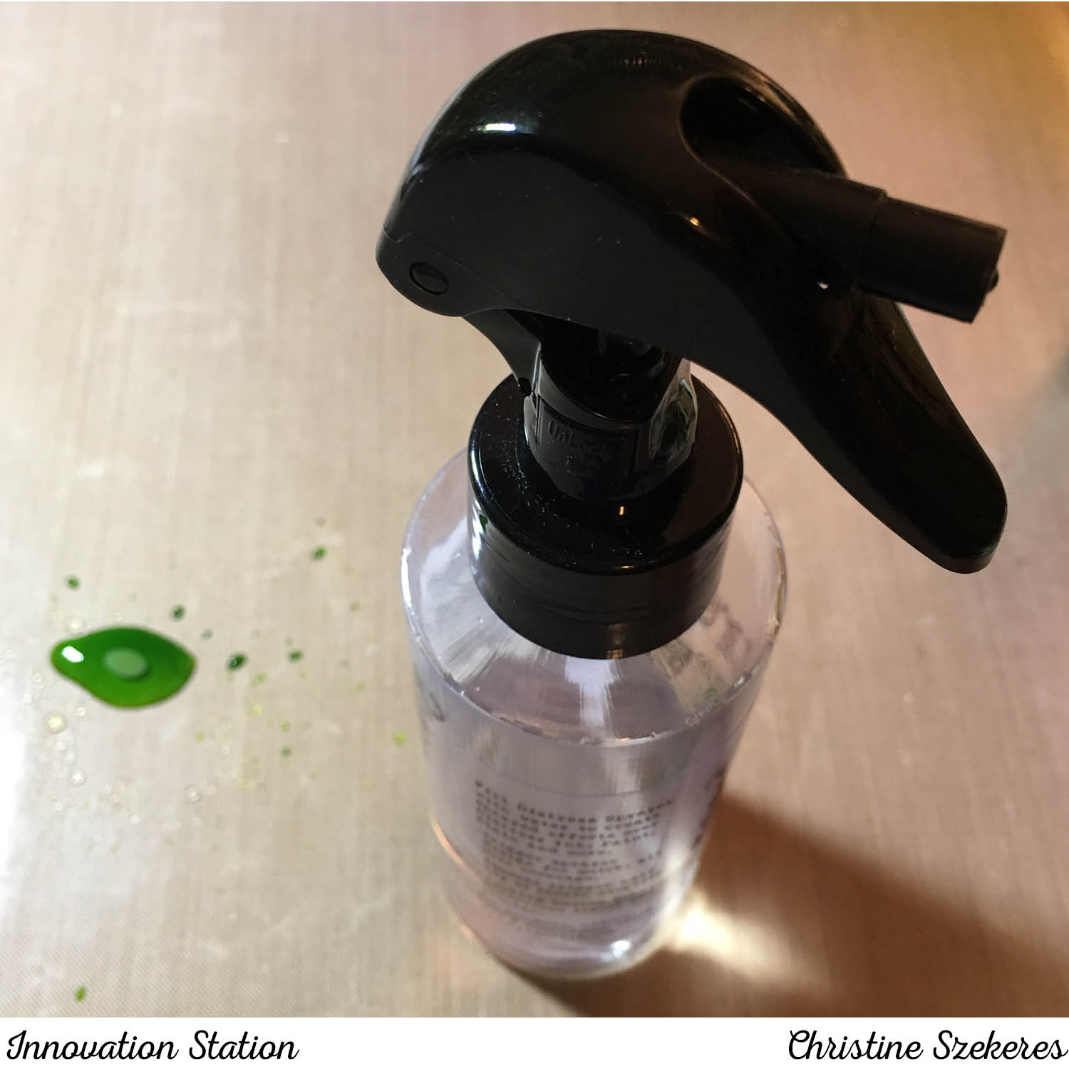
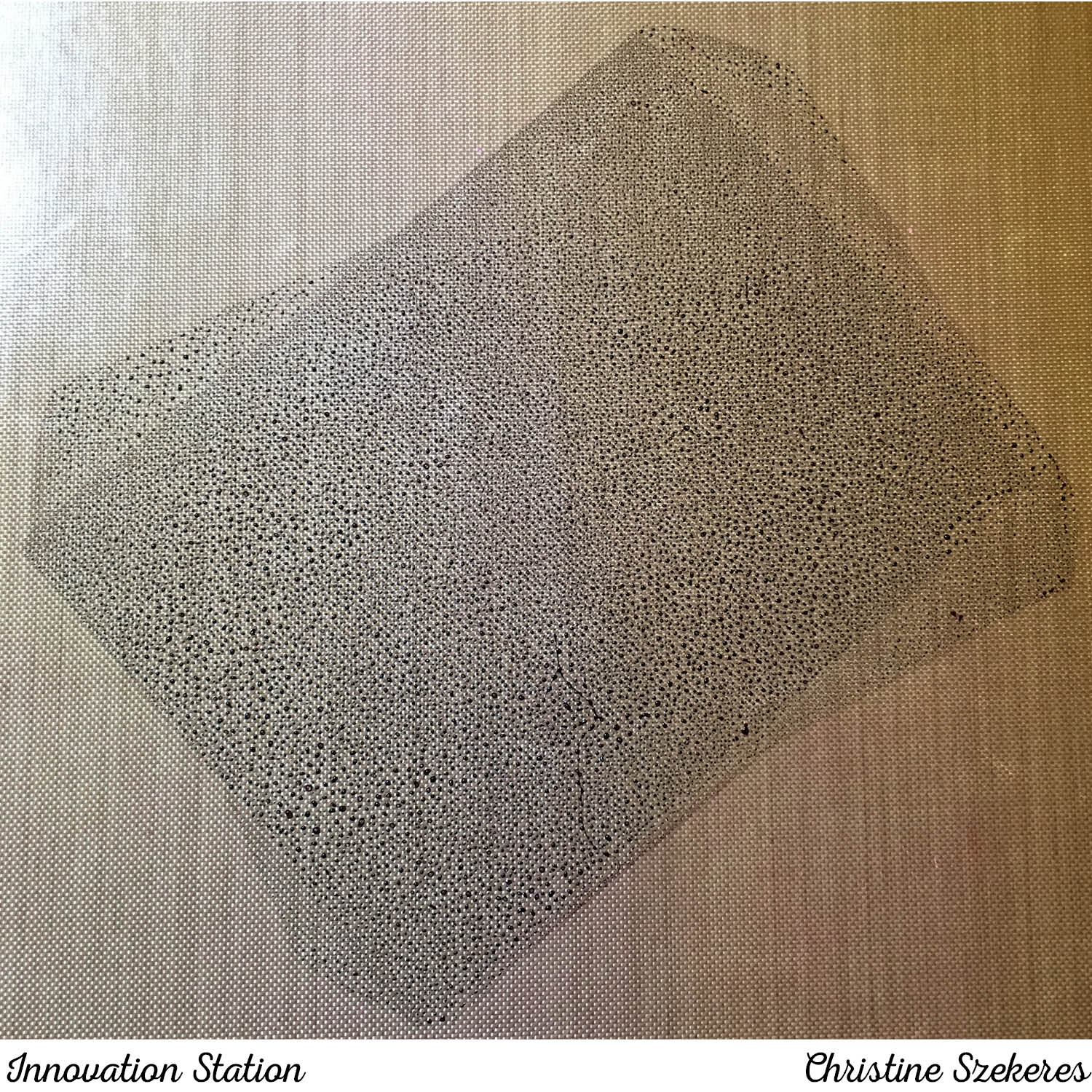
The card is very straightforward, with one *small* exception … the surprise. Halloween is my favorite holiday and I’ve always loved adding little extras whenever possible. In perfect Halloween fashion, the surprise appears when the lights go out and you see kitty glows in the dark! To achieve this I used Wow! glow in the dark embossing powder and Versa Mark ink. First, I smeared VersaMark ink all over the punched cat and then poured on the embossing powder, which is transparent (allowing the paper to show through) but also applying a glow in the dark look. I’m not the best photographer, but this was what I was able to capture, it doesn’t even come close to doing justice to the effect and I’m sorry for that. Kitty gets a witches hat (fussy cut from the DSP) and a little tag (cut using the Coffee Cups framelits).


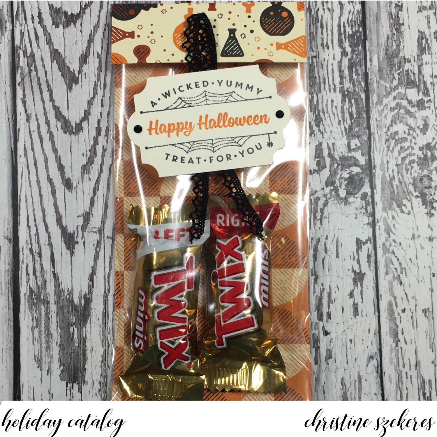
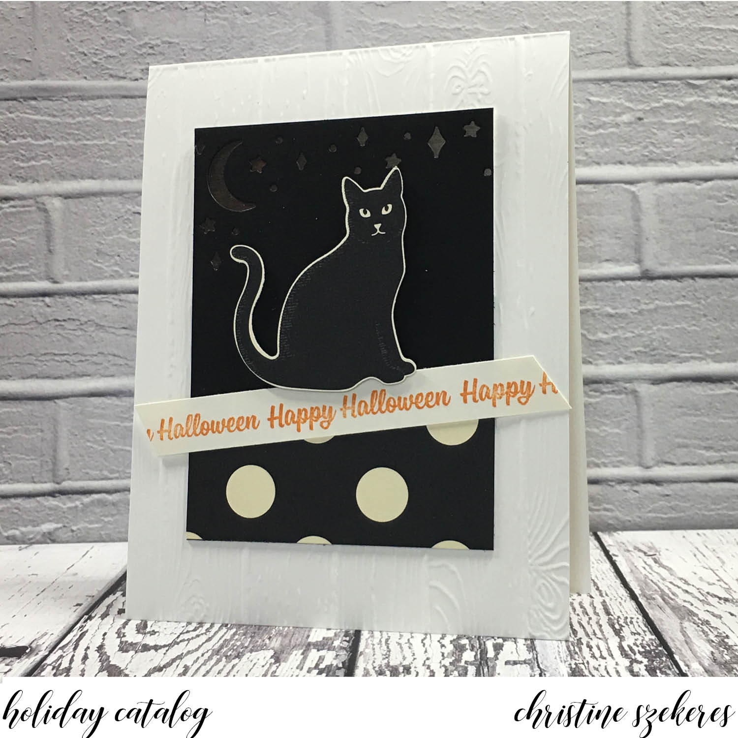
Next up, a couple of other items, one card and one treat bag, featuring the Spooky Night Suite – arguably my favorite of the new catalog. I made these at a recent demonstrator event here in the the Pacific NW. I am loving the new black rhinestones as well as the new Everyday Label Punch. The card shows the versatility of the moon and stars die from the Card Front Builder set.


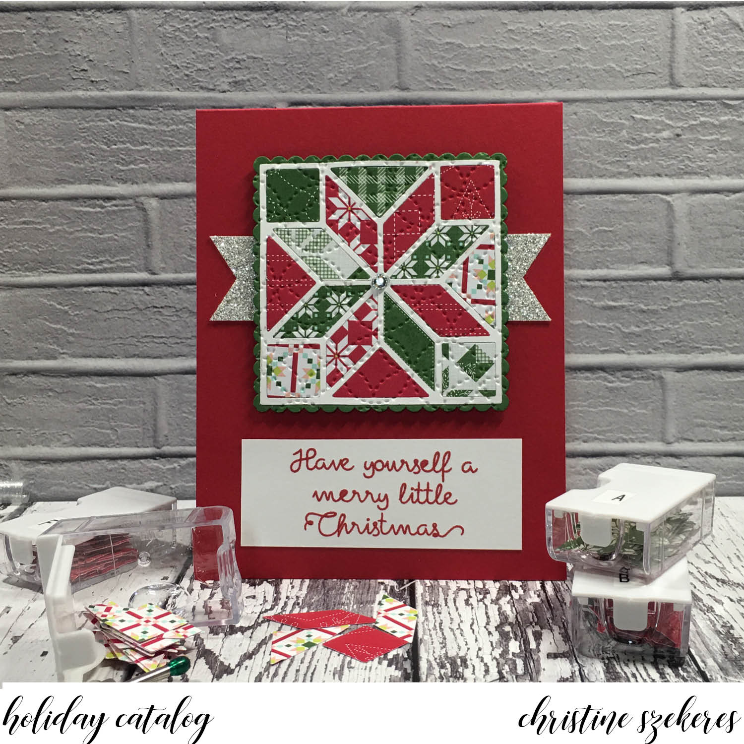
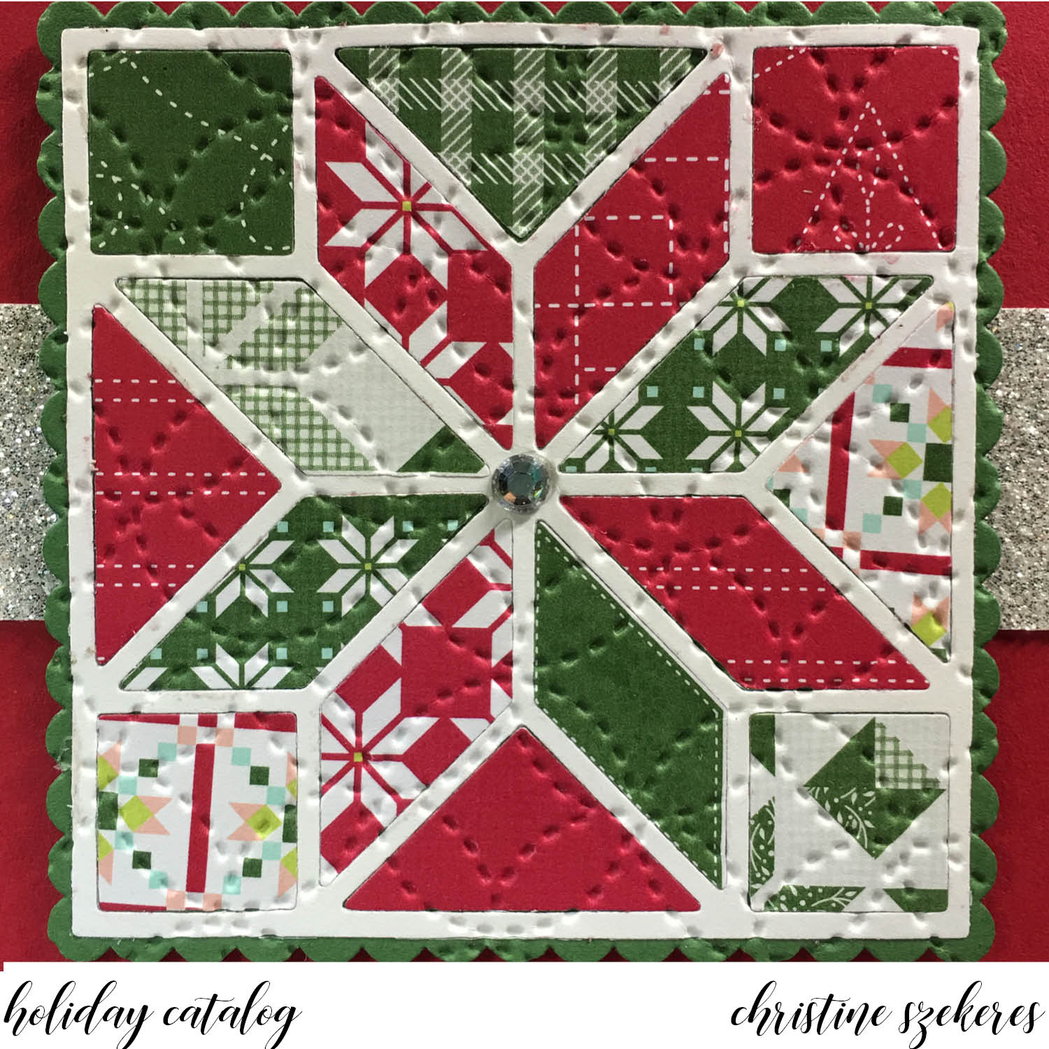
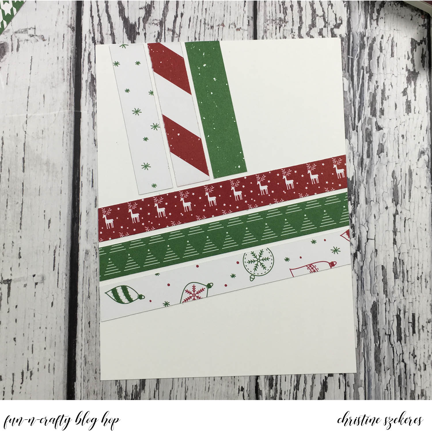
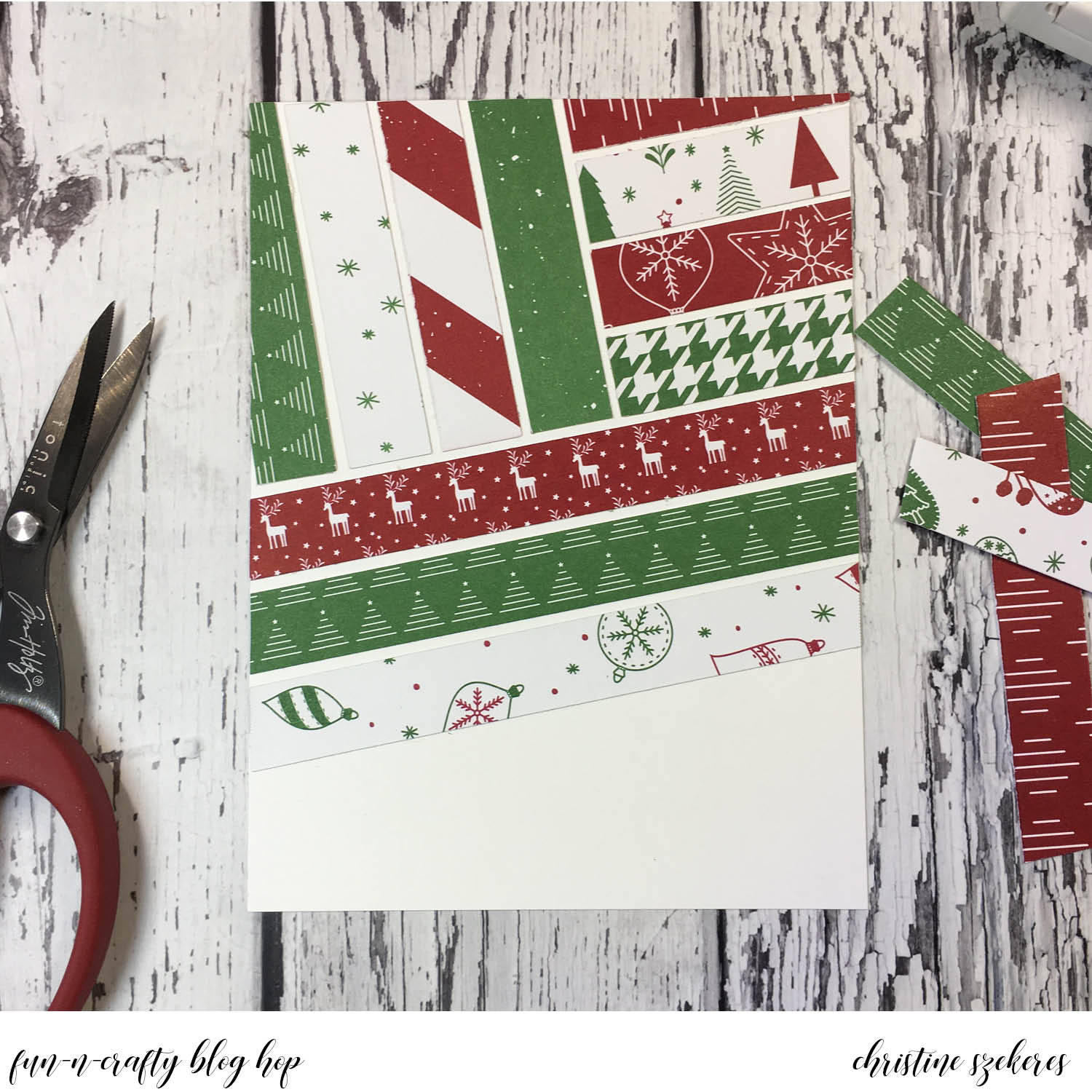
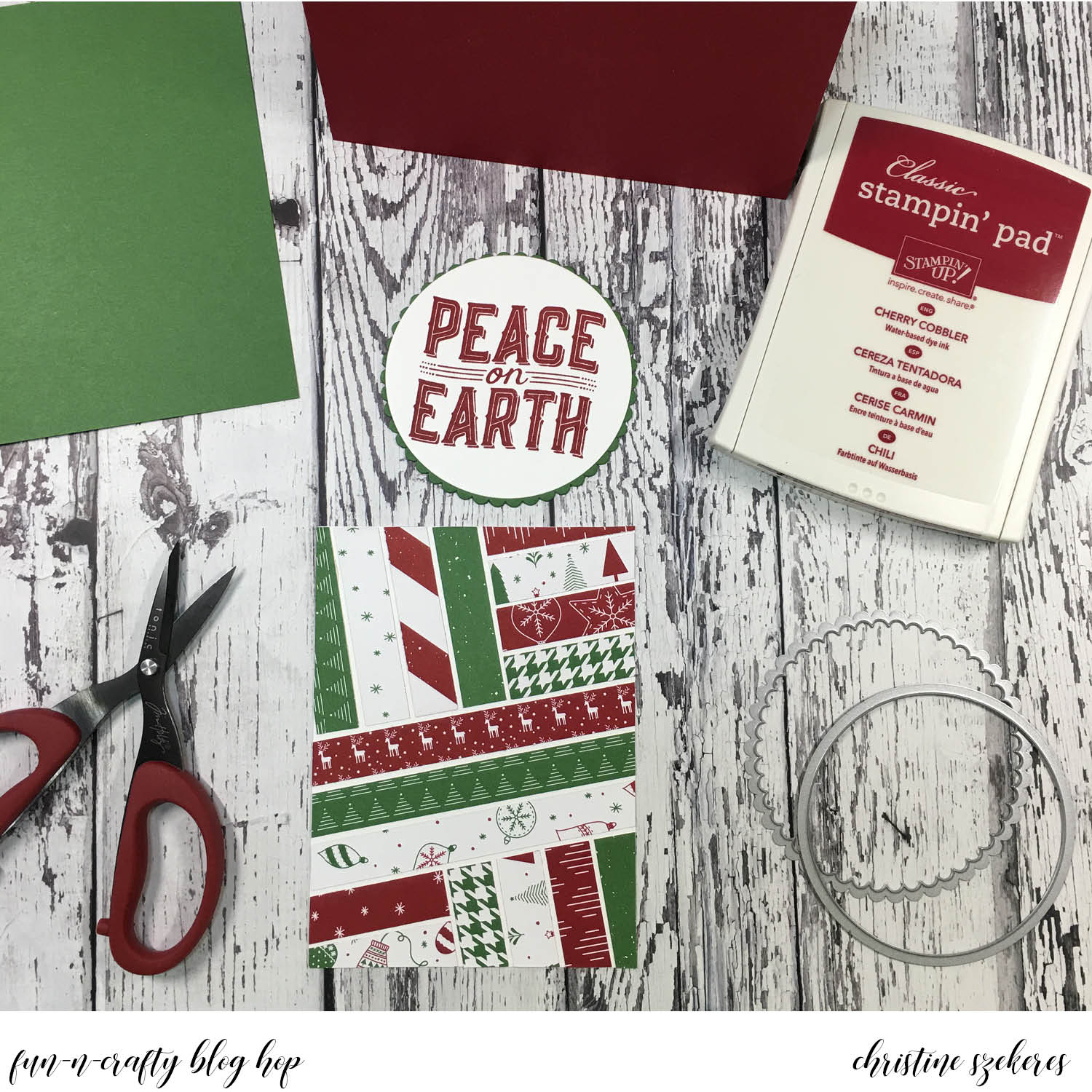
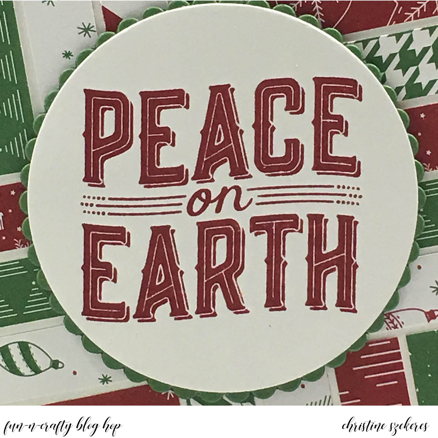
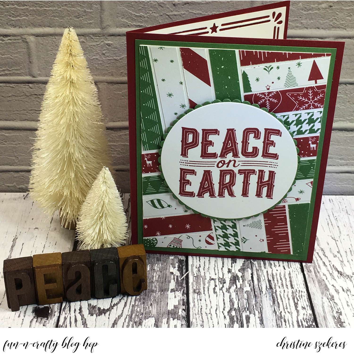
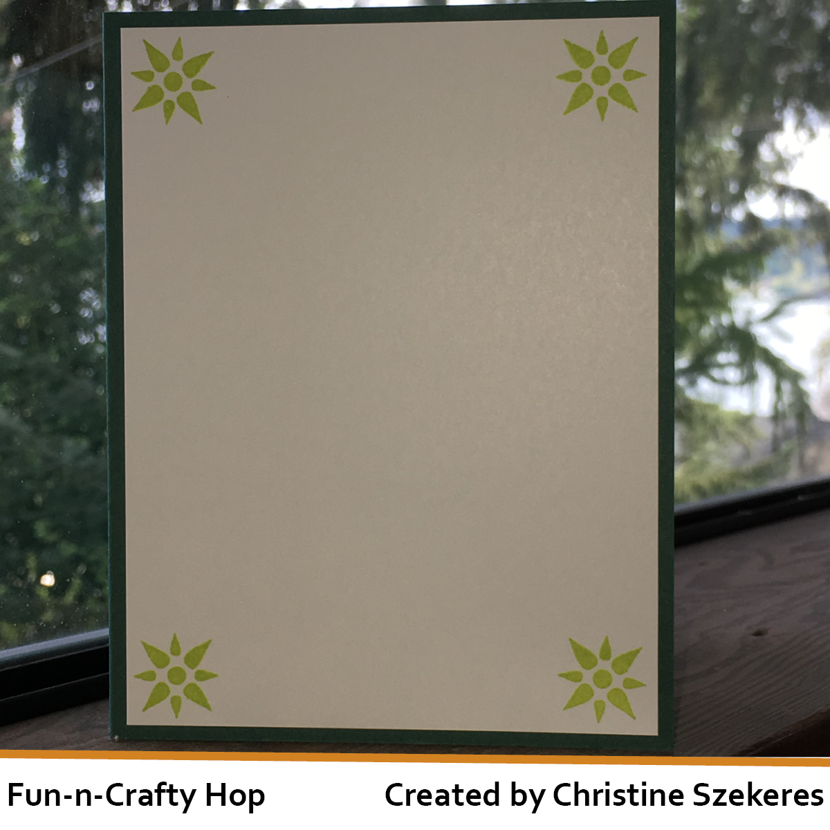
Finally, I would like to share a Christmas card I created using the Quilted Christmas Suite. After designing and making 8 kits and 9 complete cards I can say with 100% certainty I have a love-hate relationship with this suite. I LOVE the images and the coordinating dies are awash with possibilities, one being paper piecing, which is the focus of my card. Hate might be too strong a word, but after making all these kits and cards for a shoebox swap, I know that getting the coolest cards using this set takes work. Fun work, to be sure, but not a quick card. I used the Quilted Christmas DSP for my quilt pieces and once it was all pieced together ran it through the Big Shot with the Quilt Top Textured Impressions embossing folder – it adds that perfect finishing touch to the quilt block, don’t you agree?


Thank you for sharing a bit of your time with me today. Until next time, remember, creativity and imperfection live together in all we do. “Grace is the face love wears when it meets imperfection.”

~xoxo

Supplies Used
Christmas Quilt Bundle (146026) & Quilted Christmas DSP (144617)
Quilt Top Textured Impressions Embossing Folder (144687)
Spooky Cat Bundle (146014) & Spooky Night DSP (144610)
Black Rhinestone Jewels (144639) & Vintage Crochet Trim (144611)
Dazzling Diamonds Gilmmer Paper (135315) & 3″ x 6″ Cellophane Bags (141704)
Dies: Coffee Cups (143745) & Layering Squares (141708)

Innovation Station | Don’t Lose Your Marbles

Hello my crafty peeps and welcome to another Innovation Station post, a monthly feature focusing innovative tips and tricks. Each month I share an innovation that I find myself going to again and again.

This month’s innovation is the rolling marbles technique. This technique reminds me of a Jackson Pollock splatter painting and it’s so simple and fun. Honestly, I’d sort of forgotten about this technique (I used to use it all the time) until a friend demoed it at an event recently. I came home after and began searching for my marbles (literally, not figuratively). Once I’d found them I began playing and couldn’t really seem to stop.


One of the things my friend, Jennifer Blomquist, demoed was using a container (a half wood mount stamp case from Stampin’ Up!) to create this background. I always did this technique in a box and it was messy and sometimes uneven. Needless to say, I thought the stamp case idea was brilliant. The half wood mount case will work for smaller pieces (max size in this case is 3 1/4″ x 4 3/4″), but often I want to do a larger piece so I decided to try using the full wood mount stamp case from Stampin’ Up!, and it was perfect for the larger pieces (max size in this case is 4 3/4″ x 7″). HINT: marble to reinker ratios … half size case between 5 & 7 marbles and 2 — 3 drops of reinker, in the full size case between 9 & 11 marbles and 4 — 6 drops of reinker.

For my first card I wanted to use the new host set, Tranquil Tulips. I love this set! It is both a layering set as well as a mixed media style set, meaning the images aren’t designed to stamp solid, they have a dreamy quality to them. I began with a Mint Macaron A2 card base and cut a matte panel out of Powder Pink (4″ x 5 1/4″) that I mounted to the card base.


Next, I cut the marble panel out of Whisper White (3 7/8″ x 5 1/8″) and marbled it using a full wide stamp case, 9 marbles, and about 6 drops of Mint Macaron reinker. I put the marbles in the case and then the reinker drops in the middle. I closed the case and moved the marbles around until they were covered in reinker and there weren’t any big drops of reinker remaining. Next, I opened the case and secured the Whisper White panel to the lid using some low tac painters tape. Close the case and flip it over so the panel is now on the bottom with the marbles on top. Begin moving the marbles around the case until you are satisfied with the coverage. HINT: You can add additional reinker if needed by flipping the case back over (so the panel is on top and the marbles on the bottom). Once that was done I ran the it through my BigShot with the border from the Card Front Builder dies.


I also the tulip panel is 3 3/4″ x 4 1/4″ and the Powder Pink matte is 3 7/8″ x 4 3/8″. I stamped the tulips, stems, and leaves using Powder Pink, Lemon Lime Twist, and Smokey Gray. HINT: I stamped the stems first, followed by the tulips and finally the leaves. You could also stamp the tulips first, but for optimal placement on the panel, I preferred stamping the stems first. Once dry, I covered the tulips in clear Wink of Stella for a bit of shimmer and shine. I custom dyed some seam binding ribbon using Mint Macaron and Powder Pink reinkers. As I began layering all the pieces together I felt something was missing and decided it needed a sentiment, but I was stuck on where and what. As I looked over some of my sentiment sets, I came across the new bundle, Tabs for Everything, and knew just what I needed! Using the coordinating punch, I punched a tab out of Lemon Lime Twist card stock. Next, I stamped “hello you” on a piece of Whisper White card stock and punched it out using a hole punch. I stamped the scalloped frame from the stamp set onto the tab and mounted the circle using a mini glue dot. I tucked this between the tulip panel and the Powder Pink matte. I think it pulls the card together nicely!

For my second card I wanted to use another marbled background I’d created using Pacific Point so I turned to the Birthday Delivery bundle since Pacific Point is one of the coordinating colors for this suite. I love giving special birthday cards to friends and I knew this would be the perfect card for a friend who loves foxes. I was very excited when I realized that in addition to matching the stamps, the dies cut elements from the coordinating DSP. I also like that there are stamps curved to fit inside the flag banner that the fox holds. There are a bunch of amazing embellishments in this suite, including pop-up honeycomb balloons. I knew the card needed one of these inside and that is how the poodle (I call her Lola) came to be hanging out inside!


I began with an Old Olive A2 card base and I stamped the present randomly in Old Olive in for a tone-on-tone effect. I die cut the fox and banner from the DSP and also cut the following strips: striped DSP (1 1/4″ x 4 1/4″), Pacific Point marbled card stock (1″ x 4 1/4″), and Pacific Point card stock (3/4″ x 4 1/4″) onto which I stamped the sentiment, “Let’s Celebrate Your Day,” and layered all three pieces together with snail. Using the dies, I cut Lola and two balloons from the DSP and stamped the balloon strings on the left inside panel, positioning them so they looked like she had them in her mouth. The honeycomb balloon has adhesive, making placement a breeze! HINT: For perfect honeycomb placement, place it last and follow these steps: expose one side of the adhesive and place it flush with your center score line then you can expose the left side and simply close the card for the proper placement every time! I finished it off with the “SURPRISE” sentiment and some thin strips of DSP.

Thanks for hanging out with me, and learning (or relearning) a fun innovation! Join me next month for another of my go to innovations, washi techniques. Until next time, remember, creativity and imperfection live together in all we do. “Grace is the face love wears when it meets imperfection.”

~xoxo

Supplies Used:
Full Wide Stamp Case (127551) & Half Wide Stamp Case (127552)
Reinker: Mint Macaron, Pacific Point, & Powder Pink
Card Stock: Mint Macaron, Powder Pink, Lemon Lime Twist, Old Olive, Pacific Point, & Whisper White
Birthday Memories DSP (144118), Balloon Honeycomb (144124), & Glass Marbles
Stamps & Dies: Tranquil Tulips (143767) & Card Front Builder (144674)
Bundles: Tabs for Everything (145364) & Birthday Delivery Bundle (145294)

Christmas in July | Carols of Christmas Blog Hop

Hello, crafty peeps! I hope you are enjoying the Carols of Christmas blog hop. You should have arrived here from Jennifer’s blog, but if you started here that’s okay, the links to all the talented designers are at the bottom of this post. This hop is focused on the new Carols of Christmas stamp set, which is part of the new holiday catalog.

Beginning on August 1st Stampin’ Up! customers will have the opportunity to purchase this set or the bundle, which includes the stamps and coordinating dies. I love this bundle. The stamps are lovely with these large sentiments that create great focal images for your holiday creations. The Card Front Builder dies are quite innovative with a beautiful border, a night sky, some poinsettia corners and other wonderful elements.

I know, I know, I know … Christmas already, it’s still summer! Decorations and treats seem to arrive earlier and earlier each year. On the positive side, it’s a great chance to get a jump on your handmade cards and gifts.


The Merry Little Christmas suite is being called a “mega” suite as there are two stamp sets, a die set, and a punch, not to mention two coordinating DSPs and several trims and embellishments all coordinated together. The suite is located on pages 10 – 13 in the holiday catalog. Today I used the Carols of Christmas stamp set, the Card Front Builder dies, and the Merry Music Specialty DSP. I also used some of the new Boxwood Wreaths and the Silver 3/8″ metallic edge ribbon, which I dyed using my Cherry Cobbler reinker.

My first card uses the largest stamp in the set, Deck the Halls, as the focal image. I began with an A2 (4.25″ x 5.5″) Cherry Cobbler card base. I cut a piece of the white Merry Music DSP to 4″ x 5.25″ and mounted it to the base. Next, I cut a 2″ x 3″ piece of the black Merry Music DSP and using the Banner punch, created a banner. I die cut the largest oval from the Layering Ovals out of Cherry Cobbler and the largest scalloped oval out of Whisper White and stamped “Deck the Halls” on the scalloped oval in Cherry Cobbler ink. I adhered the scalloped oval over the Cherry Cobbler oval. I wanted a matching trim, but none of the red ribbons I had looked right. What to do? Dye white ribbon, of course! If you haven’t dyed your own ribbon, you’re missing out (check out this post for more on dying ribbon).


Once the ribbon was dry I cut two pieces and attached them to the back of the oval using mini glue dots. HINT: I prefer mini glue dots over liquid glue or tape runner for adhering ribbon and other trim to paper. I find it holds faster and better in the long run. I adhered the oval and ribbons to the banner and finished off the front with one of the new Boxwood Wreaths, which I glued down with mini glue dots.

For my second card I decided to make a shaker card. I began with an A2 Whisper White card base. I cut a Garden Green panel to 4″ x 5.25″ and ran it through my BigShot to cut out the three trees. Using multi matte medium, I glued a piece of acetate in place behind the trees, creating the front of my shaker card. Using the small star cluster stamp from the Carols of Christmas set, I stamped it all over the front of this panel using Garden Green ink for a tone-on-tone effect. HINT: Rotate the stamp to maintain an “organic” feel on the panel. Next, using the largest Layering Circles die I cut a panel in Whisper White and stamped “Peace on Earth” in Garden Green ink. I also cut the largest scalloped circle in Cherry Cobbler for a matte. I glued these two panels together and sat them aside.


Now it’s time to build the shaker. I wanted to make sure the shaker bits stayed within the tree shapes so it was the Stampin’ Up! Foam Adhesive Strips to the rescue. These strips are perfect for getting into small nooks and crannies and creating custom shaker cards. I filled in the rest of the panel using standard foam tape. Using a paint brush and my anti-static embossing buddy, I went around the inside edges of the foam tape. This helps reduce static between the acetate and the shaker bits and neutralizes any adhesive on the side of the foam tape. HINT: Make sure to do this step BEFORE you expose the adhesive. I added shaker bits (if you’re like me, you’ve glued the backing panel on with no shaker bits inside at least once) and adhered a piece of Merry Music DSP to the shaker panel. The final touch, a deer die cut out of sparkling silver paper.


There is a ton of inspiration throughout this hop. Since you started here, I encourage you to grab your favorite beverage and visit the other talented bloggers listed below. Next up is the talented Diana. Until next time, remember, creativity and imperfection live together in all we do. “Grace is the face love wears when it meets imperfection.”

~xoxo


Supplies Used:
Carols of Christmas/Card Front Builder Bundle (146037)
Banner Punch (138292), Layering Ovals (141706) & Circles (141705)
Card Stock: Whisper White (100730), Cherry Cobbler (119685), & Garden Green (102584)
Ink: Cherry Cobbler (126966) & Garden Green (126973)
Paper & Embellishments: Merry Music Specialty DSP (144623) & Boxwood Wreaths (144176)
Foam Adhesive Strips (141825) & Silver 3/8″ metallic edge ribbon (144213)

Fun-n-Crafty | Christmas in July

Hello my crafty peeps! I’m happy to be here again this month as part of the Fun & Crafty blog hop. This month’s theme is Christmas in July! I know, I know, it’s still summer, but for better or worse stamp companies release their holiday products in August and September.

On the positive side, you can get the jump on your holiday cards and handmade gifts! Beginning in August Stampin’ Up! is offering everyone a chance to pre-order one of the new suites, Carols of Christmas, in August before the holiday catalog goes live on September 1st.


I really like the stamps and dies in this product suite. The dies are innovative and the bold sentiments are the perfect focal images for all of your holiday creations. I think my favorite element is the card builder border, followed closely by the night sky die. Both are perfect for all sorts of cards, not just holiday and I think that is why I like them so much! In my sample I created a background using a paper piecing technique called herringbone. This can be done with washi tape and also, as shown here, with patterned paper like the Be Merry DSP. It’s a great way to use your DSP and show off all the wonderful and coordinating patterns.


This technique may look complicated, but it is actually very simple. There’s no “right” or “wrong” way to apply the paper that creates the pattern. You begin with a base layer (a piece of card stock that you adhere the strips to) and the strips of DSP. For this sample my whisper white base is 5″ x 3.75″ and I used .5″ strips. Normally, I cut two, 6″ x 2″ pieces of each pattern (this yields four, 6″ x .5″ strips) and I apply edge-to-edge adhesive (Using Stick It! or my Xyron). Once I have the adhesive on, I cut down the piece into four .5″ strips from each pattern in the pack. I leave the backing on one side of the strips so I can mock up the placement before I expose the adhesive and stick each strip down permanently.


Once I’m ready to begin, I place three strips running diagonally across the middle of the base (left photo above), alternating the patterns and trimming off the excess on each side. HINT: I like leaving a little white space between the strips, but you could also place them side by side. These strips serve as an “anchor” making it easy to place the remaining strips. After the three center strips are down, I add the next three above them (right photo above), oriented vertically (the opposite of the first three strips). Next, I add three more next to those vertical strips, this time oriented horizontally (left photo below). I keep working in this manner until the entire base is covered (right photo below). You may need to add a few small “triangles” here and there to fill in some edges, but otherwise you are done. I will repeat patterns a couple of different times, if needed, but place them in different parts of the base.


One of the things I love about Stampin’ Up! products is the color combinations. Each pack of DSP lists the coordinating colors on the back. This is super helpful when choosing card stock and other embellishments. The coordinating colors for the Be Merry DSP are Cherry Cobbler and Garden Green so my inks, card bases, mattes, and accents were those colors. I began with a side-folding A2 card and cut a 5.25″ x 4″ matte (if the card is Cherry Cobbler then the matte will be Garden Green, and vice versa). The herringbone background is adhered to the matte and then the matte to the card base.

The large sentiments in this set are the perfect focal point for your card. I cut 3.5″ x 3.5″ squares in Whisper White for the “Peace on Earth” sentiment and stamped it using either Cherry Cobbler or Garden Green ink. I also cut a 3.5″ x 3.5″ matte out of Cherry Cobbler and Garden Green card stock. Using the Layering Circles, I die cut the sentiment using the largest circle and then using the largest scallop, cut the mattes. I adhered the sentiment to the opposite color scalloped circle (Cherry Cobbler sentiment on a Garden Green scalloped circle and vice versa) and I adhered it to the herringbone background using pop dots.


Both Cherry Cobbler and Garden Green are darker colors, so I decided to finish my card with a Whisper White panel inside and I used the card builder border die to add a little extra touch to this panel (see above right). These stamps and dies are wonderful and I hope my card inspires you to purchase this bundle for yourself!

There is a ton of inspiration throughout this hop. Since you started here, I encourage you to grab a cup of coffee and visit the other talented team members listed below to leave them some blog love! Next up is the talented Kathy. Until next time, remember, creativity and imperfection live together in all we do. “Grace is the face love wears when it meets imperfection.”

~xoxo


  1. Christine – Artful Musings (you are here)
  2. Kathy – Stamp-a-blog
  3. Merit – MB Squared Designs
  4. Susan – Stampin’ by the SF Sea
  5. Jennifer – NW Stamper
  6. Stacey – A Work of Carte

Supplies Used:
Stamps & Dies: Carols of Christmas Bundle (146036) & Layering Circles (141705)
Card Stock: Whisper White (100730), Cherry Cobbler (119685), & Garden Green (102584)
Ink: Cherry Cobbler (126966) & Garden Green (126973)
Be Merry DSP (144111)

Innovation Station | Inlaid Die Cutting

Hello my crafty peeps and welcome to another Innovation Station post! This is a monthly feature, focusing innovative tips and tricks. During the 2nd week of each month I plan to share an innovation that I find myself going to again and again.

This month’s innovation is inlaid die cutting. Inlaid die cutting is the process by which you place the negative space pieces back into the die cut creating a one layer background. This technique works well with background dies, but it also works with shapes and words. Inlaid die cutting adds color and interest to full panel die cuts and allows you to create many different looks. Inlaid die cutting is pretty straightforward, which is what makes it such a wonderful card making staple. Basically you run the item through your die cut machine over and over, using different card stock and/or pattern papers. It’s really that simple. I have come up with a few tips that I find helpful, which I share at the end of this post.

Now onto the cards. For the first card I used the Hello cover plate from Poppy Stamps. I started with a top folding card base and I die cut the plate into the card face. I set those letters and inserts (the inside of the O’s and E’s) aside. Next, I die cut the plate from several pieces of card stock in the new InColors (lemon lime twist, tranquil tide, powder pink, berry burst, and fresh fig) and I cut a slightly smaller backing for the card front, which I turned into a sticker by adhering it to a piece of Stick It! adhesive and placed it behind the card face. Finally, I began inlaying letters, making sure to include the white inserts for the O’s and E’s. For the finishing touch, I added two silver enamel hearts to one of the O’s.


For my second card I die cut Winnie & Walter’s Multifaceted cover plate out of a piece of Emerald Envy card stock and also out of a piece of the Pick a Pattern DSP. Using Stick It! adhesive, I turned the Emerald Envy die cut into a sticker and adhered it to a Flirty Flamingo card base. Next, I began placing all the shapes from the DSP using the outline version to help me figure out which pieces went where. I stamped the label frame in Emerald Envy and the sentiment in Flirty Flamingo and colored in the letters using a Flirty Flamingo marker. Using my Flirty Flamingo reinker, I dyed a piece of white seam binding and also punched out the frame using the new Pretty Label punch and popped it up on dimensionals over the ribbon.


I took a friend to the airport at 4am this morning and I was leaving the house when I remembered another style of inlaid die cut I had planned to show: using smaller dies to create a background. The wheels were turning (both my car’s and my brain’s) and by the time I returned from the airport this card was almost completely designed! Bonus! I created it using the Frozen Treats dies and it shows how creative you can get with inlaid die cutting. HINT: To get a seamless one layer cut for the ice cream cone follow these steps. Cut the cone out of the white panel first and then overlap the ice cream die so it looks like one clean cut (see below left). Next, place the panel back on the BigShot’s magnetic platform, inserting the proper cone in its spot and placing the ice cream die in position in the hole left by the first time you die cut it. Run that through the machine again and voila, the cone and ice cream meet up and look seamless. I finished off the card with one of the sentiments from the Cool Treats stamp set cut out using the Layering Ovals.


TIPS & TRICKS: A few things I’ve learned along the way… If the die has a lot of pieces I often adhere my frame to a piece of Stick It adhesive sheet so that thin, edge to edge adhesive is showing through the negative spaces where I will put the die cuts in. I love Stick It! because it’s double sided adhesive so you can glue your panel to the card front and the negative spaces also have adhesive! When I do use glue I tend toward Multi Matte Medium or SU! Fine Tip Glue Pen as both provide pinpoint application, dry clear and give a strong bond. I will sometimes die cut something out of a lot of different colors and patterns and save them up for future cards. I will often store these die cuts in the pocket with the dies. With intricate full panels I will often us the version I cut out of DSP to help me figure out where all the little pieces go. The best thing about inlaid die cutting is that you can dress them up with a sentiment, but visually they are interesting enough to carry the card without needing much more.

Thanks for hanging out with me, and learning (or relearning) about inlaid die cutting! Join me next month for another of my go to innovations, marble backgrounds. Until next time, remember, creativity and imperfection live together in all we do. “Grace is the face love wears when it meets imperfection.”

~xoxo

Supplies Used:
Dies: Winnie & Walter Multifaceted, Poppy Stamps Hello, Frozen Treats (142756), & Layering Ovals
Card Stock: Whisper White, Emerald Envy, Flirty Flamingo, Lemon Lime Twist, Tranquil Tide, Fresh Fig, Powder Pink & Berry Burst
Designer Series Paper: Pick a Pattern (144163) & Cool Treats
Stamps: Pieces & Patterns (143843) & Label Me Pretty (143861)
Inks & Markers: Emerald Envy & Flirty Flamingo
Extras: Metallic Enamel Shapes (141678), Stick It!, Tweezers, Pretty Label Punch (143715) & Seam Binding

Fun-n-Crafty | Let’s “Lemon Lime” Twist Again

Hello my crafty peeps! I’m happy to be here again this month as part of the Fun & Crafty blog hop. This month we are highlighting the new 2017-19 In Colors from Stampin’ Up. I am always amazed at how well the new colors weave into the existing palette as well as coordinating with one another. These new In Colors are no exception. I decided to focus on my favorite of the five new, Lemon Lime Twist. This color is a light and vibrant green that works well with many other colors including these: Pool Party, Island Indigo, and Melon Mambo. To see the full range of In Color combinations for all the new In Colors, please click here. Today I am presenting two original cards. 

For the first card I began with a Whisper White A2 card base. Next, I ran the Split Chevron cover plate from My Favorite Things through my Big Shot three times: once in Lemon Lime Twist card stock and two times out of Lemon Lime Twist Fresh Florals DSP. I love inlaid die cutting and decided to fill up the Chevron pieces using these three colors and letting the Whisper White show through in some spots. For the finishing touch I wanted to add a die cut sentiment in Pacific Point card stock but realized I didn’t have any on hand. Fortunately, I have the ink pad and using a dauber, I was able to turn Whisper White card stock into Pacific Point card stock. Because the background is inlaid (essentially one layer) I decided to add some dimension for the sentiment so I die cut it three times (twice in white). I glued these together with the inked one on top and, ‘Voila!’, dimension.


For the second card I began with an A2 Whisper White card base. I added a Lemon Lime Twist mat (4″ x 5.25″) and then cut Fresh Florals DSP strips in various sizes. I glued the DSP strips down to the mat leaving a place for the sentiment. Using my MISTI I was able to stamp the whole sentiment at once, making sure it was well positioned within the allotted space. There are several great hostess sets, and Dare to Dream is one at the top of my list.


BONUS: over the past month and a half we (the Fun-N-Crafty team) have been playing with the new SU products. Below are two cards I made at recent events, one from a shoe box swap with my SU team (card by Kathy) and the other from a catalog party I helped a fellow team member with (card by Nicole). Both cards feature Lemon Lime Twist along with Berry Burst.


There is a ton of inspiration throughout this hop. Since you started here, I encourage you to grab a cup of tea and visit the other talented team members listed below to leave them some blog love! Next up is the talented Pamela over at Stinky Tofu. Until next time, remember, creativity and imperfection live together in all we do. “Grace is the face love wears when it meets imperfection.”

~xoxo


  1. Christine – Artful Musings (you are here)
  2. Pamela – Stinky Tofu
  3. Kathy – Stampablog
  4. Merit – MB Squared Designs
  5. Susan – Stampin’ By the SF Bay
  6. Jennifer – NW Stamper

Supplies Used:
Card Stock: Whisper White, Lemon Lime Twist, Berry Burst, Chocolate Chip, & Kraft
Ink: Lemon Lime Twist (144086), Berry Burst (144083), & Pacific Point (126951)
Stamps: Thankful Thoughts (141522), Dare to Dream (143769), & Colorful Seasons (143726)
Dies: Seasonal Layers (143751) & Sunshine Wishes (141489)
Punches: Banner Punch (138292) & Pretty Label Punch (143715)
Paper: Fresh Florals DSP (144131), Vellum (101856), & Metallic Doilies (138392)
Embellishments: Bitty Bows (144217) & Silver Thread (138402)
Extras: Paper Trimmer, Score Board, Adhesive, Big Shot, Sponges/Daubers & Scissors

Innovation Station | White Washed

Hello my crafty peeps and welcome to another Innovation Station post! This is a monthly feature focusing innovative tips and tricks. During the 2nd week of each month I plan to share an innovation that I find myself going to again and again.

This month’s innovation is white washing as a coloring technique. White washing is just what you might think, it’s the process of coloring an image with white chalk ink using a water brush and then using markers (Distress, Stampin’ Write, or ZIG Clean Color) or ink pads to add color over the top of the “whitewash”.


You start off by rubbing your embossing buddy over your card stock and then stamping your image in VersaMark ink. Pour white embossing powder over your image and then heat set. HINT: Let your heat tool heat up for 8-10 seconds before putting it over your image and the embossing powder will melt faster and cause less paper warping. Once the embossing powder is cooled you can begin white washing a layer of craft white over the image using a water brush and ink in the lid of your stamp pad. Never put your water brush directly onto the stamp pad.


Once the white washed layer is dry you can begin adding color using ink in the lid of your stamp pad and a water brush. I typically lay dark color in the corners and then using the water brush pull it through the space. Once you are satisfied and it is dry you can use a damp cloth to wipe the ink off the embossed areas. Typically this technique is done on kraft card stock, but I’ve also had fun results on gray so I’m showing that as well. Here are flowers, two on kraft and two on basic gray card stock. Both sets use Calypso Coral and Lemon Lime Twist over the Craft white. The colors look different over the gray versus the kraft, don’t they? Lastly, I will sometimes add some clear Wink of Stella over the image for that little bit of shine.


Open stamps work best for this technique and it is perfect when paired with floral images because it adds a dreamy quality to them, but it will work with any stamp with large open spaces.


Thanks for hanging out with me, and learning (or relearning) a fun innovation! Join me next month for another go to innovation, inlaid die cutting. Until next time, remember, creativity and imperfection live together in all we do. “Grace is the face love wears when it meets imperfection.”

~xoxo

Supplies Used:
Stamps: Thinking Of You, Beautiful Bunch, & Butterfly Basics
Ink: Versa Mark, Calypso Coral, Lemon Lime Twist, & Berry Burst
Embossing Powder: White
Tools: Water Brush, Heat Tool, Embossing Buddy
Card Stock: Kraft & Basic Gray

Fun-n-Crafty | New Catalog Preview


Hello my crafty peeps! I’m happy to be here again this month as part of the Fun & Crafty blog hop. This month’s theme is new catalog preview, that magical time of year when there is a 236-page treasure trove of new (and carrying over) goodies to crave.

What am I excited about? How long do you have? My catalog is a bit dogeared and contains oh so many tape flags of the must-have goodies. Some “must have” suites and stamps include: Coffee Break Suite (stamps, dies, papers, and accents all with a coffee theme), This Little Piggy (the cutest stamp set of pigs and sentiments), Birthday Memories Suite (so cute with it’s fun party images and dies that cut images out of the DSP – so creative), and Delightful Daisy Suite (combining the freshest colors and floral imagery, this set is sure to be a staple in the next year). Some “must have” tools and embellishments include: mini pop dots, Ombre ribbon, glitter enamel dots, faceted gems, embossing paste, copper trim, and crinkle seam binding. 

Here are some catalog details, painstakingly complied by my fellow hopper, Stacey over at A Work of Carte.

Catalog “By the Numbers” | Top Ten Edition

Stamp Sets: 192 (82 NEW)
New Ink Colors: 5
DSP: 15
Embellishments: 23 (18 NEW)
Ribbon STYLES: 23 (15 NEW)
Ribbon SPOOLS: 71 (56 NEW)
New Adhesive: 2
Punches: 32 (8 NEW)
Folders: 18 (7 NEW)
Dies: 57 (20 NEW)


For this month’s blog hop I’m focusing on the new Wood Words stamps (143925), Copper Trim (144179), and Wood Textures DSP (144177). These new items were some of the very first things I zeroed in on in the new catalog so when it was time for demonstrator pre-order I was thrilled they were on the list. There is also the Wood Crate die (143730) , which creates the cutest little 3-D crate and is perfect as a goodie basket to hold SU! embellies, candies, small cards, soaps, or even a gift card. These items will all be available on June 1st when the new catalog launches.

For my project today I’ve created a simple card and I’ve also cut out and built the crate. Interestingly enough, the wood crate is sized to fit perfectly in the 3″ x 6″ gusseted cellophane bags (141704).


For my card I used Mint Macaron cardstock (retiring on May 31st) and two different sheets of the Wood Textures DSP (a light and dark). I began with an A2 (4.5″ x 5.5″) card base in Chocolate Chip. To this I mounted a 4″ x 5.25″ mat in Mint Macaron and on top of that a 3.75″ x 5″ piece from the DSP. The top layer consists of a 3.25″ x 4.5″ mat in Mint Macaron and the topmost piece (where I did most of the stamping and embossing) of light DSP (3″ x 4.25″). First, using my mini MISTI I stamped the large floral image from the Wood Words stamp set twice (on the top and bottom) using Versa Mark ink and sprinkled on Copper embossing powder (141636), which I then heat set. Once it was cool I used my Mint Macaron Stampin’ Write marker to color in the open flowers to match the card stock mats. 


The last thing I decided on was the sentiment. I wanted to pull forward a bit more of the Mint Macaron so I die cut the smallest banner from the Bunch of Banners Framelits (141488) and then mounted the DSP panel to the Mint Macaron mat. Again, using my mini Misti, I stamped in Versa Mark and embossed in copper the sentiment “Hello Friend”, also from the Wood Words stamp set. For the final touch, I wrapped some of the new Copper Trim around this top panel sticking it to the back before I mounted the final panel to the card. HINT: To add a nice bow I usually tie it separately and then adhere it to the ribbon I laid down using a mini glue dot. This helps me have a pretty and even bow every time! Because this is a dark card base I also cut a Mint Macaron mat (4″ x 5.25″) for the inside so I could write a note!

I just love this stamp set with it’s farm fresh images and I can’t wait to play further with all the dies and stamps in this bundle. Remember, the new catalog launches on June 1st! There is much to enjoy throughout this hop, all of it from the new catalog that launches on June 2nd. Since you started here, I encourage you to grab a cup of coffee and visit the other talented team members listed below to leave them some blog love! Next up is the talented Merit at MB Squared Designs. Until next time, remember, creativity and imperfection live together in all we do. “Grace is the face love wears when it meets imperfection.”

~xoxo
Beanie


  1. Christine — Artful Musings (you are here)
  2. Merit — MB Squared Designs
  3. Pamela — Stinky Tofu
  4. Susan — Stampin’ By the SF Bay
  5. Stacey — A Work of Carte
  6. Jennifer — NW Stamper

Supplies Used:
Wood Words Stamps
Wooden Crate Framelits Dies
Wood Textures DSP
Card Stock: Chocolate Chip & Mint Macaron
Mint Macaron Stampin’ Write Marker
3″ x 6″ Gusseted Cellophane Bags
Copper Trim
Inks: Versa Mark
Copper Embossing Powder

Innovation Station | Custom Dyed Ribbon

Hello my crafty peeps and welcome to my first Innovation Station post! This is a new monthly feature, focusing innovative tips and tricks. During the 2nd week of each month I plan to share an innovation that I find myself going to again and again.

I’ve been “innovating” since I bought my first stamp at The Stamp Cabana in Winter Park, FL back in 1997. Over the years I’ve seen things come and go and come back again! In all this time, I’ve found myself going “back to the well” for techniques that never seem to get old.

There’s nothing worse than finishing a card only to realize it’s missing something! Often I find what’s missing is a textile and my go to textile is ribbon. Many times I can get by with an off the rack neutral ribbon (black, brown, gold, silver), but there are times when I think, “If only I had a color-matched ribbon, all would be right in the universe!”, which brings me to this month’s innovation: custom dyed ribbon.

My go to ribbon for this innovation: seam binding. It’s cheap, readily available, and holds up well, but you could use any ribbon for this process. You can use many things to dye ribbon (Color Burst powders, Distress stains and sprays, or Perfect Pearls) but my favorite for custom color matching is reinkers or ink pads. Here is what you need:

White Ribbon or Seam Binding
Craft Mat
Reinkers
Ink Pads
Water bottle
Heat Tool
Baby Wipes
Craft Scrubbie
Ribbon Iron (optional)
Gloves (optional, if you don’t like inky fingers)


Custom dying ribbon is a very simple process. First, cut the length of ribbon you need for your project. Next, place a few drops of reinker, or smear the ink pad, onto your craft sheet. I start with 2 drops of reinker (you can always add more if needed). Add water to the ink. 


Using the ribbon, soak up the liquid, making sure the entire ribbon is saturated. If needed, you can also spray water onto the ribbon. After the ribbon is completely covered you can add more ink if you want a deeper color.

Once you are happy with the color, dry the ribbon with your heat tool (if you have time you can let it air dry). Sometimes I scrunch it up so it looks “ruched” and other times I dry it flat and run it through my ribbon iron. I hold it in my hand, moving it around until it’s completely dry and volià, custom dyed ribbon, a perfect finishing touch for any card or scrapbook layout.


By the time you are done dying ribbon your fingers are quite inky (left hand) so it’s the Craft Scrubbie to the rescue (right hand). Inky fingers don’t stand a chance when you have the Ranger Craft Scrubbie.

Thanks for hanging out with me, and learning (or relearning) a fun innovation! Join me next month for another of my go to innovations, white washing. Until next time, remember, creativity and imperfection live together in all we do. “Grace is the face love wears when it meets imperfection.”

~xoxo

Supplies Used:
Inks: Berry Blast, Fresh Fig, Lemon Lime Twist, Powder Pink, & Tranquil Tide
Ribbon: Hug Snug Winter White Seam Binding
Ranger Craft Scrubbie
Ranger Craft Mat
Distress Water Bottle

Fun & Crafty | Mom’s Are Golden

Hello my crafty peeps! I’m happy to be here again this month as part of the Fun & Crafty blog hop. This month’s theme is Mother’s Day. A day to honor that woman who taught you right from wrong, wiped every tear, and kissed every boo-boo! She stands firm and steady as a rock for her kids as they venture farther and farther from home, always knowing they have a safe place to return. Mom’s are golden.

My Mom is gone, having passed almost 7 years ago. So is my Gran, who is really the woman I think of as my Mom since she raised me. I have so many wonderful memories of times with my Gran that though she isn’t here with me, I feel her presence and remember the lessons and life truths she taught me. She was feisty, loyal, fierce when crossed, generous, and independent. She instilled in me a drive to be self-sufficient, to obtain all the education I could, and to never give up on my dreams. I miss her but honor her each day. Owing to the fact that both of my “Mom’s” are gone, I never really invested in any “Happy Mother’s Day” stamps so when this month’s theme was announced I was at a loss as to what to do … enter the new Eastern Palace suite from Stampin’ Up! I am always looking for alternate uses for the stamp sentiments I have and was pleased to find that the sentiments in this set are versatile, but more on that in a minute.

When I first saw the suite I didn’t immediately fall in love. Actually, it was quite the opposite, I really didn’t like it very much but I challenged myself to order one of the bundles and work with it during the month of April. Little did I know when I set this challenge it would turn out to help me create this month’s Mother’s Day card and help me fall a little in love with the Eastern Palace suite. The suite features three new In Colors, Tranquil Tide, Fresh Fig, and my favorite, Lemon Lime Twist. It features mandala imagery, some interesting dies, and wonderful embellishments. The DSP showcases geometric shapes and adds in Dapper Denim to the other colors. It’s opulent and rich. In May, everyone will have a chance to purchase one of two bundles (premier or starter) before the new catalog goes live.


For my card I used a piece of Tranquil Tide card stock cut to A2 size (4.25″ x 5.5″). The DSP was cut to 4″ x 5.25″, and I also used a 3″ piece of the Fresh Fig card stock behind the DSP. First, I cut out the flower mandala shape using the matching thinlit die. This die is unique in that it doesn’t cut out the outer shape, but instead cuts out the “petals”, which you can lift up, adding dimension to your card. I decided I also wanted to split the DSP so that I could insert a piece of Fresh Fig card stock behind and create some interest in my card. I used one of the layering circle dies to cut out a badge for the center of the mandala die cut and used one of the circle stamps and a sentiment (to think of you is to smile) from the Eastern Palace stamp set. I stamped the circle in Fresh Fig and the sentiment in Tranquil Tide on Whisper White card stock. While not overtly “Mother’s day” this sentiment reminded me that whenever I remember my Gran I always smile, which seemed perfect. Because the card base is so dark I also inserted a 4″ x 5.25″ Whisper White panel inside and stamped one of the smaller images from the Eastern Palace suite to tie in the Lemon Lime Twist ink. The finishing touch, a rhinestone on the circle for that little pop of bling!


There is a ton of inspiration throughout this hop. Since you started here, I encourage you to grab a cup of coffee and visit the other talented team members listed below to leave them some blog love! Next up is the talented Pamela over at Stinky Tofu. Until next time, remember, creativity and imperfection live together in all we do. “Grace is the face love wears when it meets imperfection.”

~xoxo
Beanie


  1. Christine – Artful Musings (you are here)
  2. Pamela – Stinky Tofu
  3. Kathy – Stamp-A-Blog
  4. Susan – Stampin’ by the SF Bay
  5. Stacey – A Work of Carte
  6. Jennifer – Northwest Stamper

Supplies Used:
Eastern Palace Premier Bundle
Inks: Lemon Lime Twist, Fresh Fig, & Tranquil Tide
Paper: Eastern Palace DSP
Card Stock: Tranquil Tide, Fresh Fig, & Whisper White
Rhinestones